
Branding the Branders: The Joy of Designing Agency Identities

Since starting our creative studio and artist rep firm in 2016, we've been fortunate to create brand identities and all-encompassing communications for a wide range of clients. Everything from The New York Times and NPR to the Type Directors Club, the Denver Nuggets to Pinterest, Bacardi and Ciroc to Adidas and Loisa Latin food.
But a look at our portfolio also reveals an unusual little niche: brand identities for ad agencies.
Weird, right?
You'd imagine it would be a natural for them, since they're experts and do it literally every day for their clients. But truth be told, it's often better that they remove themselves from that role, sidestep the inevitable internal biases and competing billable deadlines, and treat themselves to being the client for a change.
It's like writing your own memoir or telling the story of your life: Very few authors are able to do this in a way that's compelling, usually because they're too close to it. Sometimes you just want an outsider to listen to your story, have them go off to work on it and come back with their own perspective. Luckily, a number of agencies have called us to do just that, and turned out to be pretty great clients themselves!
It sounds obvious, but having a compelling visual brand is incredibly important for an advertising agency. With a great logo and design, agencies can tell the story of who they are, why they exist, and showcase the values they want to communicate to their clients.
The first step of the design process is to just sit and listen to the agency stakeholders have to say, and why they feel like they need a new brand for their agency. Then we serve ghost-design studio for the agency, synthesizing the insights and coming back with an identity system that tells their story.
We had the pleasure of working with Joan, the creative agency founded in 2016 by Lisa Clunie and Jamie Robinson. They already came up with the great name, historically eponymous with some of the most powerful and badass women. While we loved the name, their original logo was a bit soft.
The insight from Lisa and Jamie was to have a mark that was modern, bold, confident and badass, because that's who they are as an agency. Drawing on a combination of ambition, curiosity, imagination, work ethic and aforementioned badass-ness, Joans have continuously challenged, questioned and changed the status quo. So we took inspiration from this ethos and built a custom logotype around the sword, wielded by one of the greatest and most famous Joans of all time, Joan of Arc.


The former Figliulo & Partners, the full-service agency founded by former TBWA CCO Mark Figliulo, came to us for a new identity to coincide with their fifth anniversary. The first thing we told them was Figliulo isn't the easiest name to pronounce. Luckily, they were open to us going beyond a simple rebrand of their old name and actually let us come up with a whole new one.
A key insight from Mark and his team was that the agency prides itself on having a comfortable, nurturing culture. Our suggestion was to rebrand the agency as FIG, a simpler and more youthful moniker. A modern, bold and welcoming word-mark was designed, displaying the new name in a beautiful geometric sans, quite literally living among the branches of a ficus tree.


Our most recent example is a new identity for Liquid+Arcade.
Previously known as Liquid Advertising, the agency has worked with some of the biggest names in gaming and entertainment. The El Segundo, California-based shop changed its name to Liquid+Arcade to reflect its recently expanded full-service offering, including both creative and media services.
Since Liquid+Arcade is an agency born out of the video gaming space, there was a tremendous opportunity for us to lean into video game history and nostalgia. We spent many hours of our youth in arcades, and aimed to capture that neo-noir look and feel for the agency's new identity.
We developed a new word mark rooted in the world of early 1990s video games and arcades, then created a custom logotype inspired by neon signage using shades of white, blue, red and magenta.


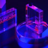


To symbolize the duality of Liquid+Arcade as both a media and creative service agency, each character of the logotype consists of an inner and outer stroke. We then fleshed out the world where the identity lives, even designing stationery made of hardened glass.
Based on our experience, ad agencies can make for pretty great clients, and we really enjoy the collaborative process. They have been some of our most understanding creative partners, and also seem to really enjoy sitting on the other side of the table for a change!
As a studio, that's really the best situation we can hope for, the perfect combination to make great, long-lasting design work. And in true agency fashion, we've even won awards for it!


