
During the Covid-19 lockdowns, most people's view of the world narrowed to whatever they could glimpse through their own windows. Yet, for all the suffering this caused, we could at least take solace in knowing quarantine was a shared predicament—with people in all corners of the globe facing the same claustrophobic fate.
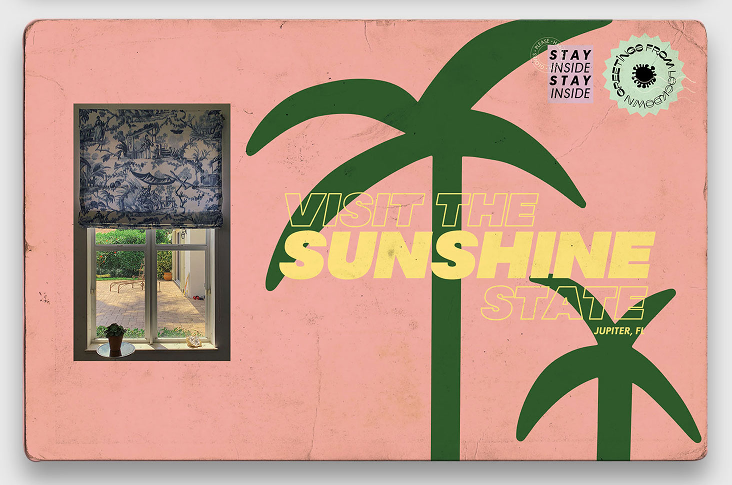
In April, two FCB Chicago creatives, Victoria Rosselli and Robyn Frost, turned the plight into art with a wonderful project called Greetings From Lockdown, comprised of mock travel postcards featuring views from people's homes across the globe. The pair asked friends around the world to share photos of their views, which Rosselli and Frost then turned into postcards, with the type treatment based on the personality and pace of each city, with a nod to classic postcard design.
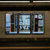
The project was amplified recently, when Outfront Media agreed to run the images on its digital OOH ad space throughout New York City's transit system.
Have a look at some of the designs here:


The postcards are beautifully done, and they also embody a sense of hope in melancholy times—subtly suggesting that even one's own limited view in lockdown is maybe worth writing home about.
Here's a gallery of photos, taken by Dannah Gottlieb, showing the postcards on display through Outfront Media's digital OOH network in New York's MTA system:


We spoke to Rosselli and Frost further about the project.
Muse: Where did you get the idea for this?
Victoria Rosselli: I was looking through a photo essay from The New York Times that showed cities that were once crowded with thousands of people each day, completely abandoned. Our cities that we once knew were suddenly confined to what's outside our window. This idea was reflective of how I was feeling at the time—thankful to be healthy and privileged to have a window to look out of. On the other hand, I felt anxious and hopeless, unable to see my friends or the person I love, all of which were thousands of miles away.
I was with my family in Florida, hiding indoors from the crazies. I deeply missed Chicago. Robyn has a lovely view from her downtown high-rise, so she would often send me photos from her balcony, whether it was skyscrapers filled with fog or blue, sunny skies. I would send her back photos of my dogs roaming around in my backyard.
We began to discuss our feelings of isolation and how this was something the entire world could relate to. As airlines at the time almost completely shut down, there was something poignant about the idea of creating postcards.
To take it a step further, we partnered with Outfront Media to adapt the postcards to the digital OOH space by utilizing their in-house content and publisher platform, Moments by Outfront. While New York was, at one point, the epicenter of the virus in the U.S., thousands of people left their city apartments and have no eventual plans to return. We added messaging that greeted New Yorkers from another city while they traveled via the MTA. Copy that read: "Hello, New York. See you before too long. —Amsterdam" gave a nod to the travel restrictions or self-isolation requirements put in place for Americans traveling outside the U.S.
How many have you done altogether?
Victoria Rosselli: We launched with 11 postcards, all of which we gathered from our friends around the world. Once it went viral on Twitter, we received hundreds of replies from Honolulu to Dubai, Edinburgh to São Paulo. We didn't expect this overwhelming response, so we've made around 30 so far and repurposed a few of our favorites to display in the MTA space.
Can you talk about the type treatments? Did you research a lot of postcard designs?
Victoria Rosselli: We wanted the overall design to nod to classic postcards but with a modern approach. The small details of postage stamps, rounded edges and the rough texture after postcards travel through the mail were important to include, especially for the idea to come across on a digital OOH screen. In regards to the type treatments, we let the cities they came from inspire us. The rounded curves in the Dubai type were reflective of the shape of the Burj Al Arab, while the serif used for Vancouver felt soothing and therapeutic. London gave a sense of movement—rhe coffee mug on the counter and the open window in the image, to the city's architecture, varying from traditional to contemporary. A variable type made the most sense to embody both the movement of the image and the many architectural styles.

Do you have any favorites so far?
Robyn Frost: Florence is up there as one of our favorites—it's a trip to Italy without leaving your home. The sun-baked rooftops and the stillness outdoors are strangely reassuring. You know everyone in the surrounding flats is doing the same—staring out the window, possibly wishing they were elsewhere. Type-wise it's a nod to spaghetti packaging, with the ribbon of green wrapping the postcard.

Amsterdam was a lovely one—the photo's from my friend Rachel's house. In terms of typography we wanted to mirror the canals. We found something that felt fluid and evocative of the city's twists and turns, while the stems of the letters are thin and representative of the narrow streets.

We used Marvin Visions Bold for the type on our Dubai postcard. It instantly sprang to mind—the A reminded me of the shape of the Burj Al Arab. It's almost identical. It felt too good to be true—licensing it was a no-brainer. Marvin Visions is a modern, variable font which felt apt when thinking about Dubai in terms of its transformation and constant, exciting architectural additions. I love how unwavering the type feels in contrast to the soft colors of the photo. Every element communicates height—the view from the building, the scale and confidence of the type.

Vancouver's cool, calm and collected. It reminds me of an Airbnb ad—it's lived in, it's imperfect, but the windows are satisfyingly symmetrical. The white of the type makes it feel relaxed and peaceful, and despite being a serif, it also feels a bit playful. The whole thing makes me want to pull up a chair with a good book and a cup of tea and get some sun on my face.

What do you hope this series does for people in this hard time?
Robyn Frost: It lets us travel the world without leaving our homes. It's a reminder that we're all in the same boat—for now, we're not going anywhere physically, but digitally we can look out of someone else's window and appreciate the beauty of the everyday. For the people who will see the postcards in OOH, we hope it momentarily takes them elsewhere—off the train, away from the platform, and off to a different part of the world for a split-second break. Creatively it's brought a lot of the design community together—other people have been making their own versions of the postcards, which is lovely.

Related Stories


Editor's Picks


Advertise With Us


