
Pantone's Newest Color Shade Was Inspired By Menstruation
To help end menstruation stigma, Pantone worked with Swedish feminine products brand Intimina to design a new color. The Period Pantone, Intimina says, is an "original shade of red that represents a steady flow."
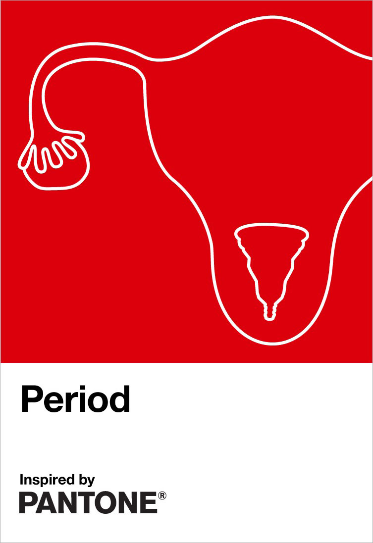
(According to this chart, it really does!)
The color Period stars in Intimina's "Seen+Heard" campaign, designed to encourage everyone, regardless of gender, to have open, honest conversations around menstruation. Intimina also donated £2,000 (about $2,500) to ActionAid, an international charity that works with women and girls living in poverty.
Blood is never just blood. There are compelling arguments about how our response to menstruation shapes our cultures. Certainly it shapes destinies.
In 2015, drummer Kiran Gandhi of M.I.A. ran the London Marathon while menstrual blood flowed down her legs. She said she did it so girls and women with no access to menstrual products don't feel shame, the kind that stops you from going to school and, trickle after trickle, derails your life.
"If we don't own the narrative of our own bodies, somebody else will use it against us," she added.
And while we understand why Intimina is invested in this—a fight that, to be fair, actually involves everybody and would change culture as we know it if it were seen that way, as a rule—it's hard to put a finger on why Pantone wanted to add its own two cents, or in this case, a swatch.
Pantone allegedly began its life as an ad and print firm run by two brothers, Mervin and Jesse Levine. Less than a decade later, the clever upstart running their ink and printing division, Lawrence Herbert, purchased their assets and rebranded the company. He is still Pantone's CEO, and the brand developed renown for its Pantone Matching System (PMS—apropos).
Pantone was born of admen and thrives, in many ways, because of a better one. And that is still a big part of its DNA.
In a Fast Company piece on how Pantone became the color authority by which our clients' greatest aesthetic ambitions live and die, vp Laurie Pressman of Pantone Color Institute elaborated on the company's ambition to embody aspects of the cultural zeitgeist. "It's our way of chiming in. We speak a language of color. So we see things in color. We can explain things in color."
This is why, in 2000, when it launched Color of the Year, the first color chosen was an "optimistic" Cerulean. "You had Y2K, dot-coms bursting, you had all this information about people wanting more substance to their lives. It was about coming up with an answer to the excitement, an answer to the fear, and using color to do that," Pressman said.
In 2019, Pantone's Color of the Year was Living Coral. In typically breathy prose, Pantone said it "symbolizes our innate need for optimism and joyful pursuits" and "embodies our desire for playful expression." The act was appropriated by a pair of creative directors at DDB, to remind people that living coral probably won't be alive much longer.
2020's color was "Classic Blue," a shade that "fosters resilience," suggesting "the sky at dusk." It is difficult not to read that now without thinking of the surreal orange dusk that gripped California for days. On the other hand, sensing that resilience was the best gift it could offer us was prescient.
Pressman calls the Period shade "an active and adventurous red hue" that "emboldens people who menstruate to feel proud of who they are. To own their period with self-assurance, to stand up and passionately celebrate the exciting and powerful life force they are born with, to urge everyone, regardless of gender, to feel comfortable to talk spontaneously and openly about this pure and natural bodily function."
To that, ActionAid U.K.'s policy director, Jillian Popkins, adds: "Millions of women and girls still suffer due to the stigma associated with periods. Many girls miss vital days of school, or even drop out altogether, which is one reason so many women experience lifelong poverty globally. Without the stigma around periods, more women could escape poverty, fulfill their potential and strengthen their communities. This important campaign will help change that."
The difficulties of women and girls "in poverty" is hidden in everyday life, exacerbating the aforementioned poverty. It is there in the pink tax, pink ghettos, and the wage gap—just a few economic costs that compound when you consider that women also live longer than men do, and tend to do the bulk of childrearing and community care.
And it exists in what we consider norms of good taste.
Days ago, menstrual underwear brand Modibodi attempted to run a video ad on Facebook, but was refused after a review of its content. The reason for the ban—depictions of red blood in common situations for menstruators.


