Meet the Designer Behind the Legendary Rolling Stones Logo

John Pasche was studying design at the Royal College of Art in London when he was commissioned by Mick Jagger to create a tour poster for the Rolling Stones.
Jagger and the band loved his work and gave the graphic designer another assignment—one that would launch his career. They asked him to design a logo.
Yes, we're talking about that logo.
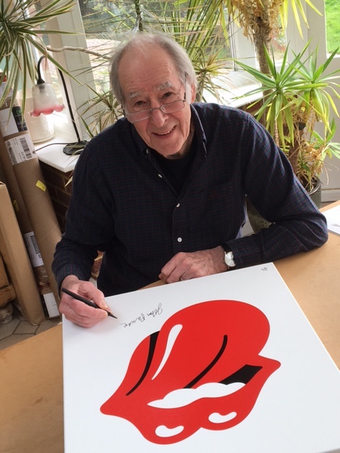
In 1970, Pasche created the Stones' world-famous tongue-and-lips logo illustration that became synonymous with one of classic rock's greatest groups. Over the years, the bold artwork has been emblazoned everything from merch (like t-shirts, lighters and underwear) to concert stages.
It's among the most iconic marks in pop-culture history. Simply put: that oh-so-red mouth screams THE STONES!
The designer would go on to create more tour posters for the band as well as art for Paul McCartney, The Stranglers, The Vapors, The Art of Noise and other musicians.
Here, Pasche, who is currently at work painting sketches of the Stones logo that will be sold in galleries across the U.K., talks about the thinking behind a piece of art that has endured for more than 50 years.
Can you tell me how the Rolling Stone's logo came to be and what your design represented?
I had a meeting with Mick at his house, and he asked me to design an image which would stand alone like the Shell image which was visible at petrol stations. He wanted it to stand for the band without the band name.
He showed me an image of Kali, the Indian goddess, which featured her small pointed tongue protruding from her mouth. This was the creative spark for the concept of the logo.
I returned a couple of weeks later with a few rough drawings of the logo taken from slightly different perspectives, and we settled on one. I completed the final artwork, which was then approved by the whole band, and the logo was born.
For me, it represented the anti-establishment, rebellious nature of the Stones at that time.
Show that logo to people today, and they know what it is. Why do you think it has had such staying power?
I think the logo has had such staying power due to the continuing success of the band and the way it has featured in various formats during the life of the Stones.
Its simplicity makes it perfect for merchandising. And although initially it may have symbolized rebelliousness, it also has a celebratory interpretation.

It's so incredible that we are talking about a logo you designed decades ago and that the Rolling Stones are currently on tour in support of a new album.
I have always considered myself very lucky to have been associated with the Stones so early in my career and have enjoyed every minute of my time as a graphic designer and creative director.
You worked in advertising after college. What was that experience like?
When I left college, I worked as a junior art director at the ad agency Benton & Bowles in London. I was broke after nine years at art college and needed to be on a reasonable salary. During that time, I was working weekends and evenings on record sleeve commissions.
I soon realized that ad agency work wasn’t for me and set up as a freelance graphic designer. I later worked as creative director at Chrysalis Records for 10 years and as creative director at the Southbank Centre for 11 years.
At Muse by Clio, we have a feature that celebrates the Art of the Album. We invite people in the ad industry and beyond to share their favorite album covers. If you had to choose one album cover that you did not design but admire, what would your choice be?
As favorite album sleeves go, I would choose [Pink Floyd's] Dark Side Of The Moon because of its simplicity and individuality.