I could hem and haw and try to pull 10 of the greatest album covers of all time, artistically spectacular and objectively outstanding. Or I can name covers that I admired from my dad's collection as a kid. Or covers that challenged not just their genre but the cultural norms that existed at the time of their release. Or covers that took images and photography that really weren't ever meant to be covers at all, that someone took a look at and went, "this captures exactly what this album is about."
Never one to go in an "expected" direction, the last three options sounded way more interesting, if not more subjective, so I went with those. I will go ahead and keep calling them artistically spectacular, though. With that, here are my top 10 great album covers.
ELO
Out of the Blue (1977)
When I was 4 years old, I used to look at this album cover while my dad listened to the record, my preschool imagination running wild. I thought the songs were made by people on this spaceship. I especially loved the "robot voices" on "Mr. Blue Sky." I didn't know it back then, but this cover joined the late '70s in a space-age zeitgeist everyone wanted to be a part of, from a similar Boston album cover to the release of the first Star Wars movie.
Miles Davis
Bitches Brew (1970)
This is maybe the biggest jazz fusion record ever. The music and the artwork were mindblowing to me then, and it still looks and sounds bonkers today. At the time, I hadn't seen covers even remotely like this, so much going on in the cover, but it captures a moment of magical realism perfectly. I also love how he called the work "directions in music"—the phrasing sounds like music has a life of its own that Davis just intended to steer.
The Rolling Stones
Sticky Fingers (1971)
My dad also had this record. It had a real zipper on the cover that you could zip and unzip! I thought it was the coolest thing ever, not only to look at but to actually play with. On top of the sweet functionality, it was designed by Andy Warhol! It definitely set the trend of the Rolling Stones pushing boundaries with what was acceptable on an album—as did their music, in the best way possible.
A Tribe Called Quest
Midnight Marauders (1993)
This is a classic Tribe album. The cover featured the heads of most of the greats in hip-hop at the time, and didn't miss a face, in my opinion. The tribal fusion with modern artists did a great job of joining eras into one encapsulating culture. This record still slaps!
DJ Shadow
Endtroducing (1996)
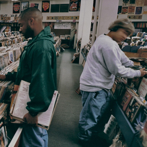
This photo of dudes in a record store shines a light on a big part of what went into the album. It primarily comprises samples that were found digging through bins at record stores like these. DJ Shadow isn't actually even in the photo—it's actually a few of his friends at a shop in the Bay Area.
Justice
Cross (2007)
This is just a simple and smart design choice. It's extremely bold to claim the cross as their symbol, but it worked. The music was also just as stark and in your face; it was really a perfect pairing of visuals to the sound. Also, have you heard the song "Stress" off this album? Give it a listen, but not when you're actually stressed—the piercing high-pitched note throughout encapsulates an adrenaline rush a little too well.
Dr. Dre
The Chronic (1992)
This is the album that brought gangsta rap to the suburbs. This cover art is a fun flip of the zig zag rolling paper packaging and a tribute to partakers of the album's namesake. (I'll assume you understood that reference, but in case you didn't, it's slang for high-grade cannabis.) All markers of a strong presentation for Dr. Dre's first solo studio album.
Prince
Purple Rain (1984)
How fucking cool is Prince on this cover? A true legend, always completely owning his own thing and crushing it time after time. The purple flowers on either side actually look to be raining down the album cover, replacing the lack of actual rain, though that might have been too on-the-nose for him.
New Order
Blue Monday 12 (1983)
This was the extended single for New Order's smash hit "Blue Monday." The cover was die-cut to look like a floppy disk. It cost them so much to produce the sleeve that they initially lost money on the release. But it did make a nice coffee table piece, in addition to a great album.
Beastie Boys
Paul's Boutique (1989)
I love how this random picture of a Brooklyn storefront is the album cover for the Beasties' second album. The vinyl release had a gatefold sleeve that opened up so you could see a panoramic view of the street corner. At the time, this record was a commercial flop, but it's now considered to be one of their best—if not their best—albums.
Art of the Album is a regular Muse feature on the craft of album-cover design. If you'd like to write about your favorite album covers, or learn more about our Clio Music program, please get in touch.


