
Barry Ament and Coby Schultz aren't siblings. But a quarter-century after forming Seattle-based Ames Bros, and building it into one of the Pacific Northwest's premier design and illustration shops, they've shared more ups and downs than some brothers experience in a lifetime.
Lately, they've trended in a distinctly positive direction, earning kudos and generating buzz for their limited-edition, 18-by-24-inch Seattle Seahawks posters. They produced a new offering for each of the NFL franchise's home games last season, plus a special edition for the team's playoff appearance in Green Bay. All proceeds funded art education in Seattle.
Created by the duo and other artists, styles ranged from Schultz's retro-playful take…

… and winged warrior …

… to Ament's epic, heavy-metal vision:

A few weeks ago, Ament shared the 2020 Grammy Award for Best Recording Package with several collaborators, including Pearl Jam bassist Jeff Ament, his actual brother, for a career-spanning box set from the late Chris Cornell (a founder of Soundgarden).

Ament and Schultz both grew up in Montana, attended separate high schools in different towns, and met in a drawing class at Montana State University. A few years later, they attended an exchange program in Utrecht, Holland, and basically bonded for life. After college, Ament worked as an in-house designer for Pearl Jam, while Schultz handled graphics for K2 snowboards. They combined forces in 1994, picking the name Ames Bros because, they quip, "Acme was already taken."
Since then, they've leveraged the "grungy" visual approach associated with Seattle's '90s music scene, working for clients in sports, technology, health, spirits, media and entertainment. Bold but on brand, their style boasts layered imagery that combines savvy messaging with an indie-rock attitude. Across packaging, illustrations, interior design—and their specialty, posters—they call the tune that others follow.

In the email conversation below, which has been edited and condensed, the duo—who answered questions as a pair—discussed their early days, dish about key projects and analyze the state of design in 2020:
Muse: How did the Seahawks posters come about?
Barry Ament and Coby Schultz: We have done work for the Seahawks over the past seven or eight years, and with their charitable events. We custom-painted Coach Pete Carroll's Nike Monarchs a few years back for My Cleats, My Cause—and helped raise a lot of money for them and the NFL's Kick Hunger Challenge. We made and sold custom T-shirts for the cause, with proceeds going to our local Food Lifeline. That led to an informal meeting a few years back with [team vp of marketing and community engagement] Jeff Richards, who was familiar with our rock posters. We talked about the possibility of creating some game-day posters for the Seahawks.
At that point in the season, it would've been for the playoffs, and there just wasn't time to pull it off. We decided it was something that needed careful thought and a good plan to bring it to life. Within a few years, we developed a plan to create custom screen-printed posters for each and every home game of the season. In the summer of 2019, we got to it. Working closely with Jeff and [creative director] John Weaver, we curated and developed a poster for each game using unique Northwest artists for each one.
Click the thumbnails to enlarge.


You offered the posters for $25 each on the team's website. I take it they all sold out.
By the end of the season, they were selling out in minutes! All proceeds went to The Creative Advantage Foundation, which funds art in Seattle public schools. Each poster consisted of a larger edition on white paper and a "variant" on silver foil. Internally we called it the "Lombardi Edition," as it was designed to mimic the shiny chrome of the Super Bowl trophy, which the Seahawks won [Super Bowl XLVIII in 2014—and they should've won Super Bowl XLIX in 2015). We attended an end-of-season event where John Weaver, marketing director for the Seahawks, handed over a jumbo check for over $53,000! We completed one more poster for their playoff game versus Green Bay, which totaled another $15,000 in sales for the program. Not bad—close to $70,000 on the season!


Was the project a labor of love?
Raising a ton of money to support the arts in Seattle public schools was a big deal to us. When we were growing up in Montana, both of us—separate schools, separate towns—had our art programs cut prior to attending high school. The first art classes either of us had beyond junior high didn't happen until we got to college. The arts always seem to be on the chopping block, so we're super excited to put our efforts into something so important and rewarding. Growing up, we were limited to drawings of our teachers and friends in the margins of our regular schoolwork. Most of it PG-13.
Is this what you always imagined doing, or did you dream of being rock stars?
As kids, seeing album and cassette covers at the local drugstore may have sparked something, but no more than the excitement of a fresh pack of Hubba Bubba and its neon drop-shadow bubble lettering. In college, in our earliest dreams and conversations about "Wouldn't it be sweet if we could hang out and…." — this [design career path] definitely would've been at the top of our list. With no idea where to start, we took the easy route and tried to make the perfect fake ID, which was instantly squelched by a do-gooder Kinko's night manager. It was a few years later when we were in a better position to start thinking about a career actually doing what we liked.
Is there a Pacific Northwest design style?
We always try to push ourselves into different styles, and sometimes the medium dictates the style. With screen-printed posters, you have to keep it simple, and oftentimes the number of colors are limited by budget, so you have to get savvy on how you can max things out through over-prints, etc. We're known for our screen-printed posters, so that look is often what people want, even if it's for a packet of hot sauce. As for a Northwest style, you've gotta go back to what Art Chantry and Jeff Kleinsmith did at Sub Pop, The Rocket and with local show posters. Those guys had as much to do with what is defined as "grunge" as any musician, because they gave it a distinct visual identity. That said, Northwest style equals grunge. I'd say we operate in the outer fringes of that style.
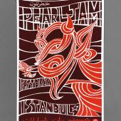
You're well-known for Pearl Jam posters, and those are certainly grungy, right?
We've designed over 250 show posters for just this one band. When we first talked the band into doing posters for their European shows in 1996, there were no online forums or collectors. The intention was to create a special keepsake for a few hundred folks at each show. If it was a total disaster, oh well, we're onto Cleveland tomorrow night. We had no feedback from fans, and oftentimes heard nothing back from the band—which includes art direction or approval. We had enough of a report with the band that they trusted us to go for it.
All these years later, the design process hasn't changed much, but the external forces have. Feverish fans and collectors are standing in line for hours and sharing images of sold-out posters in forums before the band ever plays a note. The posters have become part of the band's identity and history. So, it comes with a little more pressure that it did over 20 years ago, when we were just doing it for the fun of it.


Can you talk about your work for "Got Milk?"
Sometimes you remember the situation more than the process. We were hired by an ad agency [Goodby Silverstein & Partners] to create these faux vintage cards featuring the stars of each team for the Super Bowl campaign. We received some great photography from the client, with all of the players in throwback poses. This was back in 2002, when Tom Brady won his first championship, and all these years later the work holds up. The normal two-week gap leading up to the Super Bowl was condensed to one week because of 9/11, cutting the turnaround time in half. To add to the madness, we were also between offices and were temporarily set up in Coby's basement. We blew a couple of circuits when there was a load of clothes in the dryer! It was a lot of late nights and early mornings … pretty much on call 24 hours a day to pull it off.


You've also done environmental design, decorated whole offices, notably for Microsoft, yes?
Ames Bros worked with the Microsoft Teams Design Studio to create the environmental design of their entire workspace in Bellevue, Washington. Microsoft Teams are the guys working on Skype. Skype is all about communication and interactions from different devices and from any workspace. That includes normal office settings, at home, on a hike, etc. We decided to take that to a whole new level. Wooden panels, graphic murals, and custom wallpaper feature a detailed storyline of communications and interactions between PNW communities/characters working together from the outer reaches of space to the depths of the ocean floor.


Any design influences you'd care to mention, or current stuff you admire?
Influences include, but are not limited to: Farm equipment, candy packaging, '80s video games, fast food, wildlife, National Parks, books (lots of books), surf/skate/snow culture, vintage illustration, architecture, fish, bones, robots, cars, stuntmen, county fairs, FFA, the Old West, politics, sports, grim reapers, monsters, hot rods, monkeys/gorillas/apes, an octopus, sharks and Bigfoot.
What are the biggest changes on the design scene since you started?
Computers became a big deal since '94, and it's our prediction that they will continue to be a big deal—ha! We were trained pre-computer. We cut Rubilyth [a kind of film used in graphic design], used stat machines, hot glue and waxers. So even though we now use computers every day, our minds are wired as if we didn't. We use a computer as a tool to create the same style, but without inhaling spray mount. That's part of our aesthetic. Call it retro, if you will. That, along with being illustrators, dictates our style and we have our own little niche.
Any recent stuff you wanna plug, or a project in the offing?
We just finished working on lettering, guess you could say typography, for the new Pearl Jam "Gigaton" album/packaging. The idea was to create a font that duplicates the movement and prints from an EKG monitor. The tricky part was to fuse Eddie [Vedder]'s calligraphic style into a harder, more urgent font. The result was pretty awesome. We've got some posters in the works for the Who, Journey and Pearl Jam as well. All good. All exciting.


Related Stories


Editor's Picks


Advertise With Us


