
During each awards season—just like clockwork—I am instantly engrossed in movie posters from all of the nominees. And every year—again, like clockwork—I garner fresh takeaways on the dos and don'ts of effective visual storytelling. After all, movie poster design is an art form in its own right within the vast world of marketing. They're key art of course, but posters must accomplish far more. They drive interest, intrigue and ticket sales, while teasing cast, themes and plotlines.
They've got to stand out and convey both message and meaning—or risk getting lost in the churn.
From the success of Barbenheimer to a Dr. Frankenstein x Dali mashup, we'll take a look at the posters from some of this year's Academy Award Best Picture nominees to learn how they built buzz for the masses.
Bigger isn't always better
Killers of the Flower Moon is an uninspired hodgepodge collage.

A Scorcese epic with a budget of $200 million surely rates a top-notch effort. Yet the (literally) in-your-face composition pales in comparison to most—if not all—of its fellow Best Picture nominees.
First, it uses a trite and lackluster trope: big heads mixed with disparate imagery from the film. As viewers, we get no clue as to what this film about. But we do know one thing: Leo's in it—in a big way.
Furthermore, the collage does nothing to clarify what to expect in terms of character or story. We don't even get a glimpse of who these characters are, especially with the poster's composition somewhat suggesting that Leo—with his scowl—may be the sole antagonist. But having seen this film, I can tell you that isn't true... not even close. My assumption—based on the poster design—was wrong. Not to mention the lack of creativity with its textured edge (an oil splatter! how creative...)—which might get a pass if this was your first year at art school.
Because the truth remains that when you throw too much "stuff" and too little intent into a composition, you reap uninspired, derivative approach that muddles message and meaning.
So, how do we combat this ourselves? First, figure out what you want to convey and then solve that through visuals—not the other way around, which seems to have been this poster's lopsided approach. Why not let an indigenous creative create? Well, they did. For the official IMAX movie poster, Osage Nation Ambassador Addie Roanhorse crafted a stunning piece of art.
Being negative can be a positive
The Zone of Interest, Anatomy of a Fall and Oppenheimer keep it simple, yet stunning.
In stark contrast to the previous poster discussed, all three are striking—and successful—for different reasons.

Big questions abound for the former. How do you depict an atrocity? How do you depict the lives of the wicked who commit them?
Upon first glance, you're sucked into a black void that is the night sky. Or is it the callous, calculated nothingness that exists beyond the wall for these characters? Either way, the viewer is drawn in and questions what could be. The unsettling weight of the visual generates a sickly and dreadful unease. Something that is reflected throughout the film's narrative as we juxtapose horror with everyday life.
The film itself has been described as "hauntingly beautiful"—haunting for the subject matter and beautiful in its execution—and I think its poster mimics that in detail and decision. The viewer is still left feeling exactly what they should before sitting down to watch.

Similarly—and perhaps this year's biggest awards season success thus far—Oppenheimer focuses on only two elements: the explosion and Oppenheimer himself. Nothing more is needed to stir up emotions and hook the onlooker.
While not the standard definition of "white space," the visuals create a swell of emotions by utilizing few, yet strikingly effective images. The explosion feels all-encompassing, while the coloring moves the viewer downward toward this singular figure—Oppenheimer—almost nonchalantly engulfed by his own creation.
This mirrors what he goes through during the film's three hour-plus runtime.

Then there's this year's sleeper hit, Anatomy of a Fall, a story about a woman suspected of killing her husband with the only witness being their visually-impaired son.
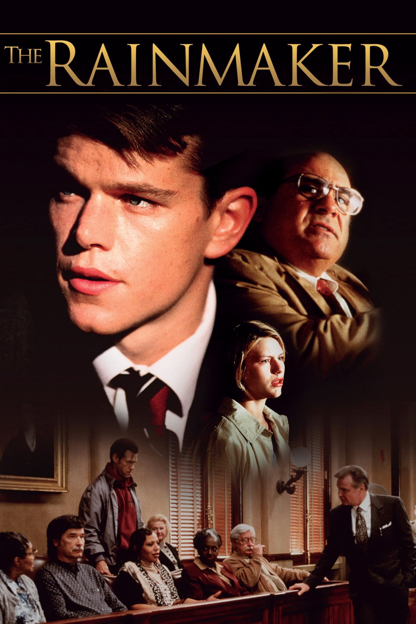
If I were to describe this movie as a "legal drama"—which it technically is—what comes to mind is probably some mundane poster with courtrooms and lawyers, judges' gavels and juries (e.g., The Judge, The Rainmaker). But when you see Anatomy of a Fall's poster for the first time, you think "thriller," "suspense" and even a "whodunnit murder mystery" type of film. That's because the approach subverts genre expectations. The visual stands out to create intrigue and wonder.
To do this, the creative team imparted the use of bright white space, purposefully chosen subject matter and a composition that works in tandem with effortlessness. By creating a column-like layout, the gory images lead the viewer directly into the copy and title. Which itself is treated meticulously to almost mimic a cross or that of the fallen body above it, creating a mirrored shape.
By carefully hinting at themes, emotions and messaging—as the three posters above do so well—the viewer is allowed to explore and understand what the movie may be about. The "less-is-more approach" works wonderfully when done right.
Consistency is key
Poor Things and Barbie use variety in harmony.

What happens when you ask a surrealist to create posters about a Victorian-era Frankenstein's monster? You get the variant posters made for Poor Things. While the results are effectively similar in nature—bodily oddity composites—they are uniquely telling of the story. More importantly, they're a solid way to use talent while suggesting the tone and themes of the film itself: free choice, expression and curiosity at all levels—physical, intellectual, emotional.

When viewed side-by-side, the onlooker can recognize both as being from the same film due to similar creative choices (composition, artistic style and subject matter), while enjoying the visual approaches of each (color palette, surrealist expression of subjects). They both do a wonderful job of "hitting the brief" in order to show off the talent involved in the film, while still allowing the story and vibe to take center stage and give viewers points to ponder.


With no less than two dozen portrait-themed posters for various characters within the film, Barbie was able to pull off a marketing coup most brands only dream about. What the team did was create a "template"—something simple, yet stylized, and instantly recognizable and relatable.


Recall that the summer of 2023 was inundated with the general population creating their own versions of this marketing phenomenon. By letting design choices become customizable, they allowed members of all audience to tap into their pink-filled world, which in turn helped potential viewers get more invested in this film. Upon release, of course, tens of millions flocked to theaters to "see themselves" in the movie.

Related Stories


Editor's Picks


Advertise With Us


