
Over the past two years, digital agency Work & Co joined with the Metropolitan Transit Authority and Transit Innovation Partnership to reimagine New York City's intricate—some might say arcane and impenetrable—subway map as a flexible web-based resource.
Now in beta, the offering marks the first significant upgrade in four decades, and provides real-time updates of all sorts. It chronicles route changes, delays and closures, while displaying the location of every train in the system. Such functionality should help riders more efficiently plan their journeys and make adjustments on the fly.


Unchanging maps fixed to station walls feel so '80s, right? And hastily posted signs listing service interruptions can be confusing or easy to miss—and downright useless with a situation in flux. (Plus, some jokers might tear them down!)
"In the early concepting phase, we explored lots of potential solutions," Work & Co designer and founding partner Felipe Memória tells Muse. "Some were actually more abstract than a map. They were time-based, or highly filtered, specific to a single train line. But New Yorkers generally don't like to be told where to go or that there's one right way to get there. So we realized the best solution was to make a map that communicates a variety of information visually."
"We wanted to reflect changes in the system that could impact a rider's commute," Memória says. "So, the decision around making it web-based was important—because that makes it more democratic, not requiring an app download—but most important was creating a product that is constantly updating. We knew that to give New Yorkers and visitors to the city the most accurate version of the subway system as it's operating currently, the map would need to actually redraw itself several times a day."

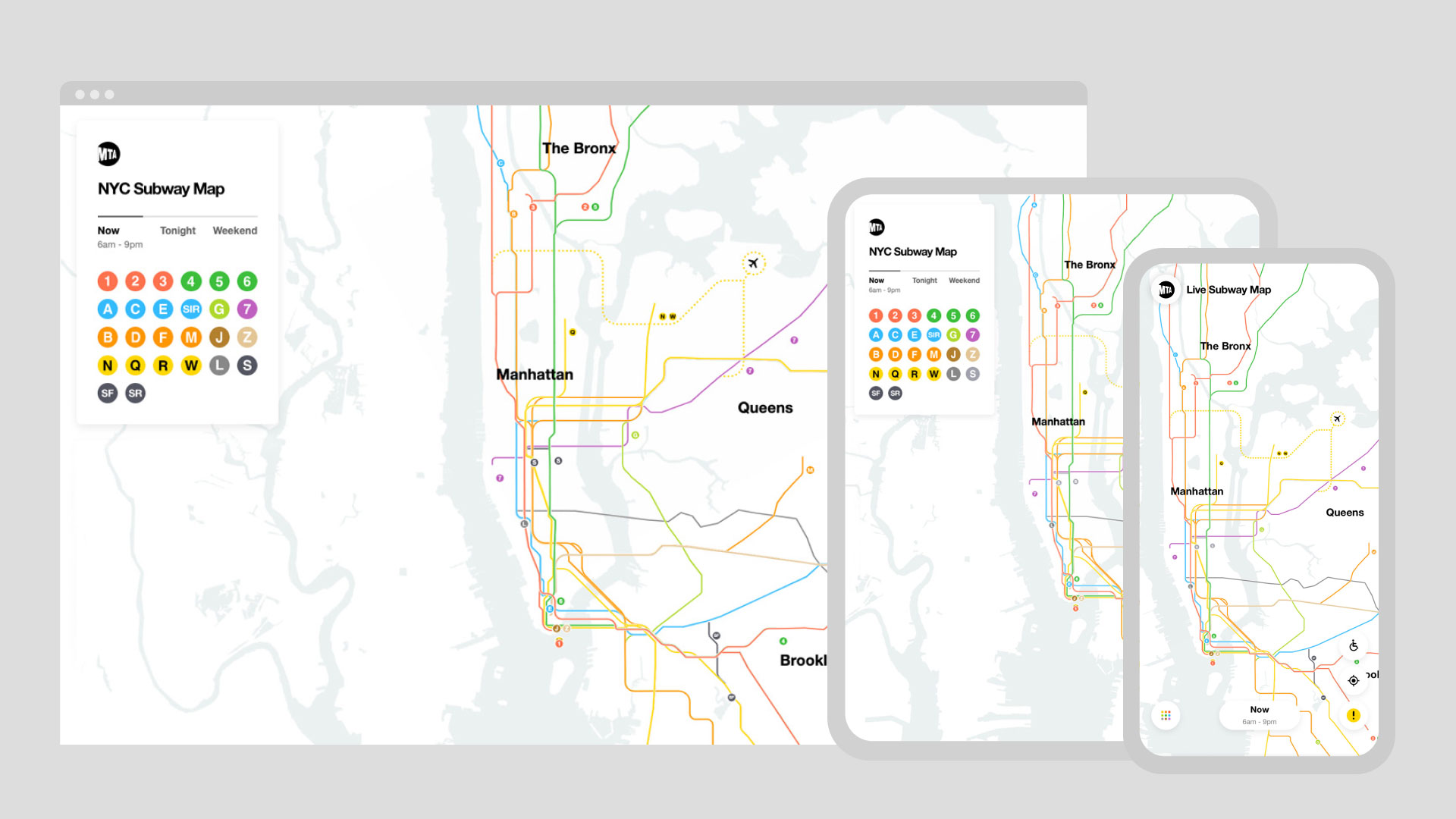
You can view the results here, and learn all you'll even need to know about the history of NYC subway maps—they stirred such passion and controversy!—in the engaging 10-minute documentary below from filmmaker Gary Hustwit.
Below, Memória explains how the project came together and outlines its route for the future.
Pictures tell a complex story.
"It's a lot to ask of busy New Yorkers to not only absorb, but then remember, all the information about changes to subway service: Which trains are operating on a different track between the hours of midnight at 6 a.m.? Which train lines aren't operating on the weekend? Which subways are undergoing maintenance? A big benefit of the new 'Live Subway Map' is that it converts complicated copy into visual information. It's better for users because our brains can interpret visual information far faster than written information, especially in on-the-go contexts—like while you're commuting or trying to catch a train. The fact that it's visual means it also works across several languages, too."
Zooming in on key data.
"Although it's still just the first release—and over time there will be many more features added—already we can improve a rider's day by making it faster for them to get the information they need. For example, the fact that you can zoom in and zoom out allows you to define the amount of content and information you get based on your needs. You can see the whole system and all the stops a train line makes and which neighborhoods it goes through. But at deeper levels of zooming in, the new map gets way more detailed, to highlight subway entrances and exits.
It's your ride!
"You can also prioritize how you view the map based on your personal commute. For example, if you take the vast majority of rides on the 6 line, you can filter to see information only for the 6. Another big advantage is being able to visualize the way service will change tonight or on the weekend—so you don't find yourself at a station that you didn't expect [your train to pull into]."
A familiar user interface.
"One of the things we always have to think about as digital designers is that we're creating interfaces. Our designs aren't static. They move and behave in ways that actually trigger an interaction. People instinctively tap on things in digital contexts. We were inspired by one of the covers of an early Vignelli [NYC subway] diagram that showed all of those iconic colored circles—and it reminded us of a keyboard. It looked like buttons, and in a digital context, we could envision how they felt highly press-able. So we used that as the basis for how we could create a filter-by-line feature that was seamless but still evoked the feeling of the iconic Vignelli design."
Chugging into the future.
"We could refine and improve the map endlessly, but ultimately we wanted to release the product as soon as we could to get it into the hands of millions of New Yorkers, in order to help them, and to get their feedback. Especially amid Covid-19, when people are concerned about planning efficient commutes, we wanted to provide this real-time tool as another way they can manage their days. It's in beta, which just means that we have released it with the goal of gathering thoughts from users so we can tweak the map over time."
CREDITS
A Film First production
in conjunction with Work & Co
Director: Gary Hustwit
Producers: Gary Hustwit & TJ Kearney
Executive Producer for Film First: Jessica Edwards
Director of Photography: Ben Wolf
Editor: Isabel Ponte
Original Score: Danz CM
Featuring:
(in order of appearance)
Felipe Memoria
Rachel Haot
Sarah Meyer
Joshua Gee
Marcela Abbade
Karina Sirqueira
Robert Penner
Mohan Ramaswamy
Motion:
Motion Director - Laura Ambrose
Motion Designer - Tsuriel Eichenstein
Motion Designer - Sang Kim
Motion Designer - Corbin Dowd
Motion Designer - Young Woo
2nd Unit Filming: Lauren Martin, Cam Östman
Production Assistance: Sanjay Singh, Jasper Curtis
Post-production Services: PostWorks New York
Colorist: Eric Ramistella
Sound Mixer: Christopher Koch
Image and Video Sources:
Getty Images
Pond5
Paramount Pictures
Stan Ries
Helen Levitt
US National Archives and Record Administration
Wikimedia Commons
Photo Communications Co.
Thanks:
Josh Owen
Jennifer Whitlock
R. Roger Remington
The Vignelli Center for Design Studies
Cooper Union
Mike Essl
Liz Muller
Chialin Chou
Joan Charysyn
Stan Ries

Related Stories


Editor's Picks


Advertise With Us


