
Lippincott, the famed creative consultancy founded in 1943, has created some of the most instantly recognizable designs of the past 75 years.
The Campbell’s soup can, the Coca-Cola ribbon, the reimagined Starbucks Siren, the Duracell copper top, the Betty Crocker spoon, the American Express blue box. These images are as deeply embedded in pop culture as any ever made.
Founded by Gordon Lippincott, an engineer, and Walter Margulies, an architect, the company also designed hotel restaurants, changed the silhouettes of typewriters, crafted the interior of the U.S. Navy's first nuclear submarine, and architected the iconic Johnson's pavilion at the 1964 World's Fair in New York.
By combining product design and storytelling, Lippincott helped to create the branding industry as we know it today.
Now, on the occasion of its 75th birthday, Lippincott is looking back at some of its most iconic projects. Below, Anna Maltabarow, marketing director at Lippincott, tells Muse all about 10 of its most high-profile designs—and the thinking behind them.
Xerox (1960)
Decades ago, a relatively unknown company named Haloid Xerox stepped onto the scene and created an industry. Its next step? Enlisting Lippincott to develop a recognizable name and symbol. The firm proposed dropping "Haloid" and simply using Xerox as the name. They developed a distinctive logotype to be used as both a brand and a corporate name, which became an instantly recognizable symbol.
Campbell's Soup Can (1963)
Lippincott collaborated with Campbell's on more than 20 label redesign projects, including a reimagining of the famed "8 oz Ready-to-Serve Soup" label. Cleaning up existing designs and showing Campbell's how to apply a cohesive system across different product lines, they helped bring to life the iconic brand that Andy Warhol immortalized on canvas in his pop-art masterpiece, and that continues to warm hearts (and stomachs) more than 50 years later.

Citgo (1965)
Lippincott gave this company, originally called Cities Service, a unique brand name appealing to adults on-the-go, a new sign that would attract motorists before they had sped past, a bright, contemporary look for the service stations, and, of course, a logo. "Citgo" was chosen for its short highway recognition and easy pronunciation. Our final logo design incorporated a fresh combination of colors and design that projected strong visibility and impact even in a busy highway environment.
Coca-Cola (1967)
Lippincott created the Coca-Cola ribbon, which first graced Coke products in 1969. Along with this iconic piece of design, we launched their first global brand system based on the iconic Coca-Cola red and wave form. The result? An instantly recognizable brand that transcends the world's borders.
Goldman Sachs (1970)
Lippincott was tasked with developing a brand that positioned Goldman Sachs as the premier investment banking firm to meet any client need, anywhere on the globe. Inspired by Tiffany's, we solidified the brand in a signature black box using classical letterforms and distinctive ligaturing of the G and S. The end result helped weld a disparate group of investment specialists into a formidable force.
Delta (2007)
As part of a massive brand transformation project that shaped the entire customer journey, Lippincott emboldened Delta's visual expression with a powerful red symbol and supergraphic. That new identity was translated onto aircraft and in major terminals virtually overnight—its boldness and simplicity only getting stronger with time.

Walmart (2008)
Lippincott sparked a transformation at the world's largest retailer by first introducing two complimentary brand assets that reflect the brand's promise. The logo features a brilliantly simple Spark, evocative of the light bulb that goes off in your head when you make a good decision. Along with the new logo, they coined the signature tagline, "Save money. Live better," and together they resonated with legacy Walmart shoppers but also with new customer segments that see value as an enabler to a better, less compromised life. Lippincott went on to work with Walmart for nine years, translating the new brand into all aspects of the in-store and employee experience.
Starbucks (2011)
When Lippincott started working with Starbucks, they were approaching their 40th anniversary and saw the milestone as an opportunity to reimagine the customer experience and visual expression of their now-global brand. The design platform centers on the perfectly imperfect Starbucks Siren, which has always been a figure of alluring familiarity. She quickly became their muse as we developed a set of international design principles that would maintain Starbucks' distinctive brand presence in stores, supermarkets and homes across the world.
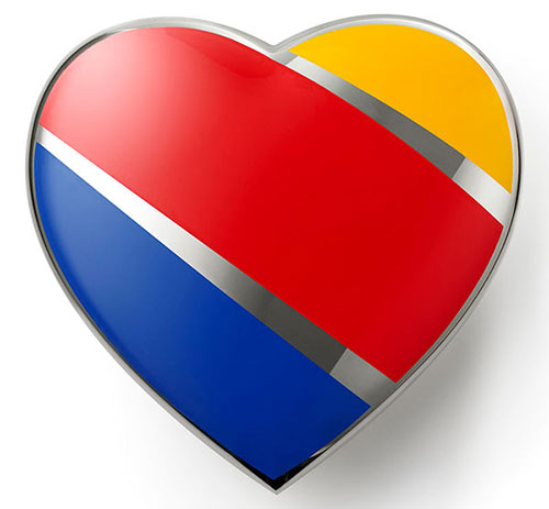
Southwest Airlines (2014)
Without a heart, it's just a machine. We redesigned the Southwest Airlines visual system to align with what has always made Southwest great—its emphasis on people. So, in 2014, Southwest claimed our heart design as its brand symbol, crystallizing a business philosophy 47 years in the making and showing the world that what started Southwest is exactly what will lead it into the future—treating people more like people.
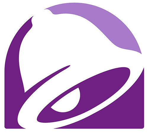
Taco Bell (2016)
Taco Bell is no stranger to innovation. But the fast-casual restaurant segment had evolved, and by the time the brand came to Lippincott, it had a two-decades-old identity out of step with its growing customer base. They started with an exploration of the bell, deciding on a visual streamlining of this beloved icon. The instantly recognizable shape can now be filled with an endless array of patterns, textures and images.
Also as part of the 75th anniversary, Lippincott sat down with some of the designers behind its most iconic projects. See the videos below with some great stories from John Young, Richard Felton, Connie Birdsall and Arthur King.
Finally, click or swipe through 40 more of Lippincott's classic designs below.


Related Stories


Editor's Picks


Advertise With Us


