Deutsch LA's New Visual Identity, Designed With Diversity in Mind
One interesting thing about Deutsch's decision to separate the New York and Los Angeles offices is that it brings the people in each office closer to the local culture and surrounding industry. Leaning into location will help L.A. and New York both find their own unique identity and will bring forward new ideas that had been partly lost under a "North American" umbrella, such as the dynamism of New York and the entertainment and maker energy unique to Los Angeles.
Leaning into the legacy of Hollywood and the intersection of technology, culture and music, I was tasked with creating a new identity for Deutsch LA. For me, this was the perfect opportunity to create something I strongly believed in—a brand infused with diversity of thought expressed through the agency's distinct design philosophy.
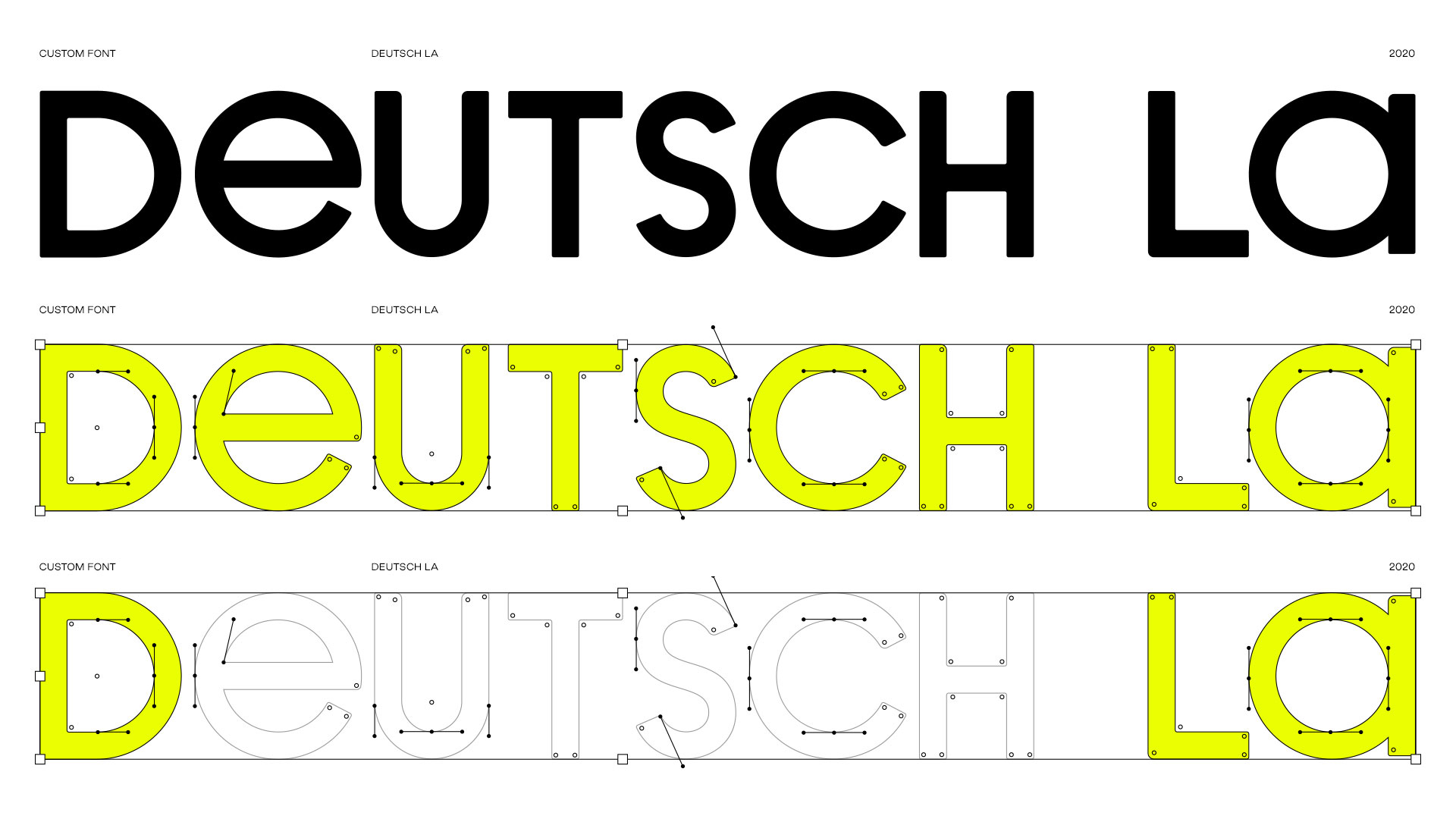
I wanted Deutsch LA's new visual identity to have a symbol that anyone could draw on a piece of paper. Something simple, easy and memorable enough for people to recognize and adapt to their own hand-drawing. The symbol needed to represent our people, the talents of the agency and the real commodity of our creative company. I wanted to create a flex mark that could represent our diverse group of people and still be recognizable as our logo.
I started drawing sketches on Post-it notes and realized I could use the letters D from Deutsch and LA from Los Angeles to create a face and finish it off with a circle around it. The concept was born.
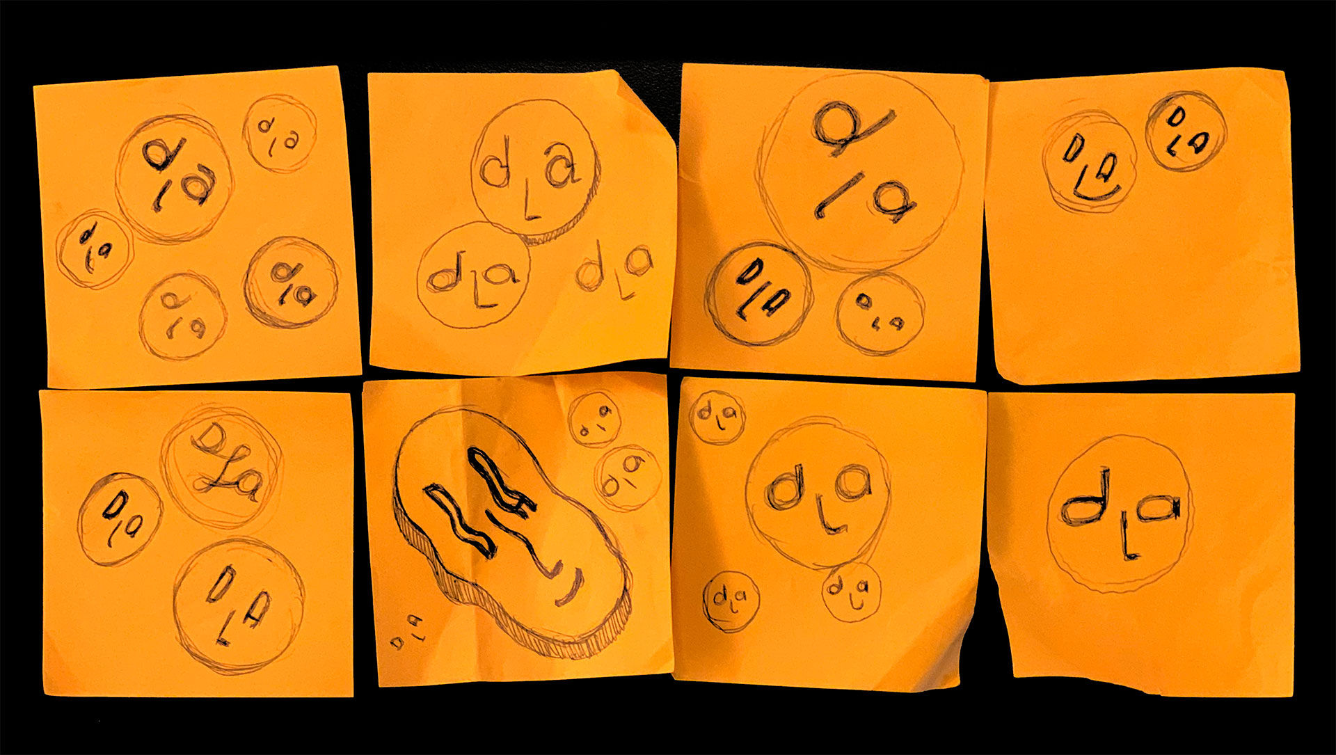
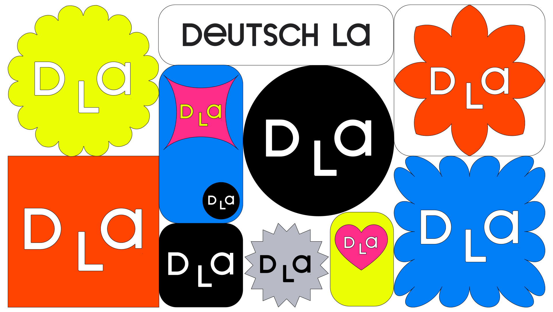
However, one important aspect was still missing, the representation of diversity and inclusion. I wanted to find a proper way to represent the different voices that make up our agency, but I didn't want to lean on a lazy solution and use different colors to represent various racial groups. I wanted diversity to be at the heart of our symbol. It was important for my design to be adaptive so that the logo represents an environment where anyone could feel included, while still representing our agency's core values and image.
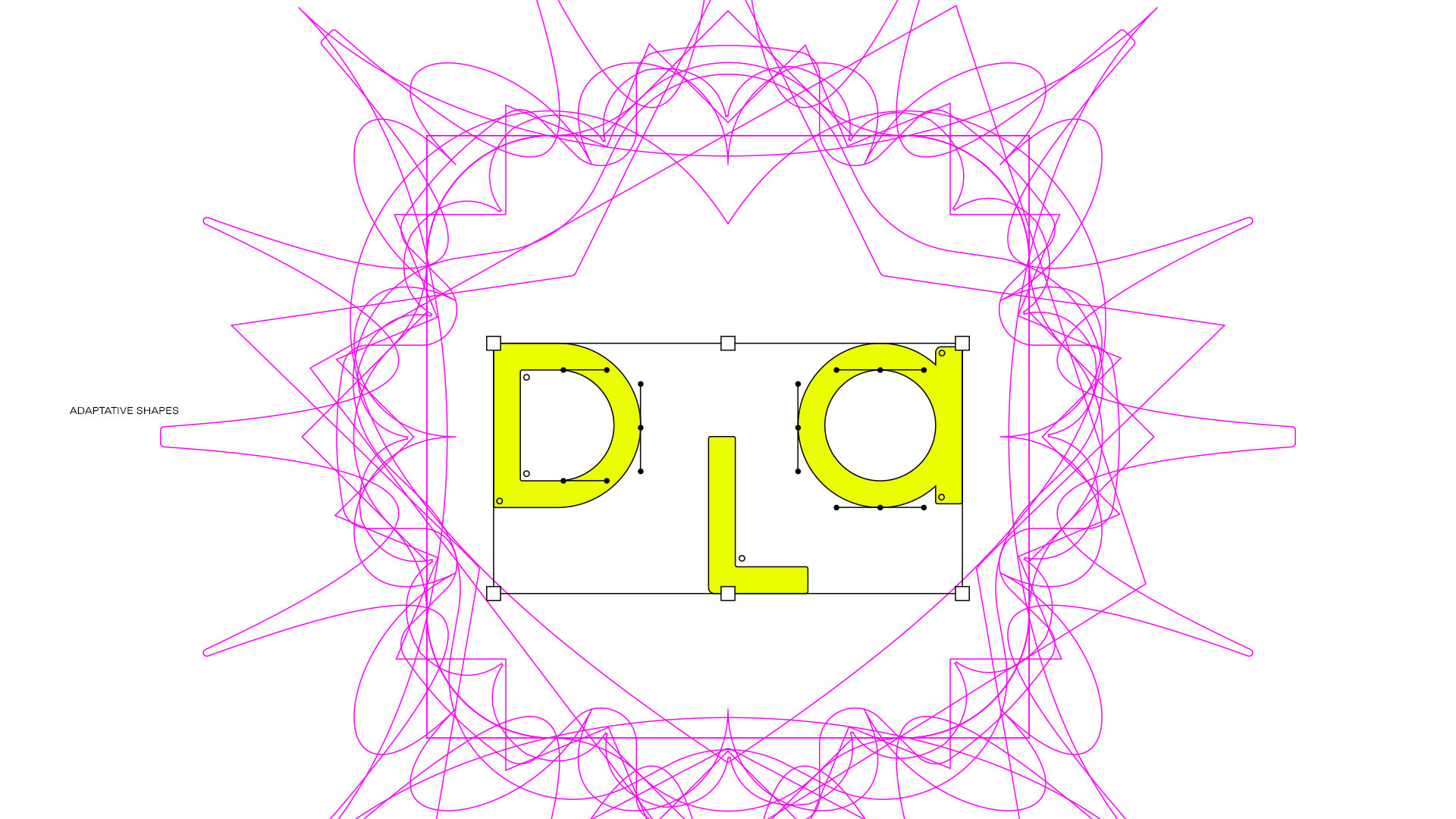
After spending some hours figuring out how to create unique letterforms to represent the eyes and nose of Deutsch LA's face, I started testing the letters inside different geometric shapes, going beyond just a circle. I discovered that the symbol would still read like a face, and to my surprise, would adapt to a vast variety of other shapes to represent all the different characteristics and backgrounds that our people share and come from.

I started visualizing how the different career paths in advertising would impact how people would want to see themselves visually represented. How would a strategist like to be represented? A technologist? Someone in media? Or data?
When it came to color, I knew the logo should work in both black and white, but again, I didn't want to make the simple design trick of inverting the color. I wanted the symbol to be in both colorways and adapt correctly for any background color, and make sure people had the option to select the symbol that best represents them, either the black-filled face or the white one.

The coolest thing about this brand is how flexible and adaptive it is. It really represents a new chapter for the agency. We've had so much fun rolling out the new brand, through social, web and even small things like customizable email signatures.