
My journey in music packaging design began and ended at precisely the wrong time in history.
Just as my studio was being hired by major labels to create packaging campaigns, the 12-inch LP had been retired in favor of the more portable and ostensibly durable compact disc. My gauzy art-school dream of designing luxurious monstrosities of double gatefold vinyl was replaced by the awkward fumbling of brittle plastic jewel boxes and semi-functional hinges. The digital revolution had arrived, and it was both highly fragile and very shiny. The CD's most challenging design constraint was working with a scale reduction to 4 ¾ inches square (a form-factor that lasted until Sean Parker and Steve Jobs started moving fast and breaking things). Yet as history proves, design guardrails could be transformed to open fields of imagination and ingenuity: Recorded music's most creative visual output was arguably accomplished during the CD era.
So in that sense, perhaps my tenure as a music designer was perfectly timed. And yes, sadly, I was long retired as a packaging designer by the time 12-inch vinyl made its triumphant return. Sadder still, the second coming of vinyl arrived for the sake of nostalgia, and not as a format required to keep an entire industry afloat.
Like everyone, I now consume music as a wireless stream of digital information: bits traveling through the air, somehow magically reassembled into my headphones as a recognizable song. Gone are the physical components I once considered to be my life's work: colorful silk screened discs, tray liners, paper booklets of painstakingly typeset song lyrics, paragraphs of personnel lists, evocative photography and even record company logos. But when I see an album cover appear on my phone, I know there's a deeper story within and it always takes me back.
Below are a few album covers that mean something to me. Maybe they mean something to you, too.
Roxy Music
Country Life
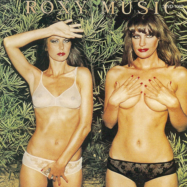
I was 2 years of age in 1974 when this album was released. But the lore of Bryan Ferry entered my consciousness at two different times in my life, both having nothing to do with his music. I first recall seeing this scandalous 12-inch LP sleeve while snooping around the hi-fi cabinet at a childhood friend's home. Transfixed, I wanted all of the answers: Who are these women, how old are they, are they friends, where do they live, and does underwear like that even exist? If that was country life, I wanted to live in the country. Later, I came to understand the cult of Roxy Music more completely when seen through the lens of women in their 30s. I'm still awestruck by the subculture that considers Bryan to be their adult pop-culture messiah: effortlessly cool, suave and supremely talented. A crooner in a tailored suit, possessing the ability to seemingly objectify and respect women at the same time, creating no conflict in the eyes of his flock. So it comes as no surprise that this enduring cover image was created as a result of Bryan meeting our cover models in Portugal (naturally) and compelling them to pose for the album packaging. Subsequent versions of this album were shipped with censored cover art, but the original cover image remains in my memory fresh as if I'd stumbled upon it yesterday.
Johnny Cash
American Recordings

"Produced by Rick Rubin" is a credit we're unmistakably familiar with; however, Rick finds the anecdotal "Reduced by Rick Rubin" to be more truthful. The concept of reduction is the single driving principle behind both the success of this album and its package design. Art directed and photographed by the legendary Martyn Atkins, our American hero stands tall and unashamed: an unflinching sepia-toned depiction of a life lived hard and a career written off. Designer Christine Cano elevated to perfection the most elemental of ingredients: a man dressed in black, positioned underneath a striking reduction of simply his name. For the first time in his career, Johnny recorded while accompanied only by his acoustic guitar. Proof that the greatest work can be created with the fewest moving parts.
Sam Phillips
Martinis & Bikinis

This album opens with a haunting 56-second prologue, the introductory lyric foreshadowing a journey as confounding as the album cover itself. She writes: "Pictures steal our memories, and turn our minds to salt." Sam Philips is an artist who's spent a great deal of her career hiding from us. Her historical reluctance to appear on a cover as the sole subject (in clear focus) reads to me as a consistently well-placed middle finger to the desires of record company marketing executives. After all, she's a gorgeous woman who famously took on the role of a mute psychopath in Die Hard with a Vengeance, playing Jeremy Irons' romantic partner and domestic terrorism co-conspirator. But what this album cover is all about remains a complete yet perfect mystery that I never want to uncover. Executed under the creative direction of the esteemed Len Peltier, we don't know if those hiding in plain sight are there as the result of one too many martinis, nor do we know if the cover typography created to look like a clothing tag has anything to do with that of a bikini. This cover remains a mystery because our minds have indeed turned to salt, and that's just fine with me.
New Order
Republic

Famed art director Peter Saville is synonymous with English avant-garde design, and most notably the creative force behind a host of Joy Division and New Order music packaging campaigns. Released in 1993, this album cover was conceived as a play on California clichés: carefree lifestyle imagery juxtaposed to the graphic depiction of impending doom. This creative choice was purported to be the result of Peter's brief residence in Los Angeles while creating the packaging campaign artwork. And while he certainly wasn't the first artist to be enraptured by L.A.'s undertow of sadness disguised as happiness, this album cover unwittingly foreshadowed a seismic cultural shift in how every product and service would someday be marketed. Peter's choice to illuminate the generic through the use of stock imagery was one of high concept, long before "stock" became a dirty word and a lazy solution to marketing challenges. He found the character within the uncharacteristic to be the perfect delivery system for the communication of visual tension. So within that constraint, this album cover is a wild success. But I can only wonder if this approach would have been abandoned had he known that our world would soon be decimated by the visual pollution of generic imagery. Or maybe that was the point all along.
Cocteau Twins
Head Over Heels

No meaningful list of album cover designs would be remotely complete without the representation of art director Vaughn Oliver, photographer Nigel Grierson and 4AD Records. It's nearly impossible to create cover art that feels exactly how an album sounds, but this package design evokes the sweet disorientation one experiences when presented with Elizabeth Fraser's indelible voice. Of all the feelings that commercial art attempts to communicate, that of witnessing a dream is by far the most challenging to craft. Composed largely without the aid of computers, Vaughn and Nigel showed us how to dream while wide awake, authoring a visual language that remains the gold standard of design aspiration.
Lyle Lovett
The Road to Ensenada

Lyle Lovett is one loyal fella. I've lost count as to how many Lyle Lovett album packages have been created by the collaborative pairing of art director Tim Stedman and famed photographer Michael Wilson, but I think it's darn near all of them. This album cover is a success not due to its striking simplicity or intimate portraiture, but to a seemingly terrifying choice of cropping. I've always been fascinated by the design decision to position Lyle's eyes so dangerously close to the top edge of the cover. By modern digital standards, a cropping choice like this is not dangerous at all: Pixels are cast in cement once a designer exports out of Photoshop. But in the days of physical product manufacturing, the mighty printing press roared to life with a rather sloppy and highly inconsistent margin of error. I've seen versions of this cover in record stores where Lyle's eyes are nary to be found, thus creating an altogether new feeling of tension (one that's ironically less disarming than that of the planned version). But none of this madness is the result of negligent design, of course. The creatives working here are far too thoughtful and strategic. If I ever get the chance to meet Lyle, I plan on asking him about this.
Metallica
Metallica

There are two topics of discussion most commonly associated with Metallica's fifth album, eponymously titled Metallica. The first topic is polarizing, with their die-hard fan base considering both the songwriting and production of this release to be uncharacteristically and unacceptably glossy. The second topic of discussion concerns both the cover art and the name of album itself: The eponym was chosen as a tilting device for the sake of simplicity, yet it was quickly abandoned by the band (and fans alike) in favor of the anecdotal "Black Album." Spinal Tap or Beatles references aside, Don Brautigam's minimal cover illustration was engineered to appear as "black on black" or "tone on tone," a graphic design phrase used to describe the nearly imperceptible ratio of contrast between the printed design and the paper on which it's applied. This design device is noteworthy for a handful reasons, namely the rather odd crediting of "cover concept" by the band's storied über-manger Peter Mensch (never before had I seen a band manager finagle his way onto the art and design personnel list). Disappointingly, this keen and understated printing trick was later abandoned for a more straightforward and visible rendering of the cover illustration on subsequent versions. Most noteworthy, perhaps, is that with sales exceeding 16 million copies in the U.S. alone, sometimes an album doesn't need a name or a recognizable cover to become a classic.
Chicago
17

Music marketing in the early MTV era generally meant one thing: very pretty pictures of very pretty people as the album's cover. Fortunately, Chicago's visual packaging identity had been long established before cable television reprioritized aesthetics over songwriting and performing. The script typography was designed by John Berg and Nick Fasciano, the former being a 26-time Grammy Award nominee and legendary art director at Columbia Records. Graphic designers love little more than creating the illusion of a package within a package, and this execution by designers Simon Levy and Larry Vigon nails it: brown kraft paper, twine and a faux red stamp. Perhaps Peter Cetera would have preferred an image of Peter Cetera as the cover, but thankfully nobody asked him.
Stryper
The Yellow and Black Attack

If I have to explain why this is an incredible album cover, we're wasting one another's time.

Related Stories


Editor's Picks


Advertise With Us


