
This column really hits home for me.
As a kid I was exposed to popular music at a very young age. I remember recording songs off my Charlie Brown record player onto a cassette deck that I would bungie to the handlebars of my bike and cruise around the neighborhood. Yep, same era as Stranger Things.
In my early teens, I began to DJ, and spent the '80s, '90s and early 2000s subscribing to Columbia House, tracking the charts, and collecting records, tapes and CDs from around the world. There was nothing quite like the new smell of an album, fresh out of the shrink wrap. The only thing that comes close is the smell of a brand new car.
But whittling down my favorite album covers to 10 was a quite chore, and I started with at least 50 on the shortlist! So for good measure, I've chosen to crank my list from 10 to 11.
The Mamas & the Papas
If You Can Believe Your Eyes and Ears (1966)
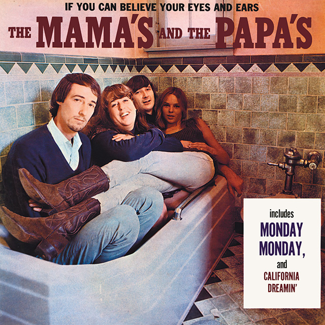
For 12+ years, rock photographer and art director Guy Webster was my neighbor in Venice Beach. Guy owned the building where our recording studios once lived, and his stories were endless. Guy photographed Jim Morrison, the Stones, the Byrds and the Beach Boys. One of my favorite stories to hear Guy tell was about The Mamas & the Papas' debut album, If You Can Believe Your Eyes and Ears. As Webster tells it; "We were all stoned! We couldn't leave the house and none of us could walk. So I put them in the bathroom next to the living room in their house in Laurel Canyon. We didn't know that you were NOT allowed to put a toilet on the cover, so when the record was pulled from stores for being indecent, we had to sticker it for the single 'California Dreamin',' which then went to No. 1 and we all became famous. I never stopped working after that album cover."
Beastie Boys
Paul's Boutique (1989)
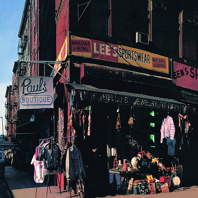
Paul's Boutique was released in July of '89, and if I close my eyes I can still smell that record. I love that the album was wall-to-wall samples from deep cuts and chock full of surprises from the first note. The musty essence was captured in the striking panoramic shot of NYC's Ludlow Street @ Rivington (design by Nathaniel Hornblower/Jeremy Shatan) and was also a fold-out vinyl. The shot matched the Dust Brothers-produced amalgamation of sounds and the Beasties' innovative follow-up to 1986's Licensed to Ill. Here's a cool clip and Spotify mix featuring all of the (known) samples used.
Tom Tom Club
(self-titled, 1981)

James Rizzi's album cover for the self-titled debut by Tom Tom Club makes the list in tandem with the LP's single "Genius of Love," whose animated music video (produced by Rocky Morton and Annabel Janke) really brings the characters to life. Artist/designer Rizzi came up with the idea of 3-D multiples out of necessity … he had final assignments due for his painting, printmaking and sculpting classes but only had time to finish one. To make his deadline, Rizzi crafted an etching, printed it twice, and then used wire to add depth. Receiving good grades from his teachers, he developed the concept further and stuck with the method.
Pink Floyd
Animals (1977)
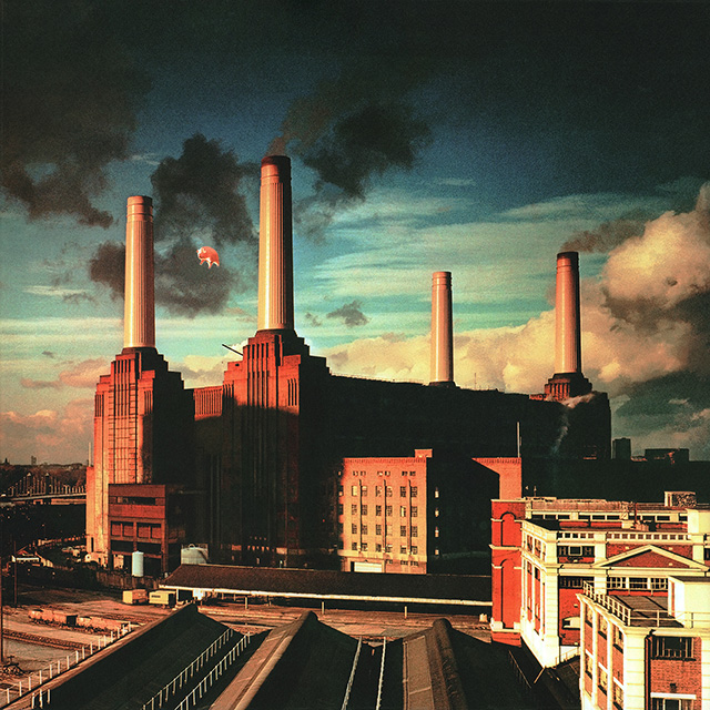
Not every band would fly a pig over Battersea Power Station, but few other bands would make an album that absolutely called for it. Design company Hipgnosis arranged for a photoshoot featuring a 40-foot inflatable pig floating above the plant, attached to the ground by a cable. Sharpshooters were positioned to take it down should the pig break free from its moorings, but the pig malfunctioned and never took flight. So the shoot was rescheduled for the next day, but they forgot to ask the sharpshooters to come back. This time around, the pig successfully took flight. And as Aubrey Powell, Hipgnosis designer, remembers, "Suddenly there was a communal gasp. The cable had snapped in a fierce gust of wind and the pig drifted up and away into the flight path to Heathrow Airport. It finally disappeared from view at 30,000 feet." Flights were canceled and RAF fighter pilots were dispatched to find the pig. It was later found in a field in Kent and retrieved amid heavy press coverage that created unplanned PR for the album.
Bob Marley
Survival (1979)

Survival, design by Neville Garrick, was the closest Bob Marley came to producing a concept album. When it was time to design Marley's most militant LP, Garrick didn't want to alienate the mainstream audience but still wanted to visually express the idea of Black survival, so he decided to include the flags of all of the African nations. Garrick flew to New York City, went to the United Nations and took note of the flags. The black-and-white graphic behind the album's title text looks like a simple texture, but upon closer inspection, there's a more subversive meaning there to represent Jamaica, Trinidad, Barbados and the Black diaspora in America, England and beyond. Garrick had found a blueprint of how enslaved people were placed on ships and he incorporated it into the LP design. He also included symbols of Black survival throughout world history inside the album sleeve. Sadly, Survival was the least promoted Bob Marley album due to its militant tone, but the record stands the test of time as a testament to the depth of Marley's convictions and the scope of his ambitions musically, politically and culturally.
The Beatles
Sgt. Pepper's Lonely Hearts Club Band (1967)
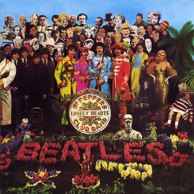
The cover of the Beatles' 1967 LP Sgt. Pepper's Lonely Hearts Club Band is, without a doubt, one of the most iconic images in the history of rock 'n' roll. The photo was originally going to show the Beatles (in their Sgt. Pepper's outfits) playing in a park. That slowly evolved into the final concept, where the Beatles stood amid cardboard cutouts of their heroes. The band originally planned on including Leo Gorcey, Gandhi, Jesus Christ and Adolf Hitler in the photo. Common sense kicked Hitler off (though they did create an image of him), the still-lingering bitterness of Lennon's "bigger than Jesus" comment kicked Jesus off, and Gandhi got the boot over concerns that India wouldn't print the album.
Joy Division
Unknown Pleasures (1979)

What can you say? Minimal. Simple. Spellbinding. Designer Peter Saville's decision to go with pulsar radio waves is right up there with Martin Hannett's spellbinding production and make this album an indie goth classic.
Jimi Hendrix
Are You Experienced (1967)

Ed Thrasher was a multitalented creative whose immense body of work helped to shape the image of rock and popular music through the free-loving 1960s and into the organized musical presentation and commercialism of the 1970s. Although an accomplished artist and photographer, Thrasher's greatest skill was that of a true art director, having the vision and insight to commission photographers, typographers and illustrators for album sleeves that would become as memorable as the works within.
Steel Pulse
Handsworth Revolution (1978)
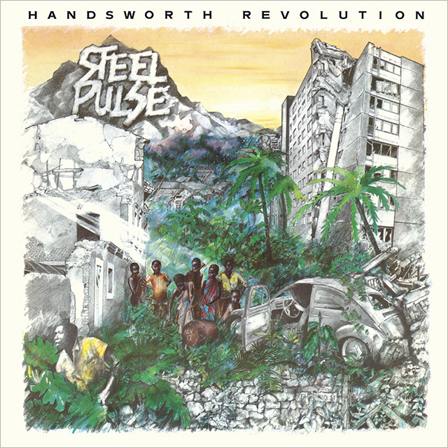
"I drew out the original cover for Handsworth Revolution myself and we took it down to Island Records in London," says Basil Gabbidon, founding member of Steel Pulse. "They passed it onto a very stylish agency that designed for Burning Spear, Augustus Pablo, Barrington Levy, as well as a lot of punk bands, and commissioned Andrew Aloof to do the final artwork. The cover of Handsworth Revolution shows that the natural world will outlast whatever it is we think of as modern."
Grateful Dead
American Beauty (1970)
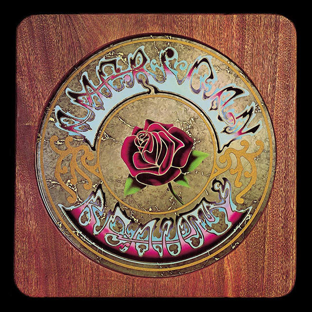
California-born artist Stanley "Mouse" Miller cut his teeth as a hot-rod painting sensation, modifying dragster cars before moving into designing the psychedelic posters which were a feature of the San Francisco landscape in the '60s. He is best known for being the creator of the famous "skull and roses" logo adopted by the Grateful Dead.
Todd Terje
It's Album Time (2014)

Cover art was designed by Bendik Kaltenborn, who also designs illustrations that appear in the Shouts & Murmurs column for The New Yorker magazine as well as the event listings in the beginning of the publication. Terje became acquainted with Kaltenborn about 10 years ago in a branch of the Dutch chain Free Record Shop, where they were both working, and quickly bonded over what Kaltenborn calls "crazy nonsense stupid humor."
Art of the Album is a regular feature looking at the craft of album-cover design. If you'd like to write for the series, or learn more about our Clio Music program, please get in touch.

Related Stories


Editor's Picks


Advertise With Us


