
Embarking on this assignment I quickly realized that the "most powerful" and "greatest" album covers are not necessarily the same thing. Some of the most powerful album covers aren't great from a design standpoint, but they make bold statements and have powerful messages. On the other hand, some of the greatest album covers are beautifully designed and memorable, but don't actually say or mean very much.
Growing up in South Africa in the '80s and '90s, I was exposed to a wide range of local and international music. Theater, choral and classical music played major roles in my upbringing. You'll notice some this reflected in my selections below.
The Roots
Things Fall Apart (1999)

At the start of this assignment, I decided to just close my eyes and try to picture the most powerful album covers I could think of. Things Fall Apart immediately came to mind. The Civil Rights era photo taken in Bedford-Stuyvesant is firmly etched in my memory. It's powerful, incredibly disturbing and, sadly, something we as a society are still struggling with today. No words could ever describe the look on that poor girl's face. The music itself is also extremely powerful, with some songs overtly addressing inequality and racism. "You Got Me" featuring Erykah Badu is one of my all-time favorite tracks.
Massive Attack
Mezzanine (1998)

There's a melancholy and paranoia to this album which can be felt in both the music and artwork. While both make one feel quite uncomfortable, they are beautiful at the same time. The cover is stark and simple, which I love. I'm also a sucker for a good metaphor—the stag beetle is used to symbolize a change (metamorphosis) in direction for the band. The artwork was a result of a collaboration between famed British photographer Nick Knight, art director Tom Hingston and band member 3D.
Rage Against the Machine
(Self-titled, 1992)

I was 16 years old when Rage Against the Machine was released in 1992. The music was raw, rebellious and filled with politically charged messaging. The band were strong supporters of anti-oppression activism and it came through loud and clear in both the album art and music. The cover features a famous photograph of a Vietnamese Buddhist monk burning himself to death in protest of the government's oppression of the Buddhist religion. The image drew international attention and led to the U.S withdrawing support of President Diệm's government. In reference to the photo, President John F. Kennedy said, "No news picture in history has generated so much emotion around the world as that one."
Miles Davis
TuTu (1986)
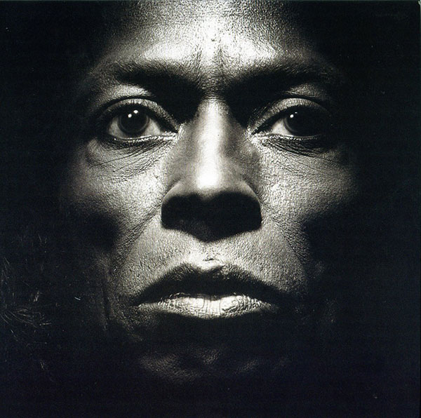


Tutu was named after the great Archbishop Desmond Tutu. I vividly remember seeing the album for the first time; it had no type, no logos, just a power image of Miles Davis staring deep into my soul. I was fascinated by his intensity, and the back cover and sleeve told even more of his journey. You could feel his passion, his torment and his commitment to his craft. The music was modern, bold and different, it was almost like Miles knew he was defying the rules and would be upsetting jazz purists. The cover was designed by Eiko Ishioka and the photos were taken by Irving Penn. If you're not familiar with Eiko's work, it's worth doing a little digging.
Blink 182
Enema of the State (1999)
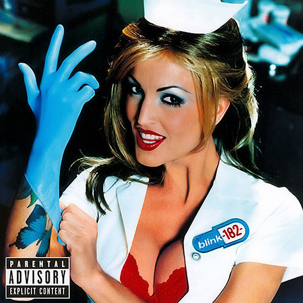
This album was released in 1999. I was 22 at the time and a big fan of the Socal punk/ska music scene. The Enema of the State cover had all the ingredients needed to win me over—a bad pun for a title, an adult actress in a nurse's uniform for a muse, and of course that bright blue surgical glove. I remember wondering what exactly Janine Lindemulder planned on doing with it. The cover was provocative, colorful and incredibly seductive. At the time, the idea of using an adult actress to promote anything seemed crazy but fit the band's anti-establishment angle perfectly. The "What's My Name Again" music video also included Janine Lindemulder dressed in the same nurse's uniform, connecting the cover art to the music.
Johnny Clegg and Savuka
Third World Child (1987)

This album cover is clearly not on my list for its aesthetics, but rather for what it symbolizes and its effect on a broken nation. Johnny Clegg and Savuka (Zulu for "we have risen") formed during apartheid, an ugly and divisive time in South Africa. Like the album cover shows, Savuka challenged apartheid and brought together a diverse group of people at a time when the government forbade it. Savuka fused South African tribal music with township jive and rock. They used both Zulu and English lyrics to connect with a diverse audience. They incorporated traditional dance, vibrant colors and African prints into everything they did. Their music was brave, powerful, educational and most importantly united people from different walks of life. And yes, I did rock a pair of those colorful pants, with high-tops.
Metallica
(Self-titled, 1991)

When this album, aka the "Black Album," was released in 1991, the cover was almost pitch black and represented Metallica's "fuck you" attitude perfectly. It was dark, heavy and sinister, just like their sound. The original copy had a very faint logo and illustrated snake embossed on it, but you had to look carefully to find it. Later copies have the logo and snake printed more visibly, which is a shame. There is power in simplicity, and it doesn't get much simpler than this.
Les Misérables
Original London Cast Recording (1985)


Hands down my favorite musical experience of all time. As a kid I dreamed of joining the cast to play Gavroshe. I just couldn't convince my family to move from Cape Town to the London's West End. The album cover features a portrait of a disheveled and waif looking Cosette. In the show this moment occurs when Cosette is sweeping the floors of the inn and singing "Castle on a Cloud." You can feel the hopelessness and desperation in her eyes. The original image was created by Émile Bayard in 1886. The typography is also instantly recognizable.
Travis Scott
Astroworld (2018)


I have long believed the music industry could be doing a better job developing and creating conceptual, integrated marketing efforts to support its artists. Astroworld is not just an album cover or record. It's an immersive experience that literally invites people into the world and mind of Travis Scott. Clearly inspired by the actual (now-defunct) theme park, the cover is masterfully brought to life by David LaChapelle, a perfect fit for this project. Having a "daytime" family-friendly cover and an explicit "nighttime" version made it that much stronger. The inflatable Travis Scott head is genius and became the connective tissue that tied the cover art to the music videos, outdoor stunts and live events. It's powerful because it's cohesive, consistent and well produced on every level.
Nirvana
Nevermind (1991)

As a Gen-Xer, I can think of no album more influential or powerful than this. It brought grunge and alternative rock to the mainstream and was as popular in South Africa as it was here in the U.S. It was raw, gritty and filled with youthful angst. The album artwork must be among the most iconic and recognizable ever made. It depicts the innocence of youth and how we are influenced and affected by money and greed. The societal expectation is for us to chase wealth and fame, something Kurt struggled with. The fact that kids still wear this on T-shirts today is testament to its power.
The Beatles
Sgt. Pepper's Lonely Hearts Club Band (1967)

Many will argue that Abbey Road is the Beatles' most famous album cover, and they're probably right. But in my opinion, Sgt. Pepper's is far more imaginative. It's a wonderful college of art styles, day-glo fashion, pop culture icons, typography and more. It was designed by renowned pop artists Peter Blake and Jann Haworth. The concept was inspired by a simple question: "If you played a concert in the park, who would you want in attendance?" The final image shows an eclectic crowd made up of 57 photos and 9 waxworks, including Marilyn Monroe, Oscar Wilde, Sonny Lister, Sigmund Freud and guru Mahavatar Babaji, to name a few. Supposedly John Lennon wanted Jesus Christ and Hitler included, but the record label rejected the idea. The artwork was clearly designed to spark discussion. One can only imagine the conversations and debates that would have taken place at this imaginary afterparty.
Art of the Album is a weekly feature every Thursday looking at the craft of album-cover design. If you'd like to write for the series, or learn more about our Clio Music program, please get in touch.

Related Stories


Editor's Picks


Advertise With Us


