
Rocket & Wink is an award-winning creative agency from Hamburg, Germany, whose work includes colorful and loud designs for various record labels. They prefer to work in between between art & commerce, which is perfect for record covers and music posters. Here are their picks for some of their favorite album art.
—Dr. Gerald Rocketson, aka "Dr. Rocket"
Motorpsycho
Timothy's Monster (1994)
Designer: Kim Hiorthøy

One of my absolute favorite '90s bands and highlights. I've seen them 20-30 times live. Best song, "The Golden Core"—pure goosebumps. I listened to this song one night on repeat and finished an application for an art degree. Also wrote one of my first stories about Motorpsycho for Intro music magazine, and photographed several times as well (before my time as a designer). The artwork of Kim Hiorthøy—he's done designs for Motorpsycho for a long time—is very much appreciated and admired. His work can also be seen in his book Tree Weekend (Gestalten Verlag). Key tracks: "The Golden Core," "Giftland."
Unkle
War Stories (2007)
Designer: 3D (Robert del Naja) from Massive Attack

It is suspected that Robert is related to Banksy, or is even the same person. Iconic artwork, reminiscent of modern "sacred" art. The band's best song, "On My Knees (feat. Michael Kiwanuka"," from the movie Roma, is not on this record, but this is the most striking cover by Unkle. Very good songs on the record and a good listen: "Chemistry," "Hold my Hand," and "Burn My Shadow" (featuring Ian Astbury).
Moderat
III (2016)
Design: Pfadfinderei
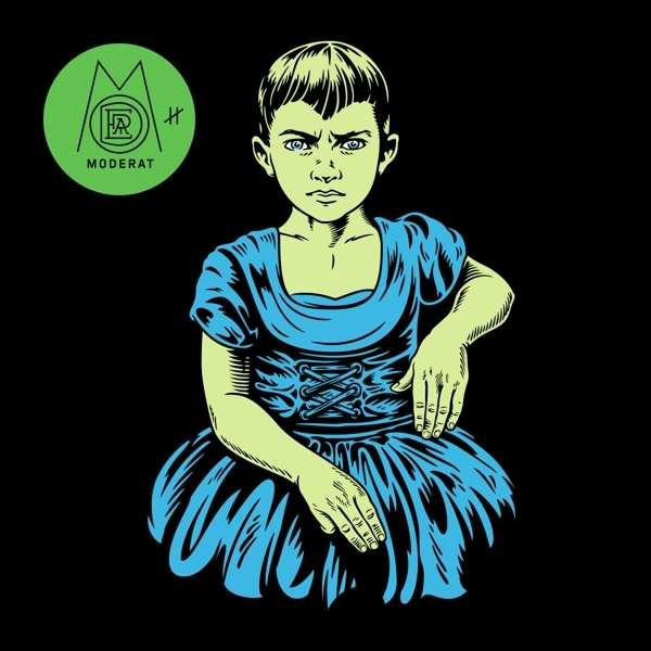
I like the posterity and high recognizability of Moderat's complete discography. Good illustration style with good image ideas and that consistently pulled through. Besides that, also a good logo design. An absolutely epic song and must listen: "Running."
Mogwai
Happy Songs for Happy People (2003)
Design: Uncontrollable Urge

One of my absolute favorite bands and highlights of the 2000s. Many good albums and covers. So I picked Happy Songs for Happy People from 2003, because it is so unpretentious. It is actually printed with silver, which of course digitally does not come into its own at all. Simple, green-red-silver, no title to see, only an F (whatever that stands for ... maybe failure). Simple captivates. Must play: "Hunted by a Freak."
Monster Magnet
Spine of God (1991)
Design: Rob Leecock

After Motorpsycho, my second favorite band of the '90s. Precursor of all "stoner rock" bands with very high psychedelic content. The first album radiates energy, power and psychedelica at the same time, hitting the music on the spot. Monster Magnet had their own psychedelic light show in the '90s—with an overhead projector and water basin, where a stagehand mixed paint, oils and water with a ballpoint pen, throwing psychedelic projections at the backdrop. Had seen them live in Holland in 1991, at a concert where they played only one song ("Tab" from their first EP of the same name) which was 45 minutes long. They left the stage without saying a single word during the whole show. They opened for Sister Double Happiness (nobody knows them anymore). Key track: "Nod Scene."
—Petronius Amund Wink, aka “Mr. Wink”
Radiohead
Kid A (2000)

I've been going back and forth between OK Computer and Kid A all this time. And now I have decided on Kid A. It was designed by Thom Yorke and Stanley Donwood. The latter has been one of my favorite designers since the OK Computer artwork. He has continued to evolve with each record. The artwork also reflects the evolution of Radiohead, who are moving more and more into the electronic realm with Kid A. The digital collages of the cover were also carried on digitally in the so-called "blibs." This whole mixture impressed me a lot in my design studies. Also, the first edition of the CD had a hidden booklet behind the CD tray. I discovered that after a year and was crazy about the typo games in it. That's why, for me personally, Kid A is the best artwork.
Bon Iver
i,i (2019)

On this cover, I love the colorfulness and the naive handling of shapes, photo and text. I would have liked to have made it. In addition, it renounces the artist name and album title. Which will be more and more common in digital applications, because this information is always next to it, and the cover must support it only as a visual image. Another thing I like about the cover is that at first glance it looks digital and playful, but at second glance it contains analog collage elements. So it perfectly reflects the evolution of Bon Iver.
Sigur Rós
( ) (2002)

OK, I love Iceland. And the artwork and music of Sigur Rós have also influenced me a lot. Maybe that's why I love Iceland. The mix of the handmade illustrations and the graphic vector staple is great. It's bold and yet dreamily tidy. The CD had a white slipcase, and the artwork was printed on transparent paper. Today, only the vinyl has the punch. And depending on how you put the sleeve in, the cover changes. Anyway, the artwork of the Sigur Rós records has strongly influenced the cover design in Iceland. Old slide optics, handmade lettering and a little motion blur, and you have a cover. But ( ) reduces it all to the essentials.
Rammstein
(untitled, 2019)

I shouldn't do this, but I'm very proud of one of our own works, and therefore include it here. It's the cover of Rammstein's seventh studio album. The whole artwork is reduced to the essential: a match. It can cause enormous destruction if the wrong thing is lit with it, but it can also bring light into the darkness. The cover is kept so simple, it doesn't even have an official title. It's like the Beatles' White Album, only with a match. How many matches we shot and illustrated is our secret, but there were quite a few.
Kraftwerk
Autobahn (1974)

This is a good example of a poster cover. A timeless classic. Not much to say about it. Every graphic designer would love to have this in their portfolio. But only Emil Schult is allowed to put it in. He designed the original; everything else is just a copy.
Art of the Album is a weekly feature every Thursday looking at the craft of album-cover design. If you'd like to write for the series, or learn more about our Clio Music program, please get in touch.

Related Stories


Editor's Picks


Advertise With Us


