
I recently stumbled across the cover of the first record I ever played on. I'd joined my brother's band after he sacked his drummer (nepotism, what?!) and a few weeks later found myself on stage at the Mean Fiddler in Harlesden. After a few twists and turns, we ended up making a record in my family's garage and somehow being played by Jo Whiley on Radio 1.
My brother had settled on calling the record Once Like a Spark but was struggling to find the right cover art.
A good mate of mine had just started managing an incredible unknown (at the time) artist called Jonathan Gent. I absolutely loved his work and managed to scrape some cash together to buy two of his paintings. To say thanks, Gent kindly gave me a drawing he'd done of Charles Bukowski holding a sign saying "I am become Deaf," a reference to Robert Oppenheimer's quoting of the Bhagavad Gita scripture, "Now I am become Death, the destroyer of worlds."
I happened to show it to my brother and his eyes nearly popped out of his head. He asked Gent if the drawing could feature on the album cover and the rest is history.
Glancing at that cover, no one would understand all the layers and beautiful, serendipitous moments that led to its existence. On the album covers I've picked below, I can't even imagine how many wild things must've unfolded for them to come together. There's probably a whole book in each and every one.
Radiohead
In Rainbows (2007)
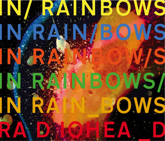
This is one of my all-time favorite records. Longtime Radiohead collaborator Stanley Donwood laced his album cover for the record with hidden gems. In Rainbows came out on 10/10/2007, 10 years after OK Computer, and there are 10 letters in the names of both albums. OK Computer's original working title was Zeroes and Ones, or 01—the mirror image of 10. Its release was also announced with 10 days' notice. Donwood described the final artwork, which was influenced by NASA space photography, as being "a rainbow, but it is very toxic, it's more like the sort you'd see in a puddle."
Linda McCartney and Paul McCartney
Ram (1971)
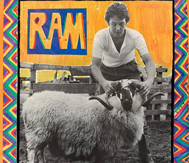
There were rumors at the time of the release of Ram that Paul McCartney had died. Bit OTT, I'm pretty sure he was just living on a farm in Sussex? The artwork for Ram bore the tiny letters "L.I.L.Y." The letters were directed at his wife Linda, standing for "Linda, I love you." How sweet is that? I'm a huge McCartney fan, but unlike Alan Partridge, I never really got into Wings. But—and it's a big but—Macca's live vocal on "Call Me Back Again" from Wings Across America is one of the greatest vocals ever captured on tape. I just listened to it again. WOW! Go give it a spin.
David Bowie
Blackstar (2016)
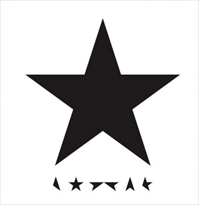
For such a simple-looking cover, Bowie's final album uses a plethora of subliminal imagery and messaging. The album uses fragmented stars to spell out Bowie's name at the bottom. The star glows blue when you hold it under ultraviolet light, and the inner gatefold sleeve shows up stars when you expose it to sunlight. Reflecting light off one side of the vinyl at a certain angle creates what looks like a star. When you reflect light off side one, you get a bird in flight. Side two, a spaceship. When a light is shone on the spinning vinyl version of the record, a ring moves around the record in various sizes. The run times on the album's back cover are rendered in a font called Terminal, which appears in a design suite called Lazarus—the name of a Blackstar track and the musical that Bowie composed before his death. Fans believe Bowie was telling us he was out of time through the "terminal" messaging. The designer, Jonathan Barnbrook, says of his final Bowie commission: "What it all means is up to you." I've taken all of this as a perfect parting gift from the one and only Starman.
Kate Bush
Aerial (2005)

The cover of Kate Bush's eighth studio album, and first double album, appears to feature a mountain range with its reflection in the sea. Does it heck! Look a little closer and you'll find it's actually a waveform of a blackbird's song on top of a photograph of a sunrise. The waveform is a reference to a short section of track nine in disc two which features a blackbird chirping … obviously! While we're on the subject of artwork, Bush asked none other than Rolf Harris to play his didgeridoo on disc two's "An Endless Sky of Honey." He also sang the backing vocals on "An Architect's Dream" and "The Painter's Link" … oh dear!
Santana
(Self-titled, 1969)
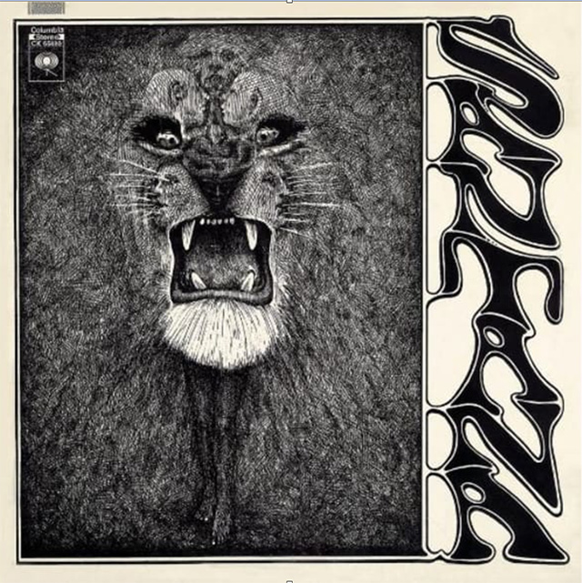
At first glance, Santana's debut record looks like it features a ferocious lion, right?! Wrong! It also features nine small faces that make up the lion's head, and the lion's chin can also be seen as a hula skirt, only to reveal a hula girl at the center album cover. According to the cover designer, Lee Conklin: "I detailed this one in pen-and-ink … the challenge has always been to subvert the poster form to whatever my muse insists on and then to convert my psychedelic experiences to any medium I'm working in. I made it my mission to translate my psychedelic experience into paper." Far out, baby (sorry!).
Harry Nilsson
Pussy Cats (1974)
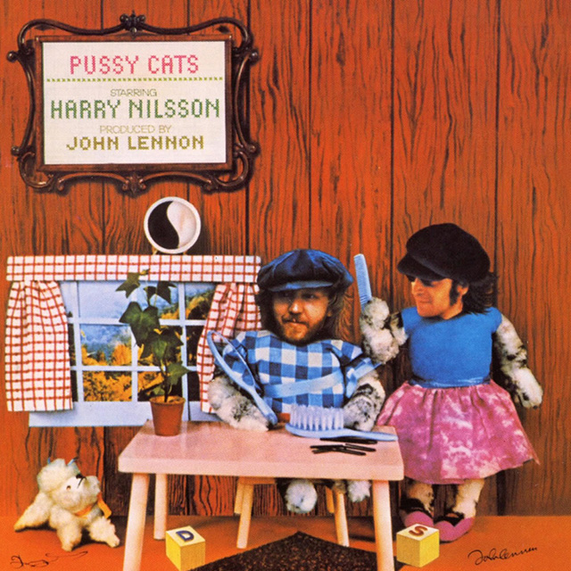
This is what happened when Harry Nilsson asked John Lennon to produce his record Pussy Cats in 1974. The album cover features a rug under a table with two block letters—D and S—flanking it. If you sound out the puzzle, it reads, "D-rug-S," or specifically, "Drugs under the table." This was an inside joke during Lennon's "Lost Weekend" era, a drunken and drug-fueled 18-month period between 1973 and 1975. Wonder whose idea it was to place the yin and yang symbol on the window ledge?
Beastie Boys
Licensed to Ill
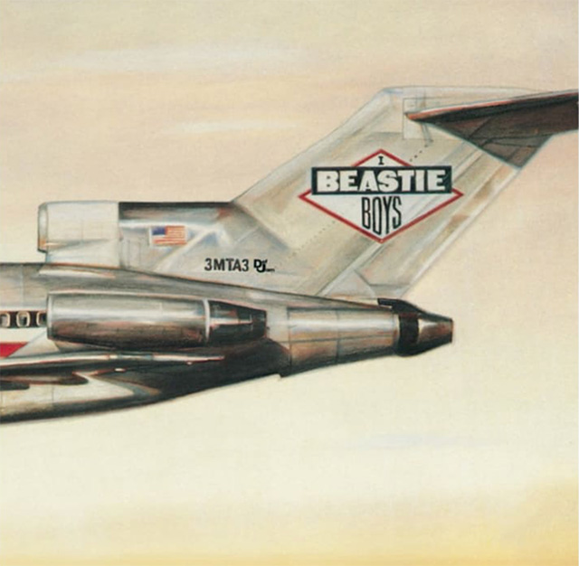
Not only have the Beastie Boys given us eight full-length studio albums to enjoy, their debut album, Licensed to Ill, featured a jet plane with the serial number "3MTA3" on its tail. If you look at the album cover in a mirror, the reverse image reads, "EATME," or "Eat Me." Thanks for everything, guys!
The Rolling Stones
Their Satanic Majesties Request (1967)
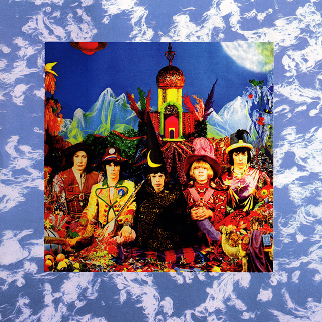
When the Stones released Their Satanic Majesties Request in 1967, it immediately drew comparisons to the Beatles' Sgt. Pepper's, which was released earlier in the same year. Jeez, can't think why? Could it have been the psychedelic aesthetic used on both record covers? Or maybe the fact that Their Satanic Majesties Request features images of all four Beatles hidden in the foreground? It's believed the cover was a response to Sgt. Pepper's featuring a Shirley Temple doll wearing a sweater that reads, "Welcome The Rolling Stones Good Guys." The best part, photographer Michael Cooper shot both covers. Don't mess with the Stones!
The Beatles
Revolver (1966)
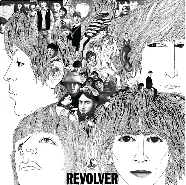
Another one from the Beatles. Klaus Voormann, the artist who designed the band's striking cover for their 1966 album Revolver, is an interesting cat. He was originally the bassist in Manfred Mann and played on songs including "You're So Vain" by Carly Simon and on Lou Reed's Transformer. He also produced the worldwide megahit "Da Da Da" for the band Trio. Voorman created the collage for Revolver from a series of photos of the band, some of which appeared on the back cover of their previous album, Rubber Soul. He won a Grammy Award for Best Recording Package for his wonderful design. But did you know that Voormann's lonesome head appears on the front cover, just underneath the drawing of Lennon's mouth? What a dude.
Led Zeppelin
In Through the Out Door (1979)
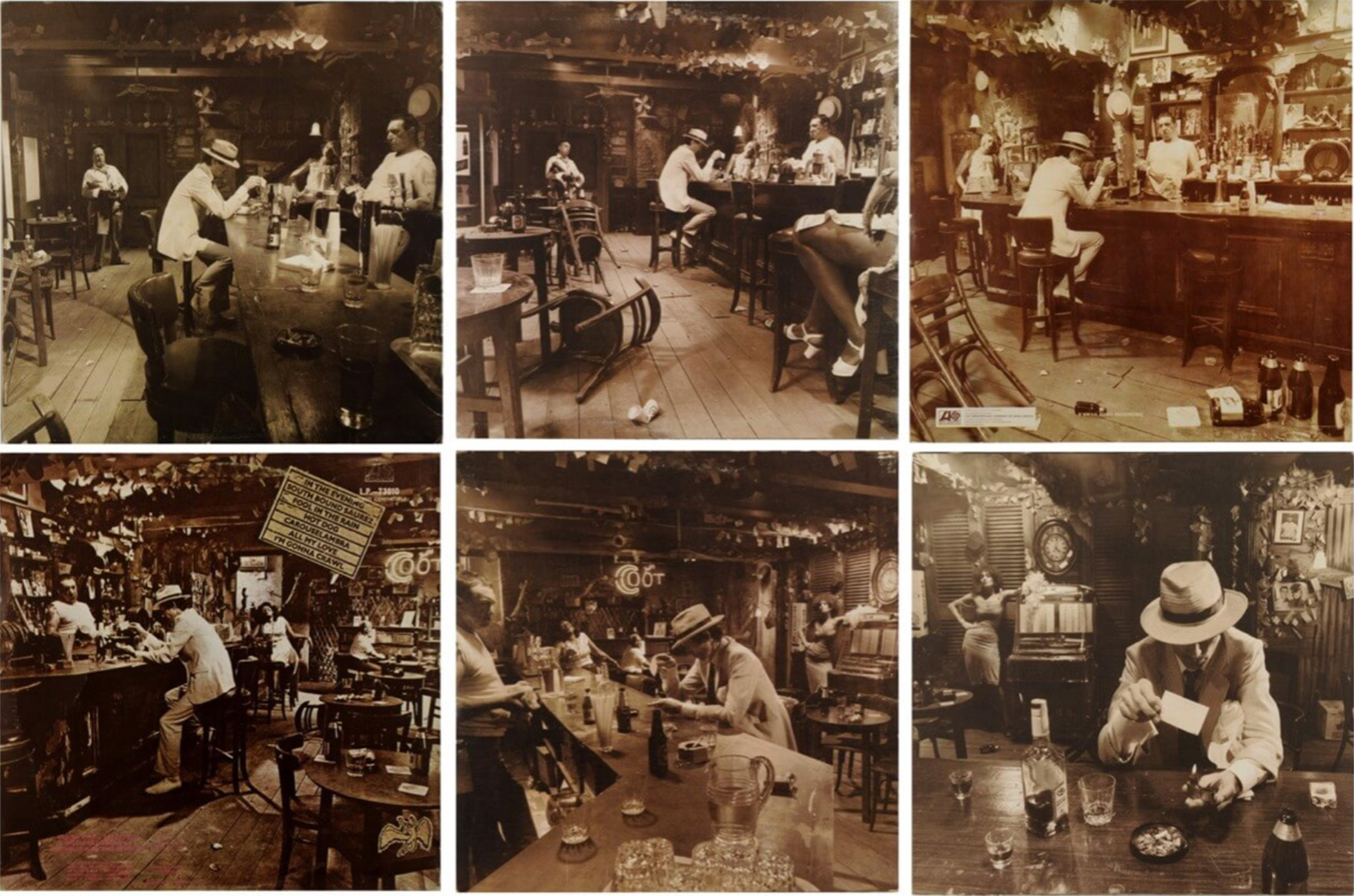
Last but most definitely not least, In Through the Out Door, Led Zepplin's final album before drummer John Bonham's death, was an elaborate affair, to say the least. English graphic designer Storm Elvin Thorgerson designed six different record sleeves for the release, each featuring a different angle of the same bar-room scene. Each album was wrapped in brown paper so you didn't know which one you'd picked, and when you poured water on the black-and-white inner sleeve, colors magically appeared. Rumour has it Thorgerson had seen the effect used on one of his kids' painting books.
Sources: Wikipedia, NME, Pitchfork, Radiox, Mentalfloss
Art of the Album is a regular feature looking at the craft of album-cover design. If you'd like to write for the series, or learn more about our Clio Music program, please get in touch.

Before founding Dirty Soup in 2011, Raife spent over a decade as a top-flight musician, recording records, movie soundtracks, playing at major music festivals around the world and major live TV shows.
Related Stories


Editor's Picks


Advertise With Us


