
Since the mid-'60s there have been many pivotal, brilliant and enticing album covers that really worked—i.e., they convincingly encompassed the music within and tempted enthused music lovers to purchase records. As designers and art directors, we had come to terms with an old dilemma: How to overcome the "art versus commerce" stigma. Commercial artist was an almost derogatory term, yet as such, we were happy to be commissioned to complement and illustrate the hot new releases—whether they be classical, jazz, blues, rock or country—and thus to promote and to sell those records. However, in the '60s, it was this very symbiosis which elevated many art directors, designers and photographers to near star status. Meanwhile, the enormous market for rock 'n' roll was subsidizing the jazz and classical fields, especially opera. The sheer volume of record sales provided decent budgets for what was becoming a legitimate new art form. A few thousand bucks invested toward album cover design was piddling compared to the projected avalanche of millions by return—particularly if the images we created were so powerful that they became iconic sales tools. With more flexible budgets, this new form of mass communication attracted some of the greatest graphic talent in London, New York, Chicago and Los Angeles. And so record cover design became a respected, competitive outlet of expression. As "art meets machine" became something to behold, the mighty Heidelbergs thundered, printing millions of identical jackets around the world.
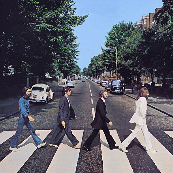
I found it quite daunting to whittle my list down to 10 of the most expressive examples of album cover art that we so fondly remember and that are still speaking to us. The critics who came before me in this column enjoyed specifying their most important and meaningful examples to date. We were bound to overlap in our choices. So to avoid repetition, I have passed over many iconic pieces upon which we all agree and that are forever lodged in our mind's eye—e.g., Sgt. Pepper, Abbey Road, Led Zeppelin (choose one), Out of the Blue, Sticky Fingers, Dark Side of the Moon, Cheap Thrills, Blind Faith, Tubular Bells, and I'm not forgetting any of the brilliant covers that came out of the Blue Note and Atlantic stables.
In the glory days of vinyl, we not only gently dropped the needle on the record but we ogled the cover, scrutinized the lyrics and intimately discovered the excesses of our favorite bands.
The list which follows is in no order—it's a parade of magnificent images that have become, to my mind, all-time classics. Often excellent works of art have appeared on albums that didn't make the charts and alas remain obscure. Sometimes remarkable recordings have lifted less inspired works to become much loved.
By the way, I have been asked by the editor to name the greatest cover of all time at the end of my list of the 10 most worthy. So, check the following choices first and then I'll get back to you. (In all probability you'll consider it a big cop-out.)
Sex Pistols
Never Mind The Bollocks, Here's the Sex Pistols
(Virgin Records, 1977)
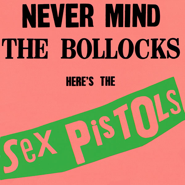
Another stunning, anarchistic and appalling exercise in anti-design that unequivocally says, fuck you, WE are the best punk band in world. The front cover was originally screened in a startling day-glo pink, yellow and green, with deliberately bad typography. (The later four-color CD re-releases in typical jewel cases obviously lost most of the shock value.) The front cover epitomized the burgeoning contemporary punk movement in Britain. It was loud, crude and effective. The garish clash of colors and the (apparent) lack of discipline effectively stood out in store windows. But in reality it was expertly honed. Honestly I cannot find fault with this cover. It is, in my opinion, the very best example of how the band successfully gave the finger to the rock establishment and at the same time sold millions of records.
The Clash
London Calling
(CBS/Epic Records, 1979)
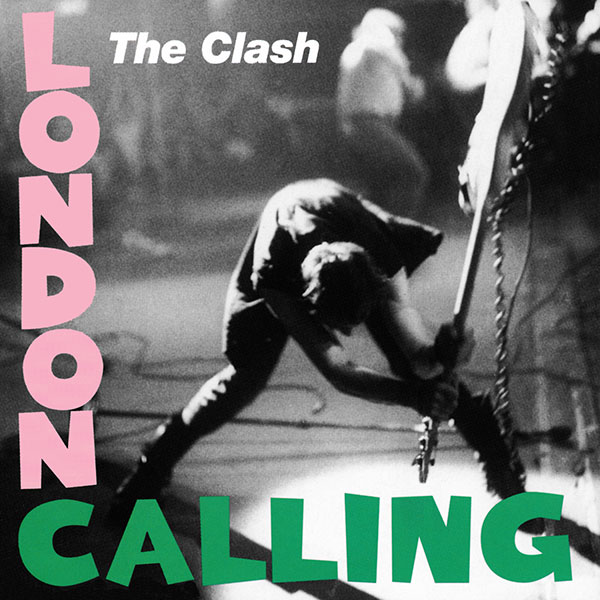
This front cover image is another brilliant, urgent slice of graphic anarchy, which at the same time parodies Elvis' debut album. Compare the two jackets here. London Calling features a dynamic black-and-white live stage shot of Paul Simonon, perfectly frozen by Pennie Smith. Remember, photographers couldn't automatically fire off rapid frames in the '70s. It was down to a nimble click, wind and click again in the dark—it's not that easy to capture the perfect shot while on stage. But Pennie Smith caught it. The jacket was tongue-in-cheekily designed by Rob Lowry. It announced, in no uncertain terms, the band's third studio album and succinctly captured the British new wave, punk concert scene during the late '70s.
David Bowie
Blackstar
(Iso/RCA/Sony, 2016)

Blackstar is a sophisticated black-on-black masterpiece by Jonathan Barnbrook (which most likely is difficult to reproduce effectively here). I must tell you that as a Grammy winner, I really would have relished presenting Mr. Barnbrook's well-deserved and prestigious Grammy to him on stage. His package is a tactile, dark salute with a daring use of matt and gloss varnishes that reveals typography that is visible only in a certain angle of light. This elaborate design solution portended the inevitability of Bowie's demise. Barnbrook has produced a heartrending and truly enigmatic epitaph to one of rock's greatest and most enigmatic artists.
King Crimson
In the Court of the Crimson King
(EG Records, 1969)
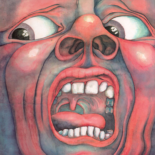
This was an instant classic cover and an eye-opener for me. The powerful, carefully composed and cropped painting, trying to burst out of the confinement of the square, was designed and rendered by Barry Godber. It could hardly be contained and had such an impact that, with all the attendant promotion, it needed no title on the front. Most likely it was adorned with a sticker for display in the store racks. To my mind, this manic image personified Robert Fripp's masterpiece, reviewed at the time as "British psychedelic prog rock, melancholy and surreal, medieval and dense"! My pal, the late John Wetton, bassist of Family, another great contemporary group, went on with Fripp to make King Crimson's ever durable Red.
Ry Cooder
Into the Purple Valley
(Warner/Reprise, 1972)
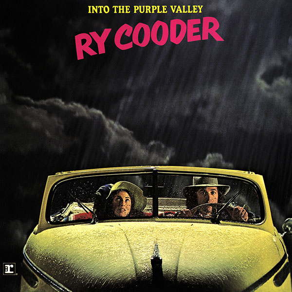
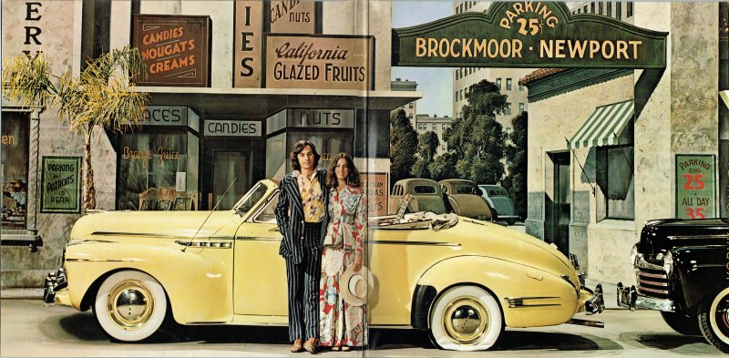
The story behind this cover is worth looking into, as Ry had a lot to say about how the outer and the inner gatefold shots were created. Apparently the photo session was spontaneously arranged on the backlot of Warner Brothers' studios in Burbank, California, with painted backdrops purloined from the prop department. The hastily borrowed rain-bird was also magically procured. The picture of Ry Cooder and, I believe, his wife looking pensive behind the rain-soaked windshield on the front appeared ominous. However, the sunnily lit gatefold revealed a happier couple with their borrowed, vintage cream Buick convertible in all its shining glory. "That car was so beautiful to look at, but ran like shit." The brilliant photography by Marty Evans, with design and art direction by Mike Salisbury, neatly covered the range of songs and overall joy of the record.
Small Faces
Ogdens' Nut Gone Flake
(Immediate, 1968)
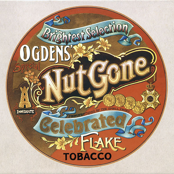
As designers we often delve into and joyfully raid major art movements for inspiration, such as art nouveau, streamline deco or many forms of modernism. Ogdens' cover pastiche is a prime example of overly elaborate, Victorian commercial design. Painfully and beautifully executed by P. Brown, with photography by Gered Mankowitz, the cover represents a well-known brand of loose tobacco from the 1890s. The circular tin theme is carried on throughout the package, first showing the loose tobacco nested under the lid and then the band and credits on several pages. In trade magazines, the Faces were branded as "contemporary pop/rock/psychedelia"—how fitting. And how fitting, if somewhat impractical, was the circular cover and circular inner sleeve. Yes, it was unstable on the shelf, held together with one staple, and yes, hardly dust proof. But nonetheless this remains a stunning work of art. And at least the corners did not get dog eared.
The Rolling Stones
Let It Bleed
(Decca, 1969)
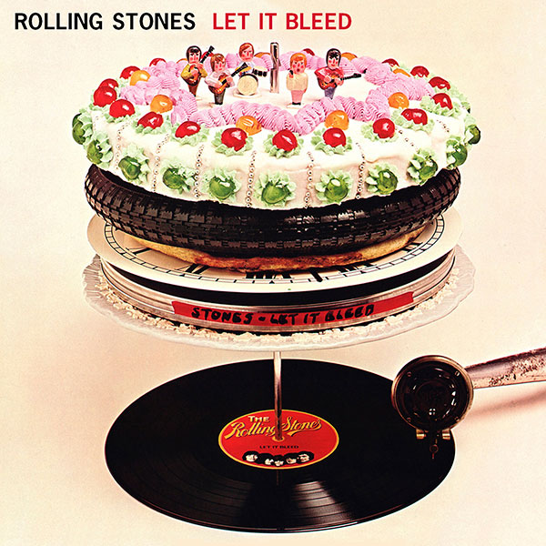
The Stones have been known for their provocative covers—e.g., Sticky Fingers, (the original) Beggars Banquet, etc.—but the sophistication of Robert Brownjohn's wonderfully surreal sculpture to my mind needs to be listed as among his best work and certainly one of the 10 most memorable covers. The assembled, teetering tower is constructed with a record album resting under an antique phonograph tone arm, which are both supported by a stack of circular items—a clock dial, pizza, an old tire and a cake with elaborate icing, topped by figurines representing the Stones. Apparently this was all inspired by the album's original title, Automatic Changer, which admittedly makes more sense.
Joe Jackson
Look Sharp!
(A&M Records, 1979)
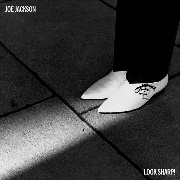
Look Sharp was a striking, perfectly composed, minimalist, black-and-white studio study by Brian Griffin. It simply showed a pair of pointy white boots, lit by a shaft of white light against a black background. The stark photograph made an unforgettable, impeccably framed and composed cover. It was clean and looked sharp, as befitted the title and the music—British contemporary, new wave.
Carly Simon
Playing Possum
(Elektra, 1975)

This jacket is mostly remembered for its controversial photograph of Carly Simon wearing just a black, diaphanous négligée, sheer panty hose and knee-high black boots. It was shot by Norman Seeff in his studio underneath the Chateau Marmont on the Sunset Strip. Carly was still married to James Taylor at the time. The obviously erotic image became the more sexually charged for having been shot and cropped Seeff-style in black and white and with just a subtle greenish tint. The tension in the photograph came as a surprise to most of her fans, as they generally expected to see a more demure Carly. In 1976, this cover nominated Seeff and art director Glen Christensen for the Best Recording Package Grammy.
Supertramp
Breakfast in America
(A&M Records, 1979)

Oh, dear. Design, illustration and art direction by two great friends and two absolute masters of their craft—the late Mike Doud and the very much alive Mick Haggerty. The front cover montage depicts the Statue of Liberty as a waitress, Lily (modeled by Kate Murtagh), holding a breakfast menu against an incredible, highly recognizable Manhattan skyscraper/breakfast table setting composed of cups and saucers, salt and pepper shakers, a plate of pancakes representing Battery Park, with knives and forks placed as if the city wharfs—all seen from an airplane window. This is a stunning work of art, an exquisitely executed marriage of photography and airbrushed art by Mick. This cover deservedly received the Best Recording Package Grammy in 1980.
Footnote
Choosing the most important album package of all time was tough, and in my opinion, it was down to these three:
Sgt. Pepper for opening the floodgates and liberating young, brash, independent designers, illustrators, photographers and art directors everywhere from many of the major record labels' draconian marketing edicts.

Abbey Road for the simple reason that the cover became unintentionally yet almost instantaneously iconic, and it still appears to be the most parodied.
Blackstar, for obvious reasons. Look at it, close your eyes and feel it. David Bowie is speaking to you.

(I mentioned earlier that this part was probably going to be a cop-out.)

Related Stories


Editor's Picks


Advertise With Us


