
Editor's note: Luke Stratton, author of the piece below, helped design a remarkable album-art package himself that's coming out this month—a gatefold vinyl packaging of rock band Dopapod's new self-titled album, which cleverly folds out into a tabletop roll-and-move board game. Check out more about the project at the Dopapod site.
I wanted to showcase a variety of styles that interest me. I had a lot of fun thinking about these choices. Half of these immediately came to me, and the other half I had to spend a bit more time thinking about. I hate to say it, but I feel like album art is not as important as it once was. I think there's a number of reasons for this. I don't buy music as much as I used to, and I do a lot of listening on Spotify.
When I was a drum and bass DJ, twice a week I'd drive or take the bus to two different record stores in town, and would go through new records and listen to everything. The art I saw on vinyl records made a big difference in my experience. Album art seems to have lost a lot of its power as music has transitioned into the digital; it can get lost in the process. There's a visceral feeling you get when you buy a new record.
I think an important footnote is that I started being what I would consider an artist during the pandemic. I've always been graphically inclined, but I'd never been making art as consistently as I have been in the last few years. For me, music and artwork are inherently married. I can't listen to Nirvana's Nevermind without thinking how that record sounds watery. There's a lot of chorus on that record, but there are a lot of songs that feel watery because of the underwater kid on the cover. You can't separate how the art influences the music, and vice versa.
Alestorm
No Grave But the Sea (2017)
Design: Dan Goldsworthy

I am obsessed with pirates. I just finished a pirate RPG that I wrote and illustrated on Kickstarter. And it had like 5,000 backers, it was crazy. This album art is definitely in that vein. I really liked the undead, underwater pirate vibe. You'll see that a couple times on this list. Alestorm is pirate metal. It sounds like shanties sung over metal like that. So it's a perfect cover for the sound.
Pink Floyd
Pulse (1995)
Design: Storm Thorgerson

You could take any work from Storm and put it on this list. I didn't want him to take over the whole list, so I had to pick one. He's done most or all of Floyd's covers and bunch of art for other groups like Muse's Absolution and Black Holes and Revelations, the Mars Volta's De-loused in the Comatorium and Frances the Mute, his list is seriously unbelievable. And this is one of my favorites. It's the strongest of all the big Floyd record covers. Pulse is not Floyd's best record, because they have so many great studio records, but it's a live record that covers some of their best music. His style has a Salvador Dalí influence; a lot of his work is very photographic, but very psychedelic in subject.
Phish
Rift (1993)
Design: David Welker

You can't see it in the cover, but there's a full spread that opens up. Welker actually did the album art for Dopapod's Never Odd Or Even. He is the renowned poster artist in the Phish community. Rift is a concept album about being in a dream. And the album art is a guy lying in bed. Every song is hidden in the art somewhere. We did a very similar thing with the new Dopapod record; when you open it up, there's songs from the entire catalog represented in the art.
Gallows
In the Belly of a Shark (2007)
Design: Dan Mumford


Dan Mumford is one of my favorite artists on the planet. He does a ton of concert posters, limited-edition screenprint concert posters, throwback movie posters across science fiction, action and fantasy. I first became aware of him when he did these prints for the new Star Wars movies. This is one of my favorite pieces. It's a little bit earlier in his style, but he's really good at picking four or five colors and running with those in a whole piece. That's exactly what we did with the self-titled Dopapod record. I've watched him work on Twitch, and this probably didn't take him as long as we think it took. This also appeals to the pirate in me as well.
Burial
(self-titled, 2006)
Design: Burial
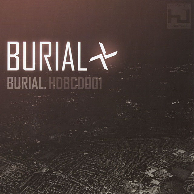
I really like the typography and graphic design. But the thing that really blew my mind is that I knew from reading an interview that Burial was from South London. This was one of the first really big dubstep albums, and it represented what dubstep was, not what it became. I knew he was from South London, and I knew the scene was really formed around South London. So one night I was up late in college, and I thought to myself that the cover looks like a satellite image of South London. I loaded up Google Earth and spent about five hours moving around South London and I found this shot. I put it up on a dubstep forum and people were either telling me, "You deserve an award" or "You are crazy." I will always remember that when I look at the cover. This record is incredible. I didn't get it during the first listen, but the second listen changed what I wanted out of music.
Grateful Dead
Steal Your Face (1976)
Design: Owsley Stanley

The Lightning Skull is one of the top 10 best logos ever created. The Dead's sound guy, Owsley Stanley, created it. I think including this album art was appropriate for me because I was Dopapod's sound guy for 11 years, and I designed their logo. The Grateful Dead are the quintessential American band in a lot of ways. They really encapsulate not only the sound of the country with rock, blues and bluegrass influences, but also the mentality of being in America and doing your own thing. The red, white and blue are all represented here. It's perfect in many ways.
Xoth
Interdimensional Invocations (2019)
Design: Mark Richards

My favorite thing about metal bands is the theme they dive into. I am really into HP Lovecraft, and into the dark horror style. I also love detailed line art—and this cover has all of these aspects. It's got a great color palette, it's got these cultists doing some ritual that's pulling this tentacle monster from the ether. I wish there were more genres that could emulate this style of art. It's almost like a comic book poster. This style comes from Iron Maiden, Megadeth, Metallica, and '80s album covers, but this is a whole other level. Richards is working digitally here, and he can get a level of fidelity you could never get with a more traditional medium.
Daft Punk
Random Access Memories (2013)
Design: Cédric Hervet & Warren Fu

I think this really lends to clean, clean design. Every other Daft Punk record uses their written logo, and this is the only one that doesn't. The cover fits the music. For the marketing campaign for the record, it seemed like they put vaseline on every lens, blooms on every camera shot. It's not robots from the '90s, it's sexy robots coming from the '70s. And this album cover is perfect for that. It was one of the best and most cohesive album campaigns I've ever seen. And Random Access Memories being their final studio record, and really their final goodbye, it adds significance to the cover. I respect those guys for wearing those helmets for all those years.
Michael Jackson
Dangerous (1991)
Design: Mark Ryden

I think posthumously people don't think it's the best record he made because of how great Thriller and Bad are. But when this album came out, I was in the second grade, I was obsessed with Michael Jackson and that "Moonwalker" video. He did the Super Bowl, and I was sitting two inches from the TV the whole time. This album art feels so unique; it's not just an artsy photo of an owl in an alley. They hired a guy who probably spent weeks, if not months, oil painting this cover. He wasn't moving into prog-rock with an album cover like this, but he went pretty high concept after Thriller. He had this whole persona across his projects, and movies, and work, and he just took pop to a new level. It's a perfect marriage of the different parts of his artistry.
Dieselboy
System Upgrade (2000)
Design: Justin Fines (Demo Design)

My first career was as a drum and bass DJ in '99 into the early 2000s. Dieselboy was the king of the American drum and bass scene at the time. This album cover is designed by Justin Fines, but he was working as Demo Design at the time. It's in a total Detroit, Midwest rave flier style, where they're using computer graphics to make these animations intentionally, it looks like vector art. It was almost as if the early 2000s felt more futuristic than where we are now, in a lot of ways. Of course we were coming into the early days of the internet. Drum and bass influenced everything. This cover reminds me of Akira or Ghost in the Shell. There's actually a sample from Ghosts in the beginning of this record. This vibe doesn't seem to exist now. It doesn't feel like we're about to break into the new millennium.
Art of the Album is a regular feature looking at the craft of album-cover design. If you'd like to write for the series, or learn more about our Clio Music program, please get in touch.

Related Stories


Editor's Picks


Advertise With Us


