
There are many reasons why I'm thankful to have been a teenager in the 1990s, but one of the most important, as it relates to this feature anyway, is that I grew up in the era of physical music.
In the days before you could just log onto Apple Music or Spotify and have access to virtually any piece of recorded music, you had to own an album (or borrow it) if you wanted to listen to it. And that made it precious. Music, as an art form, had a value that I worry has been diminished through the currency of convenience. Physical albums also gave musicians an opportunity to express themselves and expand their artistic vision. And they gave listeners even more to obsess over—which I happily did.
The following is an abridged list of the album covers that meant the most to me growing up in Canada. Narrowing it to 10 was no easy feat. Fortunately, earlier Art of the Album contributors beat me to Paul's Boutique, Low End Theory and Velvet Underground & Nico. So as you read this, if you could mentally add those to my list as well, that would be great.
R.E.M.
Chronic Town (1982)

R.E.M. was the first band I truly obsessed over. I was 14 when I discovered Out of Time, and almost immediately I went back and sought out every album, single and live bootleg they ever recorded. By the time I made my way to their first EP, Chronic Town, I was well and truly hooked. I feel the creepy duotone gargoyle gracing this cover is the perfect representation for Peter Buck's jangly Rickenbacker arpeggios and Michael Stipe's wonderfully indecipherable lyrics.
Talking Heads
More Songs About Buildings and Food (1978)
There are some positives to being a child of divorce: two Christmases, exploiting parental guilt, and in my case, inheriting some incredible new-wave records that my new stepsiblings had forgotten at my stepdad's house. I probably listened to Talking Heads '77 and Speaking in Tongues more, but this was the album cover that I always left out "accidentally" when I wanted to impress any friends that were coming over. Having formed the band while they were students at RISD, it isn't surprising they paid as much attention to aesthetics and theatrics as they did the music.
Billy Bragg
Talking with the Taxman About Poetry (1986)

I was never more idealistic (or indignant) than when I was 16. So, finding Billy Bragg then was like pouring gasoline on a self-righteous bonfire. His first four records all received a lot of play in my Walkman as I trudged through the unsympathetic world. But this album cover, with its capitalistic caricature and in-jokes like "The difficult third album," make it the most memorable for me. To this day, when I hear politicians blathering on about tax cuts or fiscal responsibility, I see this maniacal image in my head.
The Beatles
Revolver (1966)
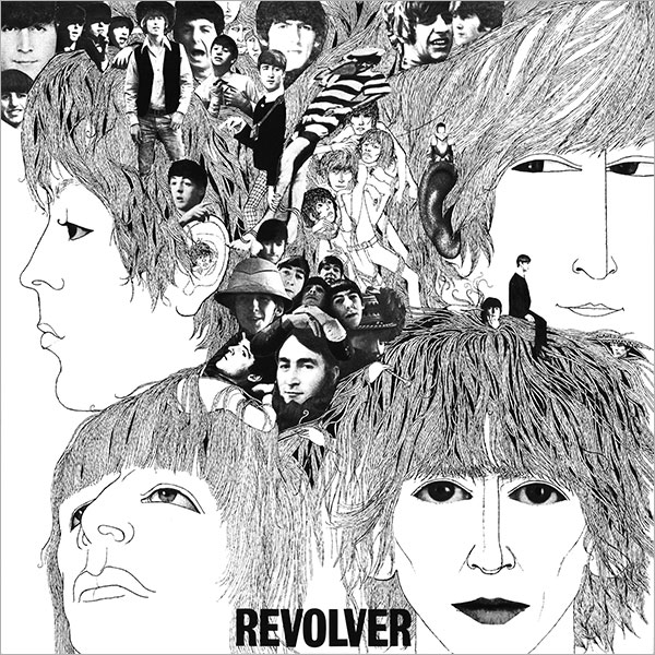
I know Sgt. Pepper's gets the lion's share of Beatles lore, but for me, it doesn't touch Revolver. I love how this record has sharper edges and a bit more experimentation. The cover, designed by their longtime friend Klaus Voormann, is a psychedelic collage made up of dozens of different photos of the band. Set within four stylized illustrations of the band members, it is a perfect introduction to what you are about to experience with the music itself. I especially love the side-eye that John is giving Paul. If Pepper was Paul's record, this one is John's.
Arcade Fire
Funeral (2004)
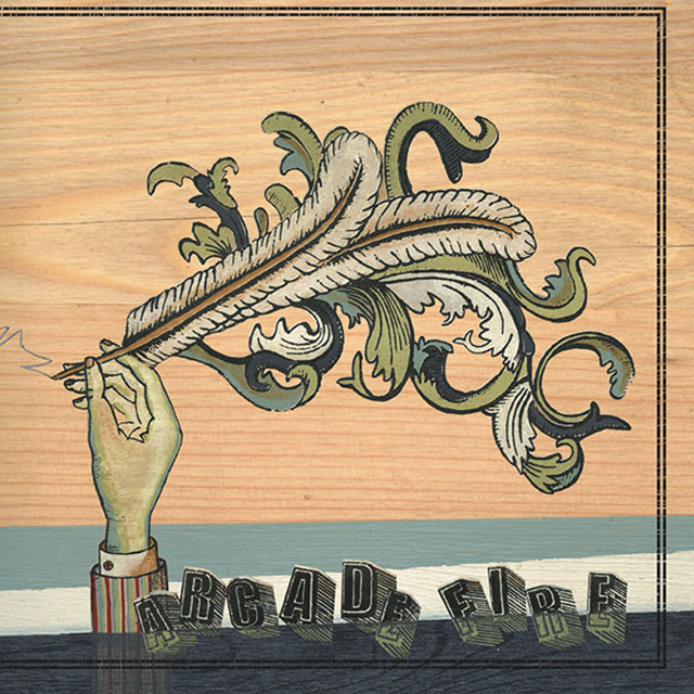
Arcade Fire and their incredible breakthrough album, Funeral, arrived just in time. By the mid-2000s, I had become fairly disillusioned with new music. But then along came Win Butler and Régine Chassagne with this brilliant, low-budget epic. The cover art, designed by Montreal-based artist Tracy Maurice, perfectly captures the handcrafted beauty of this one-of-a-kind Canadian gem.
Violent Femmes
(self-titled, 1983)
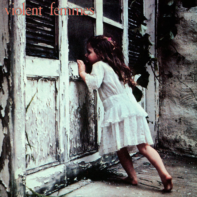
I heard the Violent Femmes before I ever saw any of their records. "Blister in the Sun" and "Gone Daddy Gone" were both staples at my high school dances. When I finally went to buy the record, I had to double check with the clerk that I was getting the right band. To this day, I find the audacity of a band choosing such a bizarrely incongruent image for their debut so inspiring. Just imagine how much pressure their record company would have put on them to choose a more traditional shot, especially in 1983.
Sloan
One Chord to Another (1996)

This album is probably the one on my list that I have listened to the most. Growing up in Toronto in the '90s, no band meant more to me than Sloan. With four singers each writing their own songs, they were my own patriotic version of the Beatles. On this, their third full-length album, they upped the vintage guitar sounds and created a simple '60s-inspired cover to match. I can directly trace my love of clean Scandinavian design and modern ultra-thin fonts directly to Chris Murphy and the handful of tasteful Sloan covers he helped create.
The Flaming Lips
The Soft Bulletin (1999)
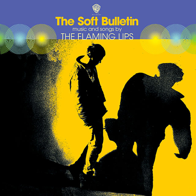
The Flaming Lips are all about the details. Layers and layers of details. It's fitting, then, that the cover art for this psychedelic masterpiece is an altered photograph of beat-legend Neal Cassady playing with his shadow while experimenting with LSD in the '60s. Overflowing with drum loops, samples, symphonic strings and horns, The Soft Bulletin is a beautiful ride punctuated with millions of tiny details. And as Wayne Coyne sings early in the album, "A spoonful weighs a ton."
Feist
The Reminder (2007)

For me, one of the most compelling aspects of Canadian songwriter Leslie Feist's music is its timelessness. While utilizing sounds, styles and instrumentation from past eras, she manages to create albums that still feel incredibly contemporary. This cover, designed by Simone Rubi, possesses that same magic: a spare black-and-white photo that demands that you look closer, the beautiful custom font, and the splash of colored lines all combine to create something that could be from 1930 or 2030.
Neutral Milk Hotel
In the Aeroplane Over the Sea (1998)
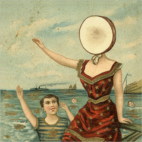
One of the things I love about great album art is how it can continue the conversation taking place with the music. I would argue that Neutral Milk Hotel's In the Aeroplane Over the Sea is one of the best examples of this artistic synergy. This wonderful enigma of an album is filled with vintage instruments and abstract lyrics ranging from world wars to folklore to teenage love and even Anne Frank. Which makes the illustration by Chris Bilheimer so perfectly fitting. Meant to evoke the early 20th century penny-arcade paintings that fascinated the band's leader, Jeff Magnum, this album cover is as idiosyncratic and mysterious as the songs within it.

Related Stories


Editor's Picks


Advertise With Us


