
The worst thing to ever happen to me was discovering music.
That's a total lie, but it got your attention.
Alright, fine, I'll be honest now.
I am a fully digital being—I work in digital design; I make digital art. Hell, I'm writing this on a laptop. I've also been streaming music since the dawn of time (or at least the days of Napster), so when I was asked to write this piece, the first thing I did was pull up my favorite playlists, click on the little "expand" button on Spotify, and squint at the album art squished into a 200x200-pixel square.
Despite not being much of a collector of vinyl, CDs or cassettes—or perhaps because of it—I seem to have developed a rather diverse taste for relatively obscure music. I hope it makes for an interesting romp through some albums and artists you've never seen or heard of before.
So here we are. Enjoy reading this as much as I did writing it. Try not to get too distracted by the tangents; they sometimes take on a life of their own.
Oneohtrix Point Never
Love in the Time of Lexapro (2018)

Oneohtrix Point Never's albums could have taken up all 10 slots of this list, for the diversity of styles he's commissioned over the years, the whole lot of them united by sheer design excellence.
In lieu of that, I'm highlighting this EP cover so I can also celebrate one of my all-time favorite designers, David Rudnick. Rudnick's designs seem to have the capacity to both reflect the whole of human history and to predict the future. Its utopias hidden within dystopias, a world where all mythos and art forms collide. A world where hyper-intelligent Lisa Frank dolphins fall in love amidst warm, glistening baths far away from the dreary realm of humans. A world that we humans peek at from the porthole of our minds, lulled into narcotic delusion as we lie plugged into our nutrient tubes, dreaming the ages away…
The Mars Volta
Frances the Mute (2005)

The sumptuous textures and vivid colors in this photograph of "inhabitants in a world of velvet delusion" by Storm Thorgerson have a René Magritte-like effect (see Magritte's "The Lovers" for a similar set of head sacks) that sits like a gargoyle at the edge of my mind. The gargoyle delights in a vicious critique of a placid and obedient suburbia, where residents see nothing, say nothing, and know nothing. This gargoyle shrieked in delight the moment it saw this depiction of suited sheep riding around utterly blinded in their pre-autonomous-vehicle-era Fords.
Me? I just like the shiny chrome.
The Body
I Shall Die Here (2014)

There is an oldness about this album—the off-black quality of the dark backdrop, the slight grain mimicking the imperfections of print, and the subtle creases along its edges. It is simultaneously aged and timeless; it looks as though it may have always existed. I picture the album sitting numbly in an oft thumbed-through crate of vinyl at the back of a nameless record store in a nowhere town. Its timeless void-echoes waiting patiently to be discovered by yet another human vessel within whom it may continue its endless reverberations.
Do have a listen if you enjoy being hollowed out by sound.
death's dynamic shroud
SEAWRLD HEARTBREAK (2014)

This album cover tells you everything you need to know about an extremely specific niche microgenre of electronic music and everything it's informed and influenced by: late 2000s-era graphics, MS paint illustrations, and—for some inexplicable reason—aquatic themes and Greco-Roman statues (the latter not pictured here). It's called vaporwave, and if you didn't already know about it, you probably never need to learn (though I guess it's too late for that now).
You may be intrigued by this cover, not understanding how this artist can get away with putting Katy Perry's likeness on an album that's not a Katy Perry album without facing a lawsuit. I don't know the answer to that. There's a lot of remixed elevator music and bisexual lightning, but not a lot of answers in vaporwave-land.
Duran Duran
Rio (1982)

This is the '80s. Yes, the entire decade, right here.
The vivacious crispness of the smile on this fantasy human is a perfect 10. The abstract lines of color running diagonally across remind me of the multicolored-print upholstery and wallpaper in the outdated McDonald's of my youth. Even the typography, with its mismatched capital D and overly heavy outside stroke, evokes an era before the nascent cusp of Adobe Photoshop.
The illustrator, Patrick Nagel, reportedly borrowed from Art Deco and Japanese woodblock prints to develop his signature two-dimensional, high-contrast style, which has become synonymous with the aesthetic of the '80s and has since been replicated in countless renditions of darkwave, synthwave (cousin to vaporwave, see Exhibit 4 above), and sci-fi contexts.
Earth Girl Helen Brown
Earth (2021)
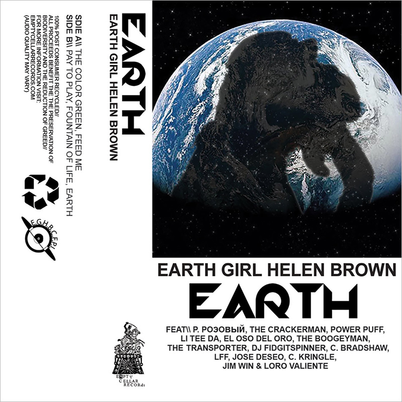
Earth Girl Helen Brown (abbreviated as E.G.H.B.C.P.F.I., though I haven't been able to figure out what the C, P, F or I stand for; as a side note, I consider it a failure as an acronym, as it is an even bigger mouthful than that which it abbreviates) is a supergroup of sorts, hence the long list of featured artists that run across the lower quarter of the cover. If it evokes the design of a cassette tape sleeve to you, that's because it is. It was only released on tape, and the artists just maintained the flat-lay of the design for digital. It's kind of a stroke of genius—one that makes all their releases uniquely recognizable and of a set.
Odd choice for a self-described digital native to select, but we always want what we can't have, don't we?
Andy Stott
Faith in Strangers (2014)

One of the most understated covers in this showcase, it still manages to tell a complete and evocative story of trust, betrayal and appropriation through a single still frame.
Faith in Strangers comprises primarily ambient electronic tracks, with fragmented, chopped-up, and screwed vocals that don't convey meaning so much as raw emotion. It's easy to take the whole album in without getting any kind of a deeper read. However, the album's name and cover are avenues into meaning. Even though Stott himself never talks directly about what inspired the album in interviews, the combined effect of its cover and title is akin to reading the name of an art piece (of dubious origin, perhaps?) off a placard at the museum and suddenly seeing it in a new light.
Sega Bodega
self*care (2018)

This cover should make you uncomfortable. Without it, you'd miss the prurience in Sega Bodega's work—the simple title of "self*care" sounds innocent enough on its own, and is totally insufficient.
You wouldn't think it based on this cover, but Sega Bodega is surprisingly shy in person and on stage—he said about an interview he recorded with Dazed magazine that it was the hardest thing he'd ever done, and you get the sense that he's only partly joking. But in a way, you could say this depiction is the ultimate form of introversion—autoerotic fascination.
Omega Sapien
Ah! Ego (2020)

Honestly, I had the hardest time picking which of Omega Sapien's album cover art to include in this. He's a self-described "underground K-pop, extra-alternative" musician with a knack for the surreal, both in his music and his choice of artwork.
Much of it has been done by Shintaro Kago, a longtime favorite artist of mine whose bizarre illustrations blend the mind-bending infinitudes of M.C. Escher with themes from Japanese or Korean horror films, all done in the style of manga. If you are interested in seeing more of Kago's work, he also did Flying Lotus's You're Dead! You could also choose to commission a portrait of yourself or a friend, as I did last year when he drew my good friend's two cats exploding from her head.
Pharmakon
Bestial Burden (2014)

This album cover, shot by the artist's sister, was so disturbing to me when I first discovered it that at one point I put this album on my list of taboo listens that I would only share with the weirdest of my friends. I was no vegan, yet it still made me queasy. Its existence spikes the nihilism of the alternately piercing and droning tracks that make up Pharmakon's oeuvre.
The fact that I am no longer all that disturbed by this cover says, I think, more than enough.
Art of the Album is a regular feature looking at the craft of album-cover design. If you'd like to write for the series, or learn more about our Clio Music program, please get in touch.

Related Stories


Editor's Picks


Advertise With Us


