It can be easy to take movie posters for granted. Often indistinguishable from other great works of printed art, it can be hard to remember they are ultimately pieces of advertising, designed to capture and sell to an audience. Perhaps no other form of advertising is more adored than key art; it sparks our imaginations as cinema-goers, adorns our walls, and distills the legacy of some of the greatest films into a single image.
Recognizing this, in 1971 the Hollywood Reporter launched the Key Art Awards, an award show with the singular mission of recognizing the best key art of the year. Today, the same show is now the Clio Entertainment Awards, and its reach has expanded considerably beyond key art. Still, the mission is the same—to honor and celebrate the incredible entertainment marketing industry.
To help celebrate the 50th anniversary of the program, Clio Entertainment and Muse asked five luminaries in the industry—all of whom have won numerous Clio Entertainment statues—to craft a list of 50 movie posters that changed entertainment marketing. For months, the committee worked to curate a list spanning cinematic history, eventually selecting 50 pieces that they felt helped move the craft forward and inspired them in their own legendary careers.
The group emphasizes that this is by no means a comprehensive list; there are hundreds of other posters that could have made this list. But we are grateful for their selections and their thoughts, and we hope this list inspires more great work from the industry in future.
Below, meet the list's curators. Or you can jump straight to the list itself.
The Committee
Meet the curators of the list and learn how they approached this project:

Molly Albright
Head of Creative Marketing, Movies
Amazon Studios
About Molly: I started my career at a boutique creative agency (Michel/Russo) and got my chops working on both print and A/V campaigns for indie films. It's where I truly fell in love with our business as well as the incredible pool of creative talent who streamed in and out of the office as freelancers. I was a sponge, took in everything there was to learn and I pinched myself daily to be so lucky. In 2000, I moved over to the "client" side and led the creative at places like IFC Films, Newmarket and Picturehouse, as well as having my own business consulting for various distributors while my children were younger. I joined Amazon Studios' movies marketing org in 2015 and I've been there ever since, building a team of creative directors and leading the creative for 360 global campaigns for all movies on the slate. I have had the pleasure of working with some of the most inspirational creative folks in town, both on the filmmaking and the vendor side, and still continue to pinch myself daily.
Thoughts on the list: I am in awe of the incredible vision, craftsmanship and sheer brilliance of the creative geniuses behind the work in these pieces. I am inspired by how exciting and indelible the inspirational work in film marketing can be, almost museum-worthy but created for a business purpose, which taps into a cultural conversation and connects people with their emotions. Distilling a two-hour story into a static artistic image is no small feat, and when it becomes iconic, when it stands the test of time, then the film and the poster become one. I salute this incredible body of work, which is by no means an exhaustive list, and encourage everyone working in our industry today to never stop trying and never stop believing.
Some posters from Molly's career: Y Tu Mama Tambien, Pan's Labyrinth, Borat Subsequent Movie Film.

Dawn Baillie
Co-Founder and Creative Director
BLT Communications
About Dawn: When I was a kid, I loved and collected the covers of TV Guide. I loved to analyze every colored pencil stroke made by the likes of Richard Amsel. I looked at the direction of the strokes, how he blended his colors, how he broke his compositions into designs that ended in twirled strands of hair. With laser-beam focus, I set out to be part of this movie poster world. However, I had no idea how to get there. It is with absolute luck that Tony Seiniger let me in the building.
Thoughts on the list: This was a fun opportunity to think back on all the posters I pored over as a young designer/artist. I find an iconic conceptual poster to be such a gift to the world. It's fascinating to think of the moments of epiphany when such great ideas come to mind, and how joyful I feel when those miracles happen for me. I tried to focus on iconic posters, and particularly on illustrated posters, in the hope of keeping the tradition alive for the new crop of designers. It is impossible to choose a favorite or to rank our collaborated list, as on any given day, my mind is delighted by yet another poster. I am so grateful to have had a career where I've been able to contribute to the culture. Thank you for including me in this project.
Some posters from Dawn's career: Dirty Dancing, The Silence of the Lambs, The Royal Tenenbaums, Zoolander.

Kenny Gravillis
Co-Founder and Chief Creative Officer
Gravillis Inc.
About Kenny: I loved two things growing up, music and movies, and I had no idea there was a career path that could have me involved in any of them. I started at Def Jam records in 1989, a bright-eyed bushy-tailed 21-year-old from East London, not having a clue what rap music was, but rubbing shoulders with the likes of Public Enemy and LL Cool J. That propelled me to MCA Records, which had me working with the likes of the Roots, Mary J. Blige and Common. After 10 years of working at a record label, I decided to try to broaden the horizons and got to work with more amazing artists independently. Then around 2004, when the music industry was struggling, I decided to pivot toward my other love, the movies. It was not an easy transition, but I do feel my love of movies always kept me excited, even when the opportunities weren't coming. Fifteen years later, I'm fortunate to say I get to work on such a wide range of amazing films. I'm still in awe of it all, and seeing a billboard on the streets of L.A. or New York that we worked on never gets old.
Thoughts on the list: I think the first thing I can acknowledge is how incredibly fortunate I feel to be in a career that looks to me for my creative expression to represent the art of filmmaking, which has had a global impact on culture for as long as anyone probably reading this can remember. I try to remind myself of that often with the usually rewarding but quite challenging process of coming up with a poster that survives the gauntlet of approvals, politics, opinions and whims that come with making, and seeing through to the end, any poster for any film, big budget or small. When something does make it through that makes you feel, makes you remember or has any long-lasting impression, it becomes very special indeed. To me, that's what this list represents. There are so many great pieces not on this list, but for me, in a respectful way, this list represents posters that took risks and resonated with a generation. I'm honored to be involved!
Some posters from Kenny's career: I Am Not Your Negro, Logan, Alvin and the Chipmunks: The Squeakquel.

Massey Rafani
EVP Creative Advertising
Warner Bros.
About Massey: I grew up a first-generation American, and a doctor's son with a passion for art; and received little understanding of that from those around me. Against all odds, I ultimately went to art school to pursue a career route that would make me happiest. I studied illustration, design, photography and film—and by some lucky choices I ended up in Los Angeles and landed one of my very first jobs as an assistant art director at Warner Bros. in-house agency. I couldn't believe I'd landed in a job that blended my greatest creative passions. Movie posters and trailers hold a profound place in my memories, and I always hoped to somehow create works and campaigns that stood the test of time. I've been blessed to spend 30 years devoted to a field of advertising and design that affects so many people's life memories the way it's indelibly affected mine.
Thoughts on the list: I've had a passionate love affair with the poster since my earliest years of art education, and the fact I've been able to actually build a career while being able to create movie posters and advertising is insanely and wonderfully surreal. Having to categorize or rank posters isn't really my thing, though, because I don't really have "a favorite" of anything; I simply have things I really love, and that gets me excited when I imagine the process that got it out to the world as a finished poster. The design challenges, the timing, the politics, and the subjectivity of it all are a constant gauntlet for great posters to run; and the ones on this list are only the tip of the iceberg of inspiring work that somehow got finished through a process that tries to dilute the bold and the daring. In the end, never mind the "How many?" and "Which ones?" and "What's best?"—I'll just smile whenever I see the bold and the daring thriving out there.
Some posters from Massey's career: Batman Forever, Ocean's Eleven, Troy, Inception, The Dark Knight Trilogy, Suicide Squad.

Adam Waldman
Founding Partner and Creative Director
The Refinery
About Adam: I love movie posters. Their blend of art and commerce, beauty and function, and commercial constraints and artistic freedom all add up to the perfect art form. My path has been shepherded by some of the best, and I'm grateful for all the support I've received every step of the way. It was BLT that gave me my education in great design, Concept Arts that gave me my confidence and my voice as an art director, Trailer Park that showed me how to build a team, and The Refinery that lets me share what I've learned with the best team I could ever have hoped for. I'm lucky to have found this incredible community of some of the best talents doing the most fun job in the world.
Thoughts on the list: This was a very challenging, triggering assignment for me: I truly, deeply love the art of key art; and I believe our work improves as a community, year after year. Many of the works on this list were The First; one could legitimately argue there have been "better" versions of them designed since. But the work that's being done today stands on the shoulders of these beautiful and impactful pieces.
Some posters from Adam's career: The Matrix, 42, Inferno (teaser).
50 Movie Posters That Changed Entertainment Marketing
Below is the list, in alphabetical order. Click on any title to see the poster, or scroll down to see them all.
• A Clockwork Orange
• After Hours
• Airplane!
• Alien
• All About Eve
• Altered States
• American Beauty
• Anatomy of a Murder
• Apocalypse Now
• Batman
• Chinatown
• The Color Purple
• The Dark Knight Rises
• Downhill Racer
• The Exorcist
• Fargo
• Fear and Loathing in Las Vegas
• Full Metal Jacket
• Ghostbusters
• The Godfather
• The Graduate
• Jaws
• Jungle Fever
• The Last Temptation of Christ
• Little Miss Sunshine
• Lord of War
• Love in the Afternoon
• M*A*S*H
• Malcolm X
• The Matrix Reloaded
• Mean Streets
• Metropolis
• Midnight Cowboy
• Moonlight
• Naked Lunch
• National Lampoon's Vacation
• Poltergeist
• Pulp Fiction
• Raging Bull
• Rocketeer
• The Rocky Horror Picture Show
• Rosemary's Baby
• Scarface
• The Silence of the Lambs
• Star Wars
• Straw Dogs
• Taxi Driver
• Teachers
• Vertigo
• Walk the Line
A Clockwork Orange
Warner Bros., 1971
Bill Gold
Philip Castle

After you note the clean, spare, contemporary and eye-catching design on this Bill Gold/Philip Castle print icon, probably one of the most noteworthy things to process while looking at this poster is the rating on the lower right. Kubrick's disquieting portrayal of violence in the future was so jarring at the time it was given a rating that in some ways doomed it and immortalized it at once. Even the copy is stripped down to a bare and provocative call for attention, and maybe a warning. The fascinating juxtapositions in this poster are the stuff of classics. —Massey Rafani
After Hours
Warner Bros., 1985
Peter Bemis
Illustrator Marvin Mattelson

As an illustration/fine art major in art school, this hit all the aspirational notes for me. A fine art painting by Marvin Mattelson; a clear, humorous and surreal concept that illustrated the premise of the film; cobalt blue (!); a logo I tried to emulate on Road House; and a clean design. SOOOO good. —Dawn Baillie
Airplane!
Paramount Pictures, 1980
Spiros Agency
Illustrator: Robert Grossman

The movie poster can have incredible impact on our individual psyches. Airplane is one of those that has enormous meaning for me personally: It's the first poster I remember seeing that made me laugh, and the first I remembered as a signifier for the film itself. Moreover, it's been the fountainhead for an entire genre of key art in the years that followed: the comedy spoof mash-up design. From Naked Gun to Scary Movie, the spoof poster trope took its lead from Airplane. Still referenced often, it's one of my personal favorites. —Adam Waldman
Alien
Twentieth Century Fox, 1979
Frankfurt Gips Balkind
Designer: Philip Gips

So much of what makes a poster a game changer is its daring to do what's different in its day. This positioning of a sci-fi horror feature that would change cinema broke as many rules as Ridley Scott did directing it. From the high-concept, iconic "hatching egg" imagery, to the text design and placement, and finally the copy that is quoted to this day, this poster—and the film it was designed for—helped invent a whole new sub-genre. —Massey Rafani
All About Eve
Twentieth Century Fox, 1950
Designer: Erik Nitsche

Storytelling! This is a movie trailer in poster form. Beautiful, whimsical design that makes your eyes dance across the page. I love the colors, the treatment, the graphics, the style. The legendary Erik Nitsche designed this. —Dawn Baillie
Altered States
Warner Bros., 1980
Frankfurt Gips Balkind
Designer: Philip Gips

This poster always spoke to me on its sheer guts to flout design convention in movie posters at that time. The film went on to become a cult favorite, bringing "sensory deprivation tanks" and "Peyote" to moviegoers' lips, while using up-and-coming star William Hurt upside down, metallic monochrome ink, and expert hints of color. It seems a pretty effortlessly arresting design, but the truth is that some very bold decisions had to be made for a poster to be this great. —Massey Rafani
American Beauty
DreamWorks Pictures, 1999
Pulse Advertising

Less is more. This tasteful yet seductive key art with a naked midriff, a rose, and an intriguing, two-word copy line is simply unforgettable. Like the scene it depicts in the film, this memorable art taps into something more. It tells you there's more to this story, and it lies in what we don't see in this art. An incredible hook. —Molly Albright
Anatomy of a Murder
Columbia Pictures, 1959
Saul Bass

Ah, Saul Bass. It's hard to pull out the most influential result of his work in key art (and film titling). But one need look no further than Anatomy of a Murder. It's simple, bold, minimal in the extreme, but tells you what to expect of the film without giving anything away. Genius. Oft-imitated, rarely equaled. And certainly, one of the greats of the medium. (See also: Vertigo, The Man With the Golden Arm, Love in the Afternoon, The Shining, Exodus and many more.) —Adam Waldman
Apocalypse Now
United Artists, 1979
Illustrators: Bob Peak
Tom Jung

Bob Peak is another of those powerhouse artists who moved the needle on the artform, alongside John Alvin and Drew Struzan. Apocalypse Now is likely the most impactful of Peak's works: The fearless use of negative space balanced against portraiture blended with scope is one of the finer examples of a technique that is still ubiquitous today (Marvel Universe, anyone?). —Adam Waldman
Batman
Warner Bros., 1989
The Idea Place
B.D. Fox
Fred (Federico) Tio

This is the only one of the Batman films from 1989 through today that I did not work on, and I remember even now how amazed I was when I arrived at Warner Bros. in 1990 and saw this poster and the wild success it was a part of. This was the original icon that spurred a much darker kind of blockbuster superhero film. The crop says it all for me. A thousand designers would not have cropped into this emblem this way, but the right designers did; and it promised something very big indeed. A classic logo treated classically. —Massey Rafani
Chinatown
Paramount Pictures, 1974
Diener-Hauser
Illustrator: Jim Pearsall

The illustration of this artwork, coupled with the gorgeous typography, is immediately compelling. The story this art tells, with the ring of the man's smoke forming the hair of the woman, results in a timeless, beautiful and iconic piece. I can't think of the film without thinking of this key art. —Molly Albright
The Color Purple
Warner Bros., 1985
Intralink Film Graphic Design
Illustrator: John Alvin

This poster epitomized my sense of what a poster should be, at a time in movie advertising when it was extremely uncommon to do something this simple, bold and memorable. Some of the industry's greatest had a hand in this poster. It's impossible for me to guess how the poster would be received today, but I know great storytelling always compels, and this poster beautifully lands that promise of a powerful story. —Massey Rafani
The Dark Knight Rises
Warner Bros., 2012
DC Entertainment
Ignition

Beautifully simple in its design, challengingly complex in its execution, the key art of The Dark Knight Rises still gets referenced as a brilliant example of epic scale mixed with double-read meaning. Based on a concept and sketches from Christopher Nolan and his production team, the concept is so iconographic that a companion AV piece (a graphic announcement teaser trailer) executed a motion version of the graphic at its ending to cohesively kick off the theatrical campaign. —Adam Waldman
Downhill Racer
Paramount Pictures, 1969
Stephen Frankfurt
Designer: Philip Gips

The art of "less is more" is still a very hard sell today, so anytime I see a poster pull it off with such grace and style, I'm always in awe. Even how the woman's nose connects to the man's face feels like abstract mountains to me. Intended or not, it just seems to fit perfectly. I must have tried to get away with this type of approach a million times, and will continue to do so. :) —Kenny Gravillis
The Exorcist
Warner Bros., 1973
Designer: Bill Gold

When I see a poster showing a scene like this, the big question I like to ask is: What is it promising? And how iconic can that promise be? This Exorcist poster walks that line beautifully. All you know is, here's a man who's about to go into something very dark, and you wouldn't want to be him. Also, the use of purple feels so unexpected. It's spooky as all hell without really showing anything horrific. It's just a feeling and a vibe, which inspired many a marketing exec to ask: How can we show horror without showing blood? —Kenny Gravillis
Fargo
Gramercy Pictures, 1996
Armageddon Design & Advertising

I love the whimsical nature of this art. And the juxtaposition of the lighthearted artwork with the dark narrative of the film. It's bold, iconic, and as the copy says, "homespun." A rarity. —Adam Waldman
Fear and Loathing in Las Vegas
Universal Pictures, 1998
Concept Arts
Art Director: Lucinda Michaelson
Designer: Evan Wright

As an Illustration/design student in art school, I was obsessed with surrealism (along with a dozen other movements), so this Dalí-esque design really spoke to me the instant I saw it. The fact it was for a Terry Gilliam film, from a story by Hunter S. Thompson, made it all the more perfectly fitting—and gonzo! It's kind of impossible not to look at. —Massey Rafani
Full Metal Jacket
Warner Bros., 1987
Phillip Castle

Masterfully airbrushed by Phillip Castle (also the illustrator of A Clockwork Orange) from an original concept from Kubrick himself. It was conceived in the spirit of Saul Bass's dedication to simplicity. It's clean, lushly illustrated, bold and evocative … all the elements of this design are purposeful and powerful. —Adam Waldman
Ghostbusters
Columbia Pictures, 1984
Illustrator: Michael C. Gross

OK, I mean, who doesn't wish they designed this? It's truly a perfect symbol for the film. If you asked someone what this is, they probably would know even if they hadn't seen the film. That's the power of a strong mark. Of course, it helped that the film was a success, but this mark and the tagline—"Who you gonna call?"—made this part of pop culture. —Kenny Gravillis
The Godfather
Paramount Pictures, 1972
Designer: S. Neil Fujita (title treatment)

File this under "If it's not broken, don't fix it." The puppeteering logo of The Godfather was also the cover of the novel by Mario Puzo. While this was (I think) the British poster, any of the artwork with Marlon Brando's image as the Godfather himself, especially in the foreboding red, tells us all we need to know. And that title treatment says it all. —Molly Albright
The Graduate
Embassy Pictures, 1967
Diener-Hauser

Talk about storytelling. I love it when key art is inspired by a moment in a movie—one moment so iconic, so compelling, that can convey so much about a film in one simple image. We don't even need to hear "Mrs. Robinson, you're trying to seduce me" to know what Dustin Hoffman's character Benjamin Braddock is thinking. The image says it all. Couple it with "He's a little worried about his future" and the title The Graduate and I'm hooked. —Molly Albright
Jaws
Universal Pictures, 1975
Seiniger Advertising
Illustrator: Roger Kastel

One of the most enduring and influential images ever to market a film, this illustration is both a beautiful, iconic piece of art, and a terrifying image in and of itself. Interestingly, there's debate as to whether this piece should be included on this list: This was the artwork for the novel by Peter Benchley, stunningly illustrated by Roger Kastel. The decision to repurpose it for the film was bold, and purposeful. To this day, it ranks at the top of many lists of the best posters of all time. —Adam Waldman
Jungle Fever
Universal Pictures, 1991
11:24 Design Advertising
Designer: Tom Martin

When Tom Martin showed this to me, I was amazed. At that time in history when this came out, advertising a film with just hands made such an impression on me! Such a gorgeous piece. As Tom was one of my most important mentors, I really took notice. The typography feels a little dated now, but the concept and the photo are timeless. —Dawn Baillie
The Last Temptation of Christ
Universal Pictures, 1988
Diener-Hauser
Illustrator: Joseph Caroff

This Joseph Caroff poster is a beauty. A designed concept of thorns that goes on for days perfectly illustrates the Last Temptation. Caroff's work is often attributed to Saul Bass, as in the case of the poster for West Side Story, but he deserves his place in movie poster history. This piece is astoundingly beautiful in its smart design. It's a classic. —Dawn Baillie
Little Miss Sunshine
Fox Searchlight, 2006
BLT Communications
Creative director: Dawn Baillie
Art director/designer: Doug Tomich

There are so many reasons this key art is inspirational, but the way in which it captures a moment from the film in a singular image—the use of negative space and the color yellow—is certainly among them. The work was bold and memorable and perfectly captured this ensemble cast as a quirky and unforgettable family full of rich characters, humor, love and dysfunction. It's all right there in the art … and this film's marketing campaign owned yellow in a way that will never be forgotten. —Molly Albright
Lord of War
Lionsgate, 2005
Art Machine

Inspired by macaroni art reinvented as bullet art, Lionsgate's Tim Palen and the team at Art Machine delivered a spectacular example of meaning layered into art, literally and iconically. One of those posters that made me envious at the time, and still holds up. —Adam Waldman
Love in the Afternoon
Allied Artists Productions, 1957
Saul Bass

This Saul Bass beauty is conceptually wonderful. The simplicity of the graphics are perfect. I love the use of primary colors on the hand lettering. I love that the shade is a blackout shade, further reinforcing it's the AFTERNOON. I love the playful pinks behind the shade. And the lettering is just delicious. The negative space is perfect. This is a perfect poster. —Dawn Baillie
M*A*S*H
Twentieth Century Fox, 1970
Diener-Hauser
Designer: Arsen Roje

The glorious, humorous simplicity of this storytelling is just delightful. The clean negative space. The irreverent attitude. The surreal "mashed up" figure. The sexiness without any sex. This poster does not get the attention it deserves. It has been copied in other posters, but to have originated this … wow! And keep in mind, this is PRE-PHOTOSHOP. —Dawn Baillie
Malcolm X
Columbia Pictures, 1992
11:24 Design Advertising
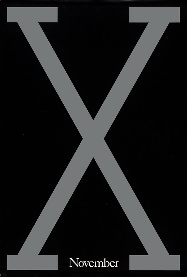
Power—that's what this says to me. The power of X. Very brave to be that bold and that direct with such a historic Black character. Denzel Washington was already an established Oscar winner when this came out, so to pass on a more typical portrait approach of him showed the brass of the film. The power was the power of X. Try to think of another letter that could get away with that. Not sure there is one. Who needs a title when you have an icon like this? Game-changing. —Kenny Gravillis
The Matrix Reloaded
Warner Bros., 2003
Concept Arts
Creative Direction and Technical R&D: Ron Michaelson
Art Director Brad Hochberg

What I love about this is how it played into the hype of a sequel in such an iconic way. The original was a mass hit and also a cult hit, I might add. There was so much anticipation for the next film, and that code was just so perfect. It also was printed on a specialty metallic foil, which added another layer of dimension to an already mind-boggling execution. Nothing else is needed. My "less is more" mantra to the max. —Kenny Gravillis
Mean Streets
Warner Bros., 1973
Tony Seiniger

I just love this art. This incredible graphic and iconic composition brings the dangerous underworld of Little Italy to life. The gun as a graphic element in the skyline, having just been fired, with the hand stemming from the negative space with the title, tells us all we need to know. So much has been inspired by this design, and its complex yet clever and simple illustration is memorable and has stood the test of time. —Molly Albright
Metropolis
Universal Pictures, 1927
Heinz Schulz-Neudamm

This groundbreaking Fritz Lang silent film had numerous posters, but this three-sheet image by German graphic artist Heinz Schulz-Neudamm is regarded as the most striking and avant garde of them. It is among the most expensive and sought-after posters today, but what makes it truly valuable is the design. Futurism, sci-fi and modernism all seem to have been meant to be in the same frame. It's both stunning and quietly discordant, in a truly brilliant way. Among the best ever in the poster lexicon. —Massey Rafani
Midnight Cowboy
United Artists, 1969
Diener Hauser Greenthal
Steve Schapiro, Photographer

I just love a great photo that says it all. Another simple approach that speaks volumes. The energy between Hoffman and Voight is so perfect. Two hustlers trying to make it happen but on the other side of luck. So great and iconic. —Kenny Gravillis
Moonlight
A24, 2016
InSync Plus
Creative Directors: Kishan Muthucumaru, Jeff Wadley
Designer: Steve Reeves

Once again, simplicity wins. Moonlight was such a groundbreaking film, and as the copy line indicates, spanned crucial points in the life of the character, played by three different actors. This coming-of-age film about identity was told with visual beauty, and the key art is no less defining. It gorgeously captures the intensity in facial expression and eyes, which is nearly impossible to get so right as a composite in one static image. This was executed using unit photography, rather than a special shoot, which makes it even more impressive. —Molly Albright
Naked Lunch
Twentieth Century Fox, 1991
Rod Dyer

I love a conceptual poster. And here we have a classic. Clean, surreal. Just the best thing ever. I wish I'd thought of it. —Dawn Baillie
National Lampoon's Vacation
Warner Bros., 1983
Illustrator: Boris Vallejo
Designer: Michael Gross

Comedies can be a tough sell. Make me laugh in one image. What I loved about this was it relied on the main character's goal of being the superhero. He was never going to be, so rather than take a scene from the film, they illustrated Clark Griswold's psyche—completely overblown and full of fantasy, depicted brilliantly by Boris Vallejo. Boris comes from a fantasy illustration background, so it was a perfect match. —Kenny Gravillis
Poltergeist
MGM, 1982
Seiniger Advertising
Designer: Tony Seiniger
Photographer: William Erikson

A Tony Seiniger classic. Clear concept, negative space, and outlined title treatment: all things I took note of as I passed this in the hallway of Seiniger Advertising. It tells you everything you need to know about the film. It sets the mood in a perfect, clean way. —Dawn Baillie
Pulp Fiction
Miramax Films, 1994
Creative Vendor: Miramax Film Creative Department
Creative Director/Art Director: James Verdesoto
Art Director/Designer: Tod Tarhan

I was just starting my career when this film was unleashed in the world. I loved Reservoir Dogs, and this was Quentin's next film. I couldn't wait. This poster plays on the title of the film in the most perfect way possible. The iconic image told such a rich story in one shot, and was a promise of escapism while giving nothing away. Uma Thurman's character Mia Wallace is alluring and unforgettable in this art. —Molly Albright
Raging Bull
United Artists, 1980
Rosebud Advertising
Illustrator: Kunio Hagio

This Kunio Hagio piece shows why illustration can be better than a photo. This is an astoundingly evocative painting. It conveys an emotion that is raw and exciting. This poster and Eyes of Laura Mars are what inspired my Silence of the Lambs poster. You get the quality of the film from this skillfully executed design. —Dawn Baillie
Rocketeer
Walt Disney Pictures, 1991
Painter: John Mattos

I think the reason this poster has always struck me as so brilliant is it was designed in 1991, a time when leaning on such an extreme illustrated Art Deco design was pretty much unthinkable in major movie marketing. Based on writer-illustrator Dave Stevens' original sketch of his superhero character, the poster was painted by John Mattos. This was the only one of three companion posters Mattos painted that ever got released because the studio feared the audience might think it was an animated adventure. Though the studio is said to have tried to compensate for any confusion with several additional photoreal posters, for designers this will always be the iconic one. For me it's that, both for its rebellion in the face of photoreal posters in the '90s but also because it reminds me of one of my favorite movie posters of all time, 1927's Metropolis. —Massey Rafani
The Rocky Horror Picture Show
Twentieth Century Fox, 1975
Seiniger Advertising
Photographer: William Erikson

Everyone knows this poster. Everyone. It has been in continual use for 40-plus years without any need to update it. The tagline is funny because it came out the same year as Jaws. —Dawn Baillie
Rosemary's Baby
Paramount Pictures, 1968
Frankfurt Gips Balkind

Not since Battleship Potemkin has a baby carriage left such a massive mark in film. Again, genius is sometimes about boldness in its own era. Horror films were not conventionally sold this quietly and beautifully. The ephemeral Mia Farrow profile as landscape for the horror that a simple baby carriage portends is calmly and terrifyingly disturbing. Oh, and the type design restraint—with copy running directly into title, surrounded by enough erie negative space that you can't help but seek out the title below it—genius. —Massey Rafani
Scarface
1983 Universal Pictures
Mike Bryan

The Scarface poster has a simple, eye-catching and effective iconography that holds up to this day, and honors the iconography and cult status of De Palma's classic feature. Probably one of the better elements for me is the copy and tagline. This was back when posters took a moment to craft their pitch to play off and complement the visuals, and the audience usually took the time to absorb it when it was this compelling. —Massey Rafani
The Silence of the Lambs
Orion Pictures, 1991
Dazu
Dawn Baillie

I've mentioned that while in art school studying illustration, I obsessed heavily on surrealism and several other movements. That designer Dawn Baillie was able to capture a modernist, surrealist horror iconography in a single image like this and throw in a Dalí easter egg—all while still effectively selling the genre and star with such an avante garde style—shows mastery on several levels. It's no wonder Dawn has gone on to affect the movie poster lexicon in the genius way she and her company have done. The poster was a game-changer, and so is Dawn. —Massey Rafani
Star Wars
20th Century Fox, 1977
Tom Jung

Tom Jung's classic collage is often attributed to Drew Struzan (who also delivered a stunning piece of art for the sci-fi classic). In this case, Jung's art has become synonymous with the movie that changed what was expected of a science-fiction film. —Adam Waldman
Straw Dogs
Cinerama Releasing Corporation, 1971
Diener Hauser Greenthal
Creative Director: Phil Gipps
Designer: Arsen Roje

Surreal, clean, a concept! Broken glass on a photo? A purple hand-drawn logo! What?? This is insanely good thinking. Bold and confident. Absolute perfection. PS: Another unexpected purple logo can be found on The Exorcist. —Dawn Baillie
Taxi Driver
Columbia Pictures, 1976
Photographer: Steve Schapiro
Illustrator: Guy Peellaert

There is something about this poster that feels uncomfortable. The tone of it, the style of it, how De Niro is looking off but not really doing anything. He's just standing there. And that's what's so cool about it. Very much like the character Travis Bickle—just part of the furniture, unnoticed, uncharismatic, awkward yet on the edge. All very subtle, and this poster captures that in its style and execution. Would be a very hard sell in modern-day movie marketing. —Kenny Gravillis
Teachers
MGM/UA Entertainment, 1984
Seiniger Advertising
Creative Director: Tony Seiniger
Concept: John Miyauchi

What I love about this poster is it gets across a concept of the kids at JFK High being ticking time bombs. You have the apple icon, which we all know as a goody-two-shoes gift from a student to a teacher, but adding the fuse changes the context completely in such clever way. Sometimes you have no assets to work with from the film itself and you have to come up with creative ways to tell a story. This poster achieves that brilliantly. —Kenny Gravillis
Vertigo
Paramount Pictures, 1958
Saul Bass

There hasn't probably been a single artist who influenced film poster design as much as Saul Bass. So let's just give the credit where credit's due—he made the language of graphic design mean something unlike any other in the art of movie posters and film titles, and will be referenced in all we do for a very long time. —Kenny Gravillis
Walk the Line
Fox Searchlight, 2005
Studio Number One
Illustrator: Shepard Fairey

Shepard Fairey is one of my favorite artists, and Walk the Line is one of my favorite biopics. The way Joaquin Phoenix, as the Man in Black, is prominently recognizable, with his guitar slung across his back, standing in front of a ring of fire, is perfect. The colors and simple yet complex craftsmanship highlight just how memorable a great illustration can be. —Molly Albright
Related Stories


Editor's Picks


Advertise With Us
