This Colorful New Font Is Made Entirely of Brand Logos
If you're completely, irrevocably head-over-heels for brands, we finally have just the typeface for you.
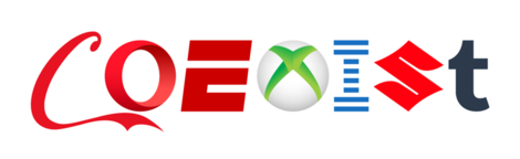
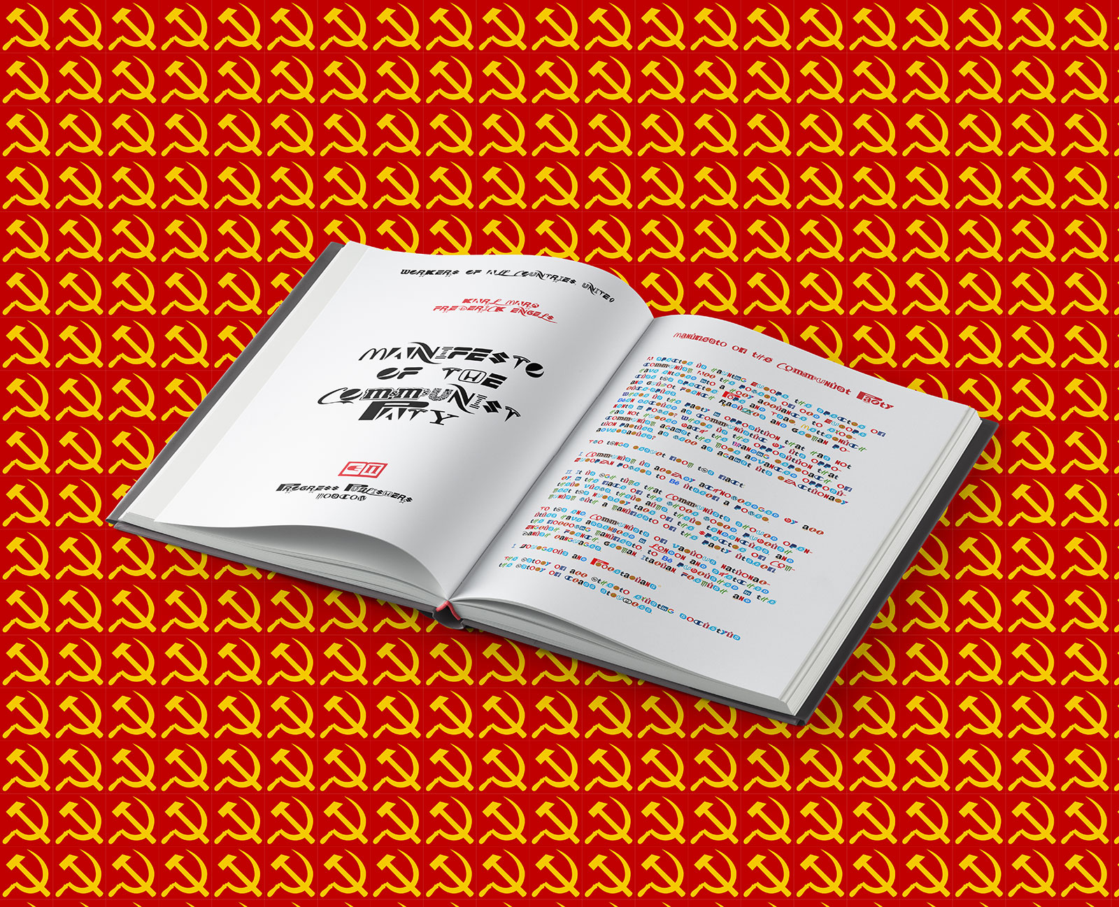
Creatives at digital agency Hello Velocity have developed Brand New Roman, a font comprised of 76 corporate brand logos. The Idiocracy-style project is partly parody, but you can actually download the font and use it—and artists have already been playing around with it, too.
Lukas Bentel, partner and creative director at Hello Velocity, tells Muse that the driving idea behind Brand New Roman was simple: "This stage of capitalism is pretty weird. Seems like a good time to spoof it!"
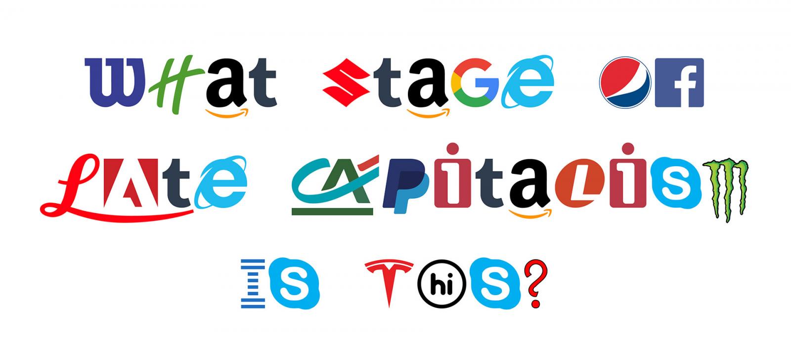
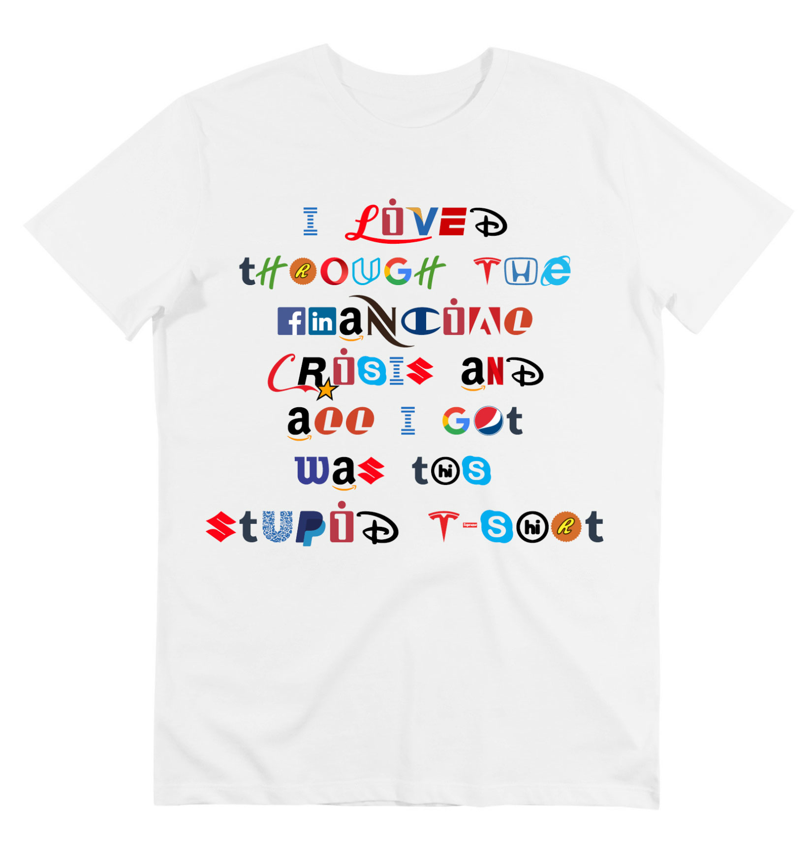
The font is pretty overwhelming when all the original colors of the logos are used:
"At this point, brands are inescapably ubiquitous and attention-hungry," says Bentel. "What's interesting about Brand New Roman is that when you smash so many of these brands together, they start to lose their powerful brand connotations in interesting ways. The sheer density overrides all the extra brand identity connotations each symbol usually carries."
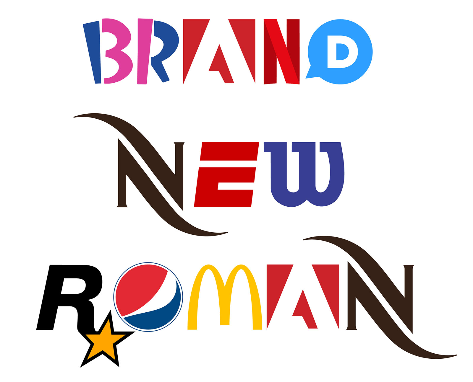
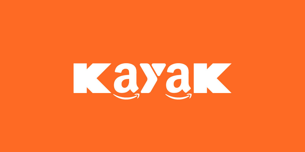
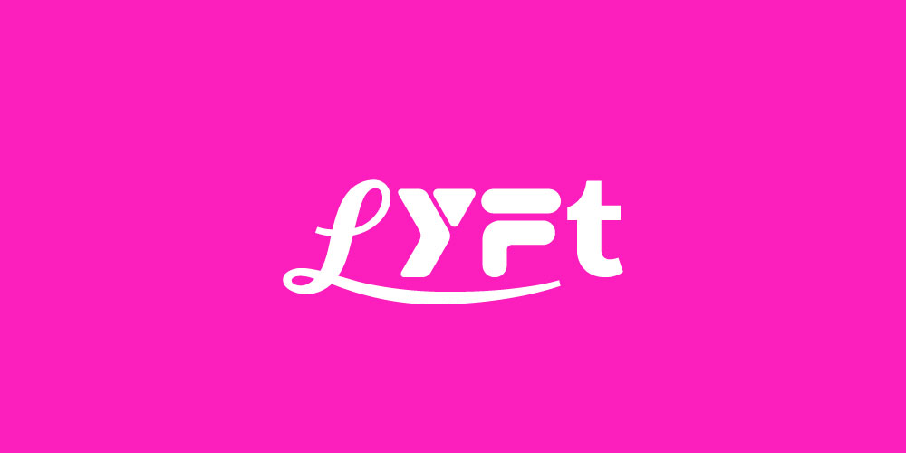
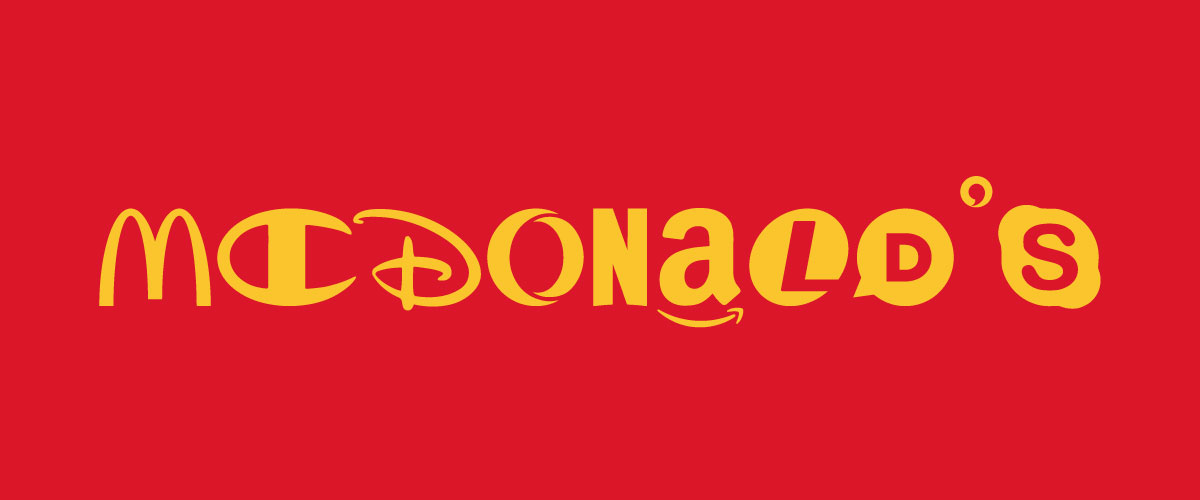
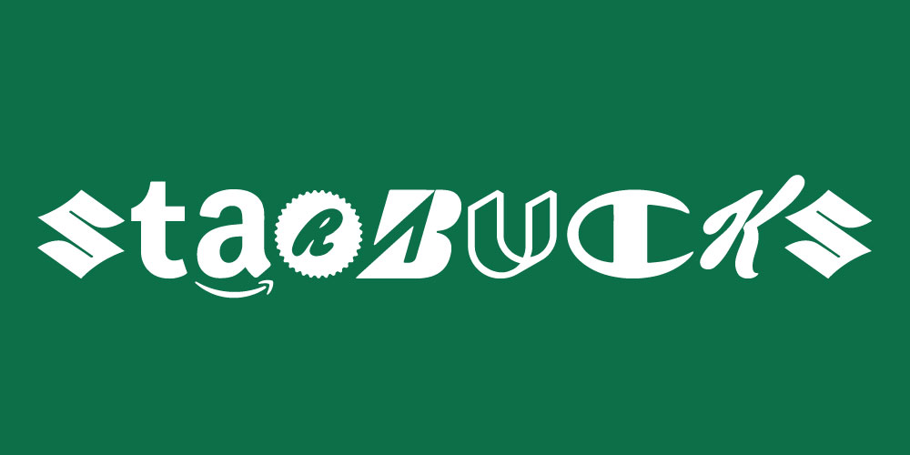
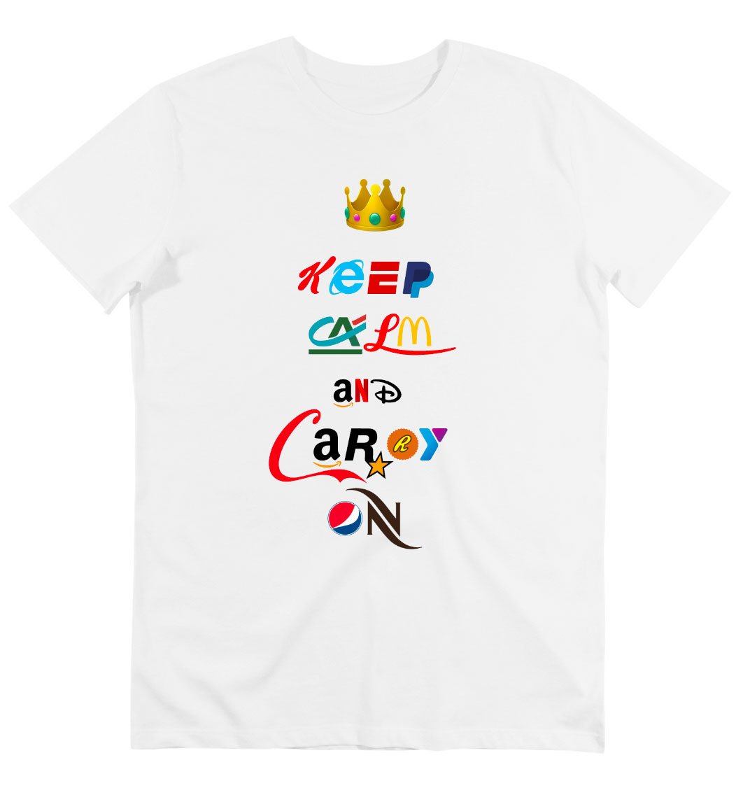
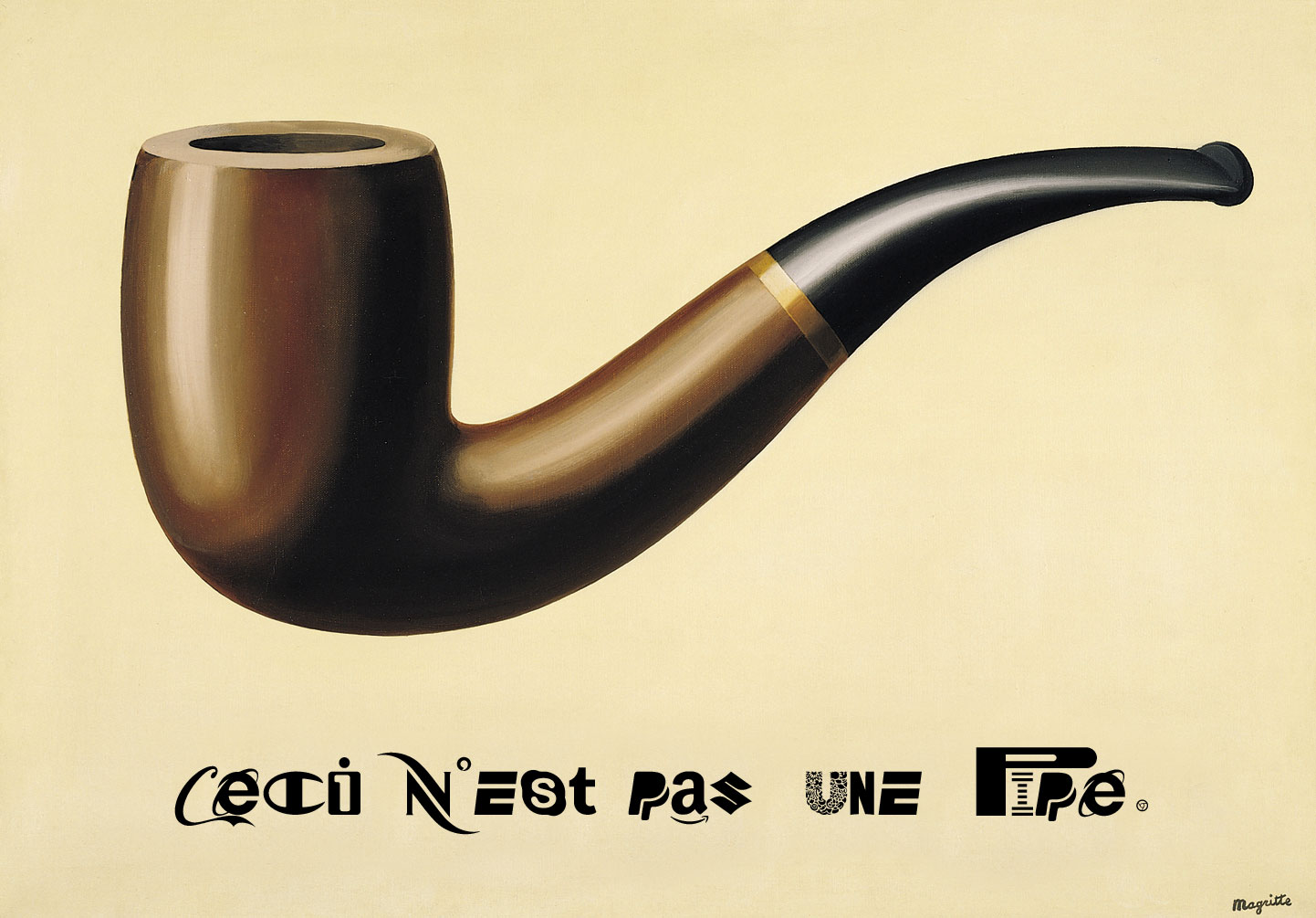
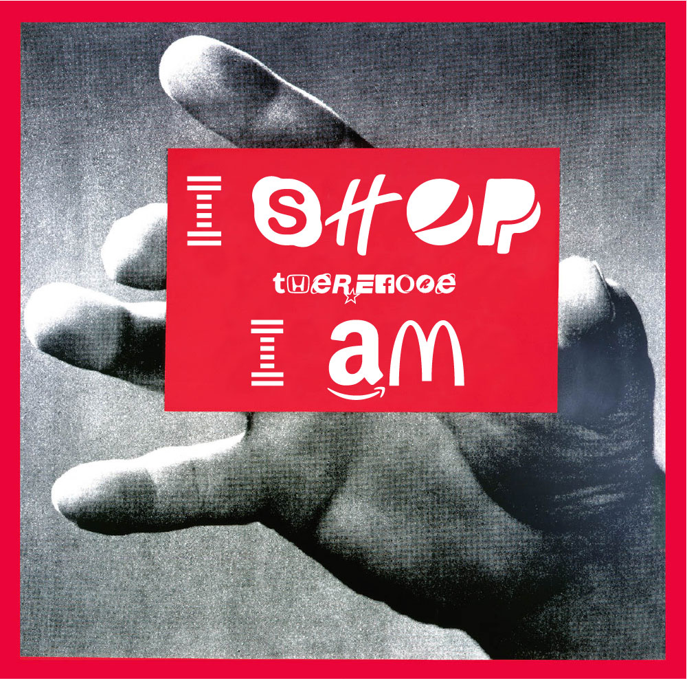
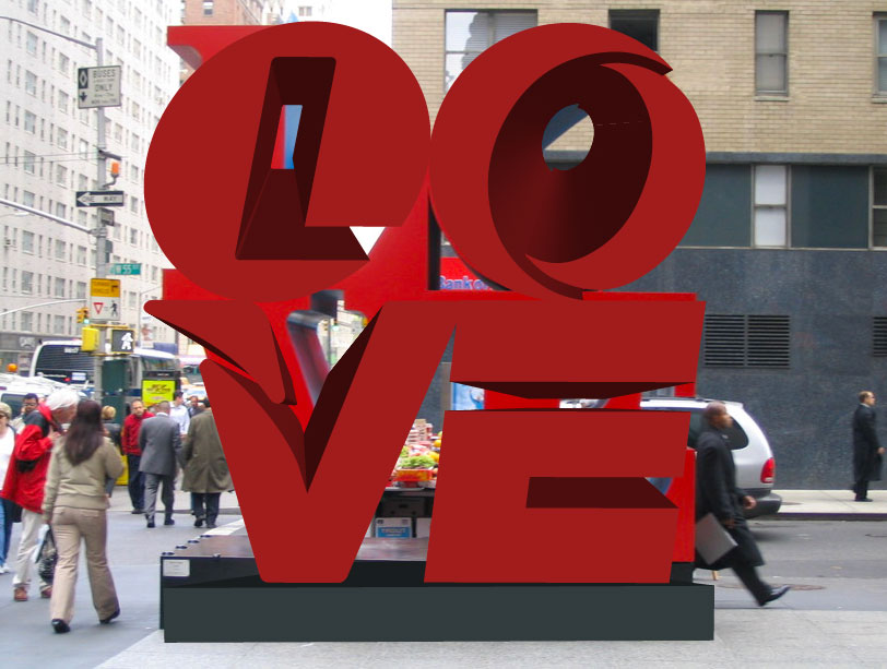
It's more palatable, and readable, in single colors. Below, check out a bunch of brand names written out in Brand New Roman—a kind of consumerist ouroboros in action.


Building out the font was a time-intensive process, Bentel tells us.
"The main work came in sourcing accurate, high-quality vector logos—in color, and black and white—for each of these brands. Some brands do a good job giving access to their logos and branding, but most don't," he says.
The team gave themselves a few goals/constraints, says Bentel:
1. Only use letters that are used as stand-alone branding elements. This meant we couldn't just extract a letter from a logo composed of multiple characters.
2. Make the font as legible as possible—within reason, of course! We mixed and matched logos to find the set that worked best with each other and workshopped it with a couple of type designers along the way.
3. Use the most recognizable current logos possible.
4. Make awesome ligatures. Try typing "cool cooool coooool."
"We broke these rules a few times when it became almost impossible to satisfy each of them," Bentel admits. "For example, I challenge you to think of a company that uses the letter 'I' as a standalone legible logo. We searched far and wide and could not find any recognizable, legible logo! We opted to pull the 'I' from the classic IBM logo, breaking rule 1, and the 'i' from Lenovo's predecessor iomega, breaking rule 3."
Bentel and the Hello Velocity team were thrilled with the results.
"In the end, I think Brand New Roman is pretty aesthetically compelling, which makes sense given all the time, money and design that has gone into crafting each of these logos for the purposes of standing out," he says. "With Brand New Roman we are making them work together."
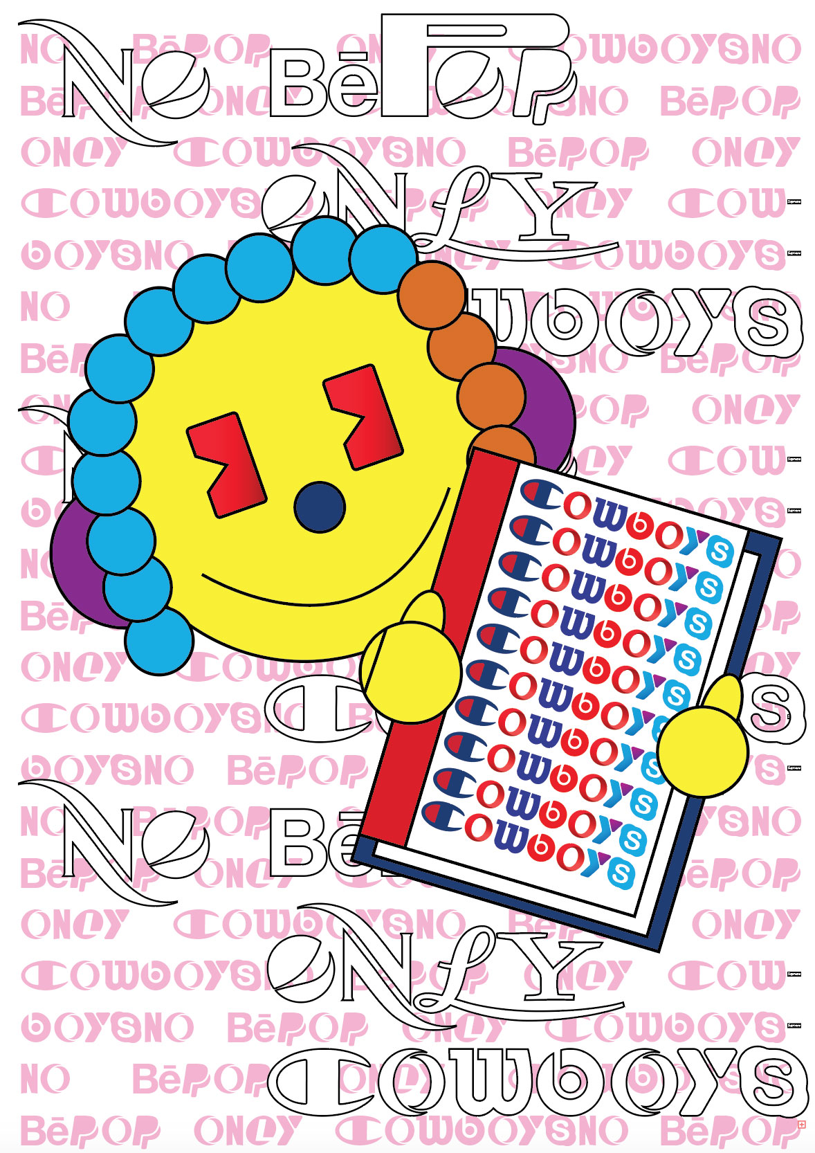
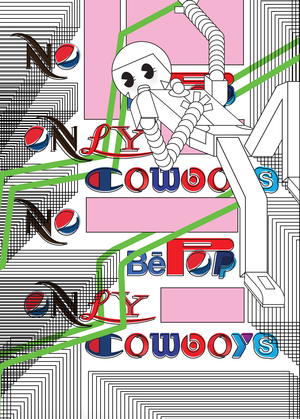
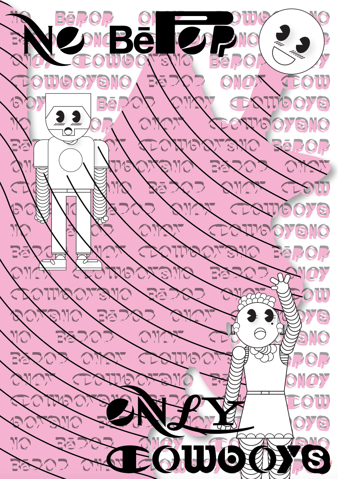
Below, check out some imagery from artists who've been playing around witht he font.
Nikolas Bentel

Hello Velocity
Barron Webster x Hello Velocity
Channel Studio
Laurianne Froesel
Ceci n'est pas une pipe
I shop therefore I am
LOVE
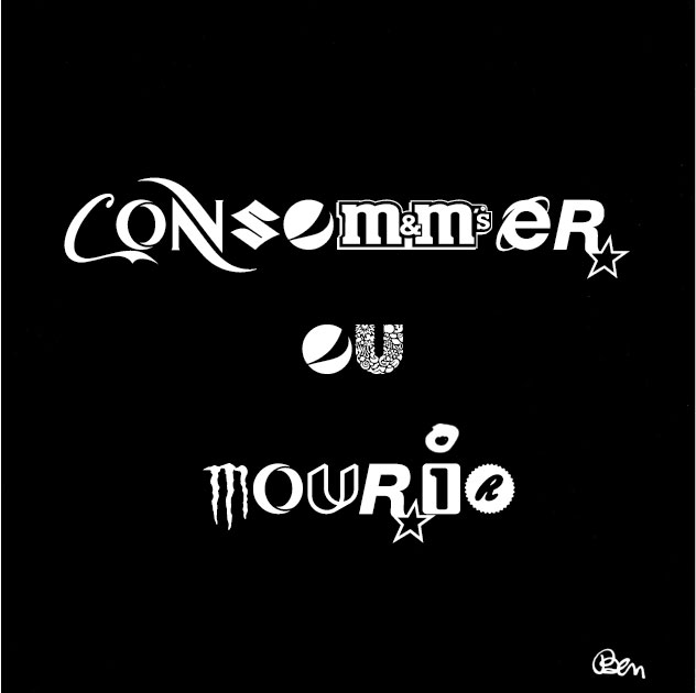
Consommer ou mourir
Kevin Cadena

Related Stories


Editor's Picks


Advertise With Us
