


 Events
11 Great Album Covers, Chosen by Bob Fingerman
Queens of the Stone Age, Devo, ELO and more
As a lifelong scribbler of both words and pictures—a professional one for the last three-plus decades—I will preface this highly subjective list with the caveat that these chosen few are primarily because of the covers’ personal significance or actual merits, and less so for the albums themselves. Many of my favorite records’ covers are not commensurate with my enjoyment of albums themselves. In fact, some of those covers kinda suck. I love these and here’s why…
The Beatles
Yellow Submarine (1968)

Yellow Submarine is a major touchstone for me. The movie itself represents the first positive cinematic experience I can recall vividly. I saw it with my mom at the Trylon theater in Rego Park, Queens, from the balcony, because she could smoke there. The songs, images, everything blew my tender little pre-school mind. So it followed that this was the first album I bought with my own money (also indelibly imprinted: the record department at Korvette’s on the Queens/Long Island border). I wanted to buy a record, and when I saw the cover it all flooded back. The euphoria of the movie. In pre-VHS days, anything to relive the experience was welcome. That cover! And it was an import. So exotic. Maybe I was 9? I would stare at the cover as I listened, even the orchestral stuff on the B-side. OK, album, take me back to Pepperland.
Jonathan Winters
Here’s Jonathan (1960)

I grew up loving comedy. My dad introduced me to that enduring passion with Bill Cosby, Bob Newhart and Jonathan Winters. Cosby, well, ruined forever. But Newhart and Winters are forever. And it was through the manic playfulness of Winters’ covers, particularly this one, that I was drawn into his brilliant madcap world. Again, so much is influenced by the when as much as the what. In the pre-Photoshop days, a photo cover portraying the many manifestations of Winters grouped together seemed like magic. And those characters all delighted my eyes. I wanted to hear them come to life on the vinyl within the sturdy sleeve. With Winters, what you saw is what you got, and I loved it. Still do. As a sidebar, I will add that as a lifelong admirer of artist Frank Frazetta, I adore his Winters cover, but not as much as the one I chose here (an anomalous example of my preferring a photo to a painting).
Devo
Q: Are We Not Men? A: We Are Devo!

Here’s one where the cover and album are of equal significance. Devo is my band. They are my people. I adore them. And this cover announced their intent. It’s both creepy and alluring. It’s bold, confusing, attractive and assaultive. Like Devo.
Electric Light Orchestra
Out of the Blue (1977)

Here was another youthful purchase that was based entirely on the cover. I was a sci-fi kid and this was a sci-fi gatefold cover, and I trotted to the record department at Alexander’s (another Queens department store) and bought it because I just wanted to look at it. To soak in the detail. When I got it home and played it, I experienced buyer’s remorse, at first. It was more symphonic and soupier than I was prepared for. But eventually ELO wormed its way into becoming a favorite.
Queens of the Stone Age
Era Vulgaris (2007)

One of my favorite current bands, and this cover appeals to me on all levels. Playful but a bit creepy. Its aesthetic is a great throwback to typography and overall jacket design of another era, but totally contemporary in its own right. I like those two differently abled anthropomorphic characters. I like the palette. It just works.
Andy Partridge
Powers (2017)

It doesn’t get more niche than this oddity, but leave it to XTC’s Andy Partridge to create an album of soundscapes inspired by the works of inimitable (predominantly sci-fi paperback) artist Richard M. Powers. Powers was mind-bogglingly prolific and brilliant, folding fine art mavericks like Yves Tanguy into his abstracted cover art for sci-fi pulp. Partridge, a devotee, designed and painted the cover himself, an astute homage to Powers. Dreamlike and hypnotic, the album and cover are of a piece. Delirious and wonderful.
The Dickies
The Incredible Shrinking Dickies (1979)
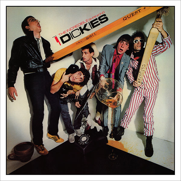
Punk doofuses the Dickies had a lot of fun albums sporting a lot of fun covers, but this one nails it, and again, said BUY ME, which I did. It’s well executed and funny. It plays to furious nerds, that rich combo of smart and stupid. It’s a reference to a sci-fi B-movie? I get it! Here, have money! Mine, now. Oh, the songs are great, too? Yeah, I’m a winner.
Oingo Boingo
Only a Lad (1981)
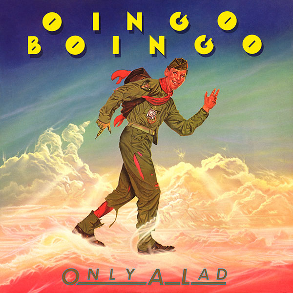
Oingo Boingo has had many great covers, but this one combines classic traditional illustrative art with subversive mischievousness and is very much WYSIWYG, as the band combined traditional, seemingly upbeat musicianship with darkly sardonic lyrics. It apes advertising art, yet is truthful about the product.
Shorty Rogers & Andre Previn
Collaboration (1955)

Jazz albums often have the best graphic design, but this example by the great Jim Flora captures the exuberance of this delightful combo. Shorty Rogers was playfulness incarnate, his jazzy takes of classical music and more drawing me into jazz. A great toe-dip before “the harder stuff.” Rogers laid the groundwork for my love of Ornette Coleman and Charles Mingus through my first exposure to his sound, courtesy of the Warner Bros. cartoon “The Three Little Bops,” which was narrated by Stan Freberg, another jazzy genius. Cartoons led me to classical music, literature and fine art. Anyone who has ever disparaged Warner Bros. cartoons as mindless entertainment has demonstrated they were a dimwit who missed out. For a feast for the eyes, check out the collections of Jim Flora’s fantastic jazz art that Fantagraphics released a while back. Glorious.
Jack Gilford
A Child’s Introduction to Grownups (1964)
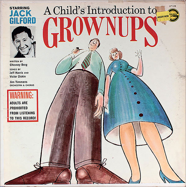
OK, this one’s pretty obscure, but a children’s album I played the grooves off of that happens to be a sharp, almost suspicious, look at adults. Kindly Jack Gilford is both reassuring in his narration, but also skeptical of the wisdom of these so-called grownups. Very enticing and just the thing for a budding antiauthoritarian. The cover art of these two seemingly benign adults, from a child’s perspective, really sets the tone. Grownups are these monolithic beings that have agency over you, tiny human. Great, simple, painted cartoon art. No idea who did it, but job well done.
Derek and Clive
Ad Nauseam (1978)

Oh, this vile cover. Conceptual package design at its best and worst, simultaneously. The printed sleeve depicting vomit contained within the actual clear thick plastic cover is so well executed, it challenged me to buy it. Worse yet, I did, as a Christmas gift for my dad, with whom I shared a love of Peter Cook and Dudley Moore. Little did I know how over-the-top the drunken extemporaneous comedy would be (even given that cover). Within the first minute of putting it on the turntable on Christmas Day, with my aunt, uncle, mom and dad all present, off it came. My dad later reported, upon having taken it home and listened to it all the way, that it was contemptible trash. Naturally I asked if I could have it. With reluctance, he complied and told me if I liked it, I was sick. I did. A lot.
Art of the Album is a weekly feature every Thursday looking at the craft of album-cover design. If you’d like to write for the series, or learn more about our Clio Music program, please get in touch.

Bob Fingerman, best known for his cult comic series Minimum Wage, in 2018 realized his childhood dream to become one of MAD's "usual gang of idiots." Alas, MAD was soon thereafter essentially euthanatized. Bob accepts only partial blame for that. His newest book is the comical Dotty's Inferno (Heavy Metal/Virus). In October 2021, a heavily revised author-approved edition of his novel Pariah will be released, also through Heavy Metal.
