


 Events
9 Great Album Covers (and a Book), Chosen by Jesse Wilks of 123w
Toro y Moi, Lucinda Williams, Warren Zevon and more
The first band I ever really loved was Blink-182. Whether they were singing about aliens or partying or just joking around about farts in between songs, everything they stood for felt like something my 13-year-old self deeply needed to be a part of. In my short life, I’d never connected with anything like that before. And looking back, it still feels like hearing the opening riff of “What’s My Age Again” was one of the seismic shifts in my life. I became obsessed. Started saving up for a guitar. Buying tabs on how to play the songs. Self-identifying as an artist of … some sort.
Though my interests and tastes have long since evolved, I’m still pretty fanatical when it comes to music. I try to keep up with a few different music blogs and sites. Try to see at least a few concerts a month, and am constantly, obsessively compiling playlists to fit very, very specific moods or feelings. So if you ever need a playlist for walking around the west end of Toronto while feeling sad on a dreary Sunday afternoon … hit me up.
Blink 182
Enema of the State (1999)

I know this one’s been covered in this series before, but it really was like the big bang for me and I couldn’t not include it. Nothing makes a 13-year-old want to buy a CD more than a giant “Parental Advisory” sticker. And a photo like this on top of that? My world was a-changing. OK, enough. On to the next one.
Craig Finn
We All Want the Same Things (2017)

While The Hold Steady are known for big, anthemic sing-alongs, Craig Finn’s solo work focuses on smaller, more intimate human stories. A man who gets into a minor car accident and for the first time in his life receives a windfall of cash. Why tourists in New York feel the need to take pictures of garbage cans. The everyday moments that seemingly reveal to us the true nature of life. Shot by Dan Monick, I love how the album cover for We All Want the Same Things captures a very specifically mundane feeling. Driving on a highway in the rain. It could be anywhere. And the stories on the album could be about anyone.
Titus Andronicus
The Monitor (2010)

Titus Andronicus’s magnum opus from 2010, named after the ship the USS Monitor, is a loose concept album about how in some ways the Civil War never really ended. The album cover immediately takes its audience to another time period and signals that this is a record that doesn’t just need to be listened to, but considered. Designed by Nolan Strals, the title The Monitor, as it appears on the cover, is actually from a note written for the telegraph sent to President Lincoln with an update on the warship’s progress in battle. The rest of the album is just as meticulously crafted. It is to this day, my all-time No. 1 favorite album.
Toro y Moi
Outer Peace (2019)

I grew up with the idea that recording an album was a glamorous experience. That you’d walk into the Capitol Records Tower building in Hollywood with a guitar and a briefcase full of cocaine and start laying down platinum singles. The explosion of home studios definitely challenged that romantic idea, but I love how this album cover by Harry Israelso for Toro y Moi’s Outer Peace brings back an attitude and a vibe to the recording process. The cover gives you the same feeling the music does, and it actually makes working things out on a computer feel … cool. I may or may not have used this image on a few moodboards here and there since its release.
Carole King
Tapestry (1971)
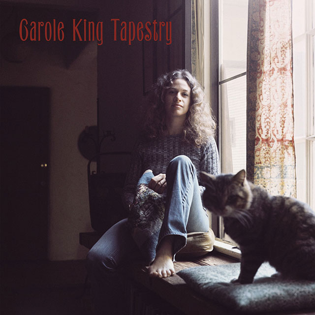
Here’s a secret. Every time I try to write a spot or manifesto that feels emotional, I listen to “So Far Away” from Carole King’s masterpiece Tapestry and try to match that feeling. With a photo taken by famed rock ‘n’ roll photographer Jim McCrary, the cover for the album is almost as iconic as the music within. It captures what feels like a late afternoon in October … right before the weather changes. “So faar aaaway. Doesn’t anybody stay in one place anymore…”
Warren Zevon
The Wind (2003)

Warren Zevon started writing his final album, The Wind, after being diagnosed with an inoperable form of cancer. Songs like “Keep Me in Your Heart for a While” offer a stark reminder of the fragility and beauty of life, and the cover’s straightforward portrait comes off as equally vulnerable given the heart-wrenching context of the album.
Constantines
Tournament of Hearts (2005)

The mid-aughts saw a huge boom in Canadian indie rock and gave the world artists like Arcade Fire, Broken Social Scene, Feist, my personal favorite The Weakerthans, and so many more. It’s been mythologized that all those bands’ favorite band … was the Constantines. Named after the women’s Canadian Curling championship, Tournament of Hearts, with songs about “the weird winds of Ontario,” this album feels quintessentially Canadian. The cover, designed by bassist Dallas James Wehrle, depicts a steep rocky incline. The album sounds like that, too.
Drake
Views (2016)

The most obnoxious thing about Canadians is our insistence on pointing out when someone or something has some vague connection to Canada. We seem to operate with a chip on our shoulder the size of a double-double (eh there bud). So, for one of the world’s most famous artists to not just loudly identify as a Canadian, but put maybe our most famous landmark on the cover of his album, felt like we were finally, loudly declaring … Canada … it’s a place.
Lucinda Williams
Car Wheels on a Gravel Road (1998)

The name. The cover. The song “Can’t Let Go.” It’s all just so evocative. The photo here was shot by Birney Imes, who has a great collection of photography capturing the American South. Despite being born about 1,600 km north of where this picture was taken in Mississippi, the album still feels deeply nostalgic for me, and reminds me of the southwest Ontario country landscapes that I grew up around. While I’m sure some of the typography here might bother the designers and art directors among us, to me it only adds to the appeal of the album. This album will always be 2 Kool 2 Be 4-Gotten.
Bonus
Jeff Tweedy
Let’s Go (So We Can Get Back)

OK, so this is a book not an album. And it’s not even the photo or design I like, it’s the name. I’m a copywriter by trade so I wanted to include something outside the gamut of album covers and talk about words for a quick second. The name of Jeff Tweedy’s autobiography is one of my all-time favorite phrases. “Let’s go so we can get back” is a feeling deeply ingrained into my psyche. I’m a pretty antsy person who has a hard time relaxing or chilling. As soon as I get anywhere I just have an overwhelming desire to go right back home. I’m not sure Tweedy meant the phrase that literally but “Lets Go (So We Can Get Back)” does a better job at bluntly describing my state of mind than anything else I’ve ever heard or seen. A good phrase for anyone who loves to go on vacations and just fantasize about being back home.
Art of the Album is a regular feature looking at the craft of album-cover design. If you’d like to write for the series, or learn more about our Clio Music program, please get in touch.

Jesse Wilks is an associate creative director at independent agency 123w in Toronto and Vancouver. 123w has been named Canada's small agency of the year the last two years in a row. Jesse has been in the business for over 10 years, and worked at agencies like Juniper Park, TBWA, john st, and Muh-Tay-Zik Hof-Fer in San Francisco. For all 10 of those years, he's worked with one of his best pals—art director Gerardo Agbuya.
