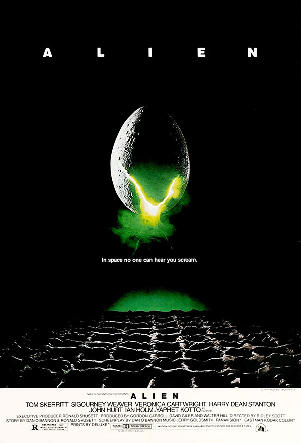
Powerful images can evoke our greatest fears. They can raise questions, tease answers, and send tingling chills down our spines. In 1979, this was exactly the goal of Steve Frankfurt and Philip Gips, designers from Frankfurt Gips Balkind (the agency now known as InSync Plus). The poster they created became iconic, as well as the industry standard.
Sci-fi existed long before Alien. There had been a golden age of sci-fi in the 1950s, some of it tinged with horror—born out of fears of communism and atomic bombs. But what Alien did was different. It fully bred sci-fi and horror, birthing a new genre that had no formula for marketing.
It could be the cracking egg, or the militant formation of bodies, or even the leaking green gas escaping into a dark atmosphere. I find it to be the combination of all three in the Alien poster that create unease. Add in the unnerving tagline, and you've got a formula to sell scares.
For generations, Alien has set the bar for designers through its exemplary blend of imagery and copy. For Kenny Gravillis, chief creative officer at Gravillis Inc. and chair of the 2018 Clio Entertainment print jury, it was a huge inspiration and continues to influence the way he approaches work today.
Gravillis, whose agency's own recent work has included this stunning poster for Spike Lee's BlackKklansman, spoke with Muse about the Alien poster.

Muse: What about the Alien poster stood out to you most?
Kenny Gravillis: I had never seen anything like that before, and the tagline was just as iconic as the image.
Do you remember seeing it for the first time?
I was too young to go to the movies and see the film, but I remember seeing the poster at a cinema and wondering, even at the age of 9, what was the deal with that shape and why did it look like an egg? I was intrigued.
What elements of the Alien key art still inspire your work today?
Iconography! I think anytime you can use something that feels iconic, it seems to stay in your memory bank more than a collage of people or even a handsome/pretty face.
How did the Alien key art move the needle for entertainment marketing?
I think when people start talking about your poster, and it becomes part of pop culture conversation, then you start to move the needle. "In space no one can hear you scream." Think about how much that has been riffed on or talked about decades after that movie came out.
What about the work showed the cultural significance of the time?
I think it followed the risk that was taking place at that time in cinema. You had Apocalypse Now and Mad Max that year, and you just hadn't seen that combo of sci-fi and horror before. It started that genre, as we know it today.
Generally speaking, what makes a great piece of key art?
Something that makes you interested, curious and even excited about what is to come.
Did you get to know any of the people behind the Alien poster as you came up in the industry?
I got to meet Peter Bemis one time, and it was the first thing I said to him—how genius that poster was. One of many people who told him that, I'm sure.
Fun Facts
Q. Poster designer Stephen Frankfurt was named the president of which top advertising agency in 1967?
A: Young & Rubicam.
Q: What popular TV series recently paid homage to the Alien poster in a teaser poster?
A: Stranger Things.

Q: The co-founder of which major agency designed the famous title sequence for Alien?
A: R/GA. Richard Greenberg, the co-founder, was the lead designer.
Q: Which other iconic movie poster did Steve Frankfurt and Philip Gips design?
A: Rosemary's Baby (1968).


Related Stories


Editor's Picks


Advertise With Us
