Photo: Heidi Kirn
How does a 95-year-old ad club reinvent itself for a new generation of talent, in a town pulsating with the energy of its own creative renaissance, without losing the legacy of the community that came before it?
That was the challenge facing the Ad Club of Maine over the past 18 months, as it moved to update its identity to be as vibrant as the younger, multidisciplinary creative community that has sprung up in Portland and beyond—and which it hopes to attract to its ranks.
Led by president Colleen Craig and vice president Steve Holt—veterans of Portland agencies Garrand Moehlenkamp and The VIA Agency, respectively—the club had already been evolving its approach. Among other efforts, it had been organizing new events with fresher themes and casting a wider net for creatives to attend them.
But by the end of 2017—at a meeting over beers at South Portland's Foulmouthed Brewery—they decided a wholesale rebrand was needed, to ditch the stuffy "ad club" label and design a more approachable, inclusive brand that would be more in step with the times.
Ad clubs around the country have grappled with similar issues. But in Portland, Maine, it's particularly pressing. The once-sleepy New England town has become quite the creative hub lately—notably with its celebrated restaurants, but also in advertising creativity, particularly design. The one organization devoted to fostering that creativity couldn't go on with an outdated image itself.
"If you think about what's happened in Portland in the last five or 10 years, we have less of these big agencies and much more of these smaller, niche, design-focused shops," says Craig, who recently left Garrand for a job at Moo.com but who remains the organization's president. "Portland is a creative place. Maine is a creative place. There's a lot of people doing cool stuff. We can own that in a way no one else can. At the same time, it was important to us to remain true to our roots and our history."
It was a tough balance to strike, but one that would be worth the effort.
'Made, but Never Done'
The board first engaged the old guard, who'd been integral to running the club in prior decades, to get them on board with the idea of evolving the brand. Then they set about working on ideas for a new name and logo.
In August 2018, they unveiled the finished identity at a party at the Space Gallery in Portland.
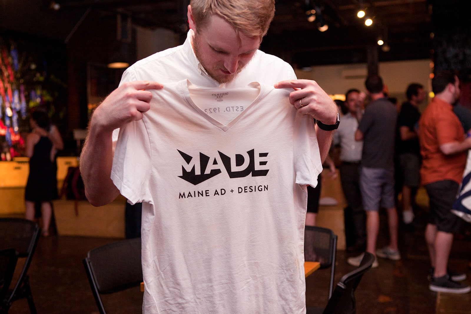
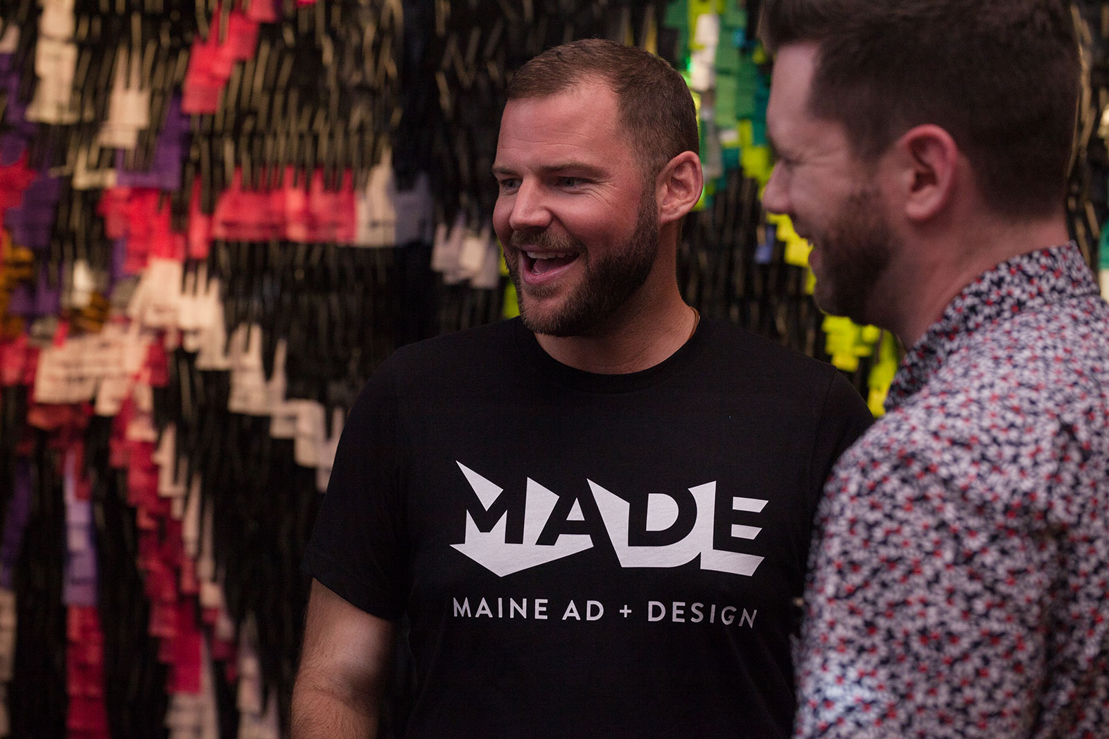
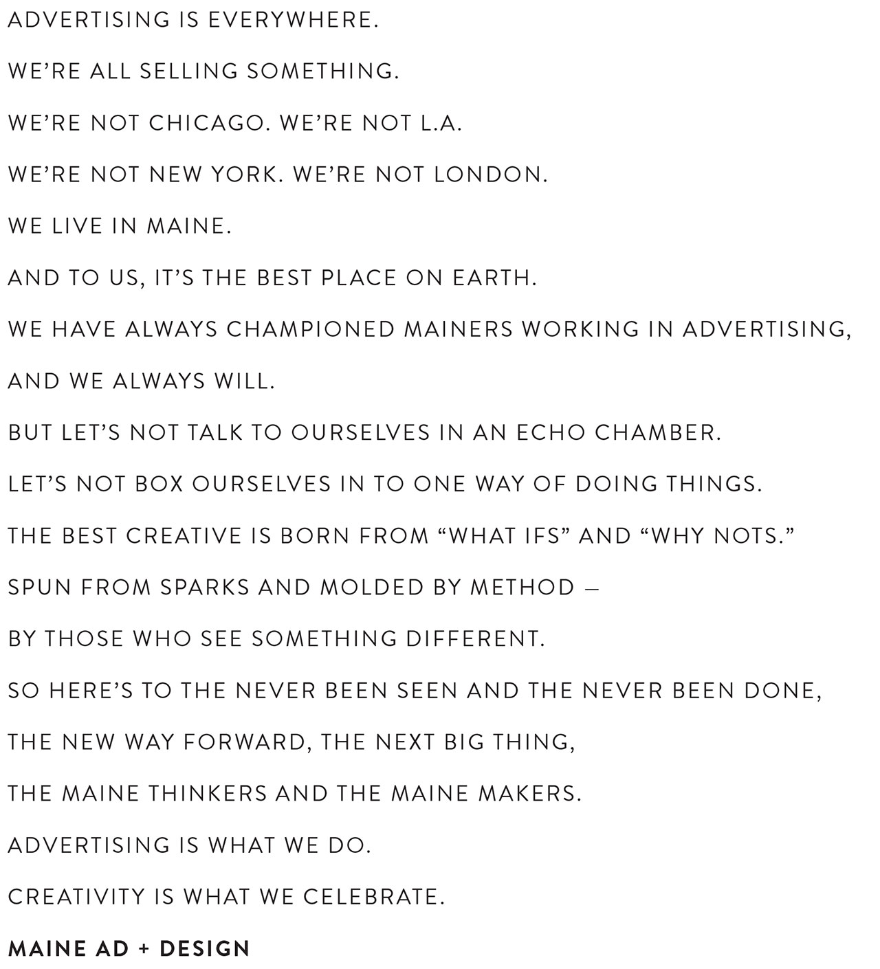
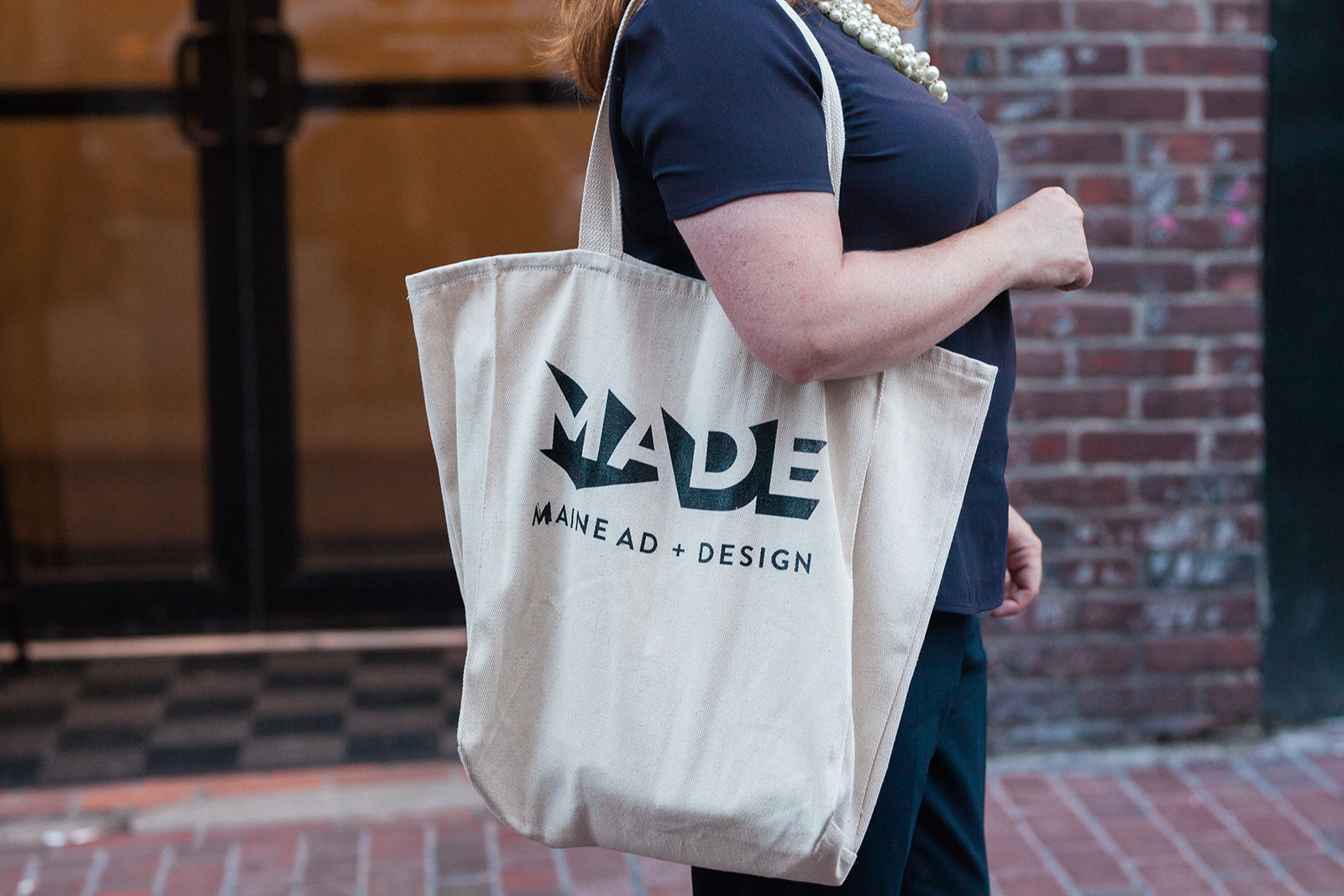
The new name, Maine Ad + Design, or "MADE" for short, leans into the ascendancy of the design community while cutting the antiquated word "club," which felt too exclusive. The four-letter acronym also cleverly incorporates three separate references—ME, for Maine; AD, for advertising; and MADE, honoring the makers of the creative industries.
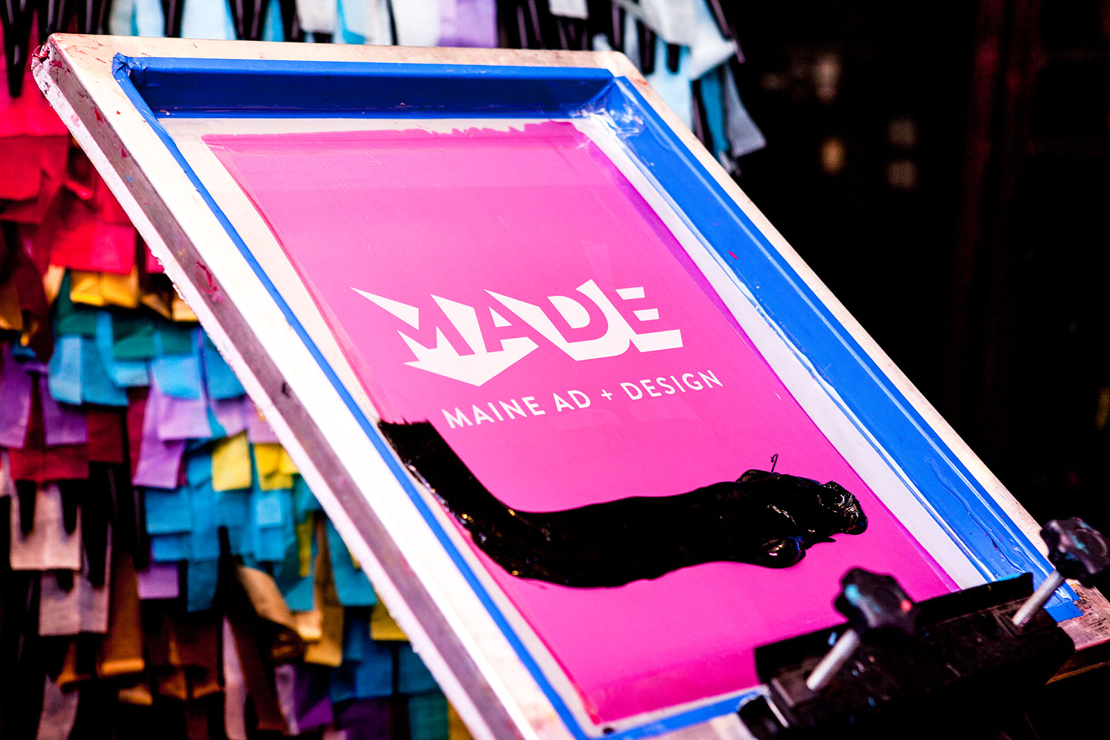
Meanwhile, the striking logo, created by local designers LK Weiss, Erica Johnson and Libby Connolly, uses negative space to spell out the MADE letters in jagged, energetic fashion—an embodiment of creativity and the excitement of rethinking the organization and its purpose. Weiss, who began the design explorations for the new logo, says she started with a simple geometric word bubble, like you'd see in a comic book.
"To me, the message was about communication and talking and conversing and sharing," she says. "I started by putting the letters into a box, and then just destroying it. How can I break the letters, and break the shape? I started playing with the angles and the corners of the original box—the curve in the D is perfect. When I look at it, it still doesn't make sense to me. And that's why it makes sense."
The mark also nicely reflects the group's mission of being more interactive in general.
"You look at it, and your eye goes everywhere. You want to touch it and figure it out," Weiss says. "It's so full of movement—which means it may look completely different to you than it does to someone else. Similarly, in marketing and communication design, we can't make all people feel one thing or hear one message. We can deliver a message and hope it's understood and recognized, but know that each person will interpret that message in their own way. This mark isn't one thing. Neither are artists, advertisers, designers, strategists or writers. It's welcoming, intriguing, makes us want to know more."
"It mirrors the creative process. It's made, but it's never done," adds Holt.
"It's a little uncomfortable, in a great way," says Craig.
Black is the logo's default color, but the design exploration also led to versions in deep yellow and poppy red, as well as navy and teal.
The Larger Rebrand
The rebrand initiative also includes the social events. The group has been hosting a series of social gatherings called Drinking With Strangers ("Walk in. Crack a beer. Meet a few folks from the Portland ad scene. Leave as BFFs") and an education series called Navigating Ad Land ("Modern authenticity in a world of spin"), where CMOs from around New England are invited to speak.
There is also a new website, as well as a manifesto designed to put the group's new ethos into words.
MADE is also preparing for the Broderson Awards this spring, a biennial award show recognizing Maine's best advertising and design—an event that was rebooted in 2017 after a three-year hiatus.
MADE merch is for sale on the website, with proceeds going to a scholarship fund that will award $1,000 to each of the top five local entrants in the student category of the Brodersons. (The students submit to the show for free.)
Surge of New Members
Results have been extraordinary since the rebrand went live. The group saw the most new membership sign-ups ever within 48 hours of the website's relaunch, and membership has grown by more than 50 percent overall since August, says Craig.
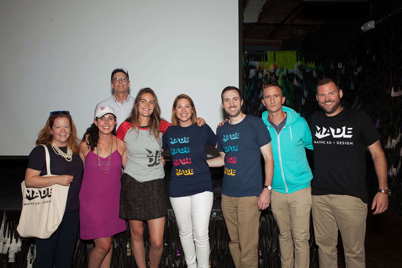
"We attribute this to a few things—consistency in our communications and events, a continual evolution of programming and pure sweat equity of the board to get the word out," she says. (The other board members include Liza LePage, Chris Davis, Kirk Duke, Chris Grass, Nicole Barna and Kate Simmons.)
"There's a renewed sense of energy both within our board and the community—the new brand has fueled that—and our membership validates that it was worth it," Craig adds.
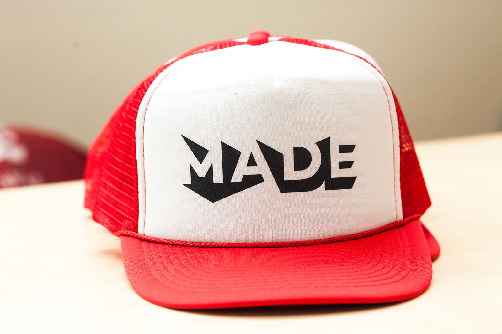
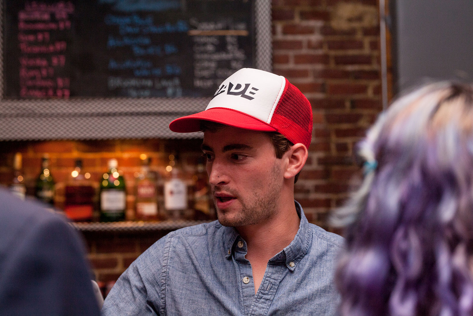
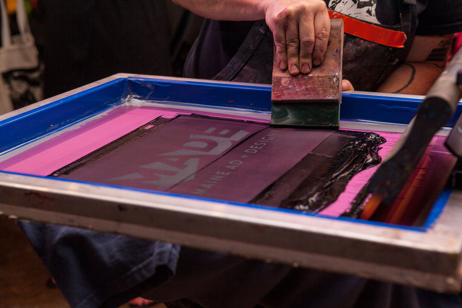
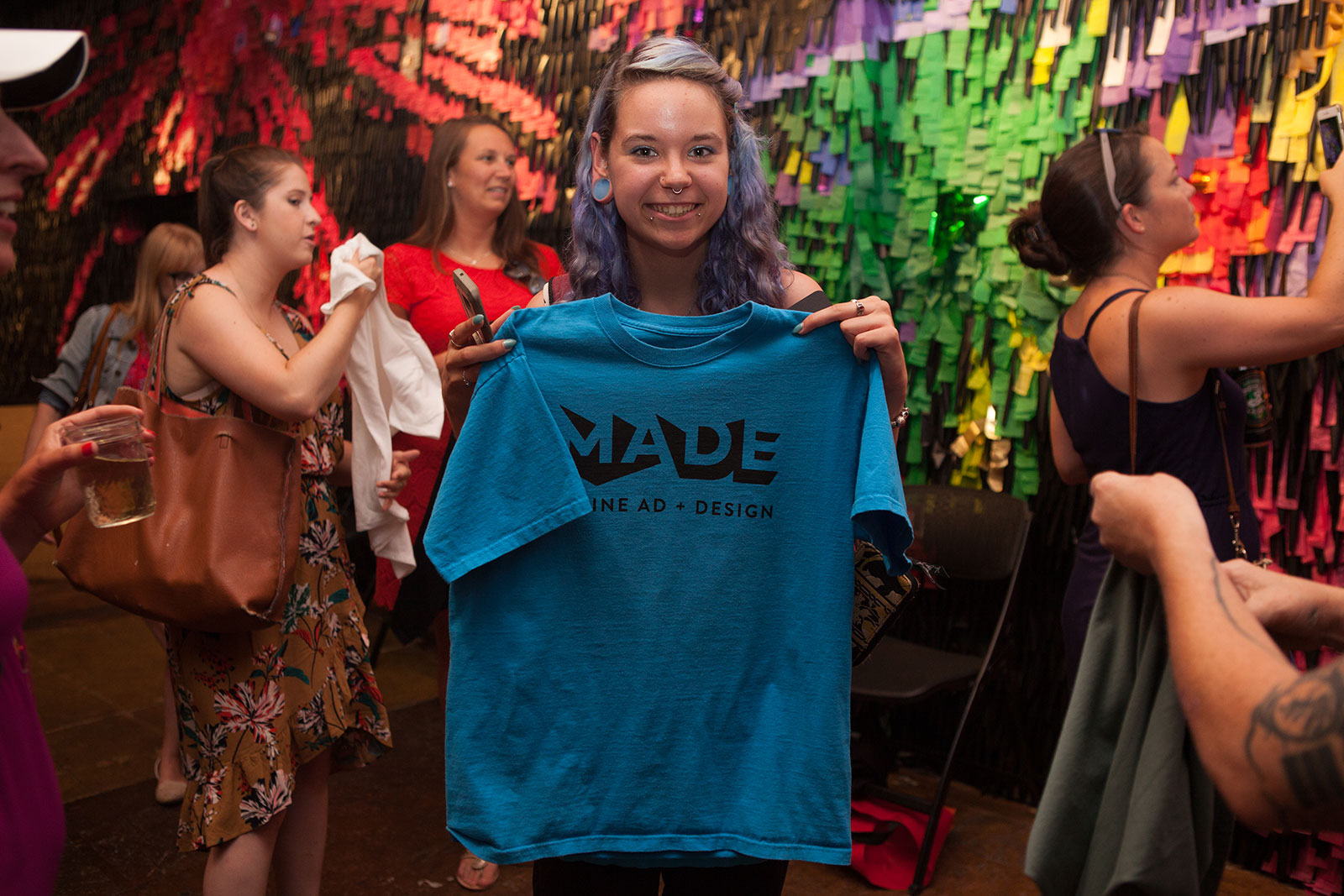
That energy was certainly felt at the brand relaunch party at Space Gallery. The MADE logo quickly made quite the impression, as it was screen printed on items that attendees brought with them.
"Sometimes you see a logo and say, 'Oh yes, that shape makes sense, and that letter is totally in the right spot. It was meant to be,' " says Weiss. "This mark beckons thinking. It requires a second look, or even a third. It begs to be studied. It's all of us and none of us. It makes sense and it doesn't. It's art."
Adds Craig: "It has to live for the next 95 years. So, no pressure!"

Related Stories


Editor's Picks


Advertise With Us
