I've been lovingly building my vinyl collection for about 12 years now. I would definitely say I have a bit of an addiction. Out on the road, I make a point of stopping into neighborhood record stores wherever I go. It's a ritual that offers a more intimate understanding of a region's particular musical tastes.
Your friendly neighborhood record shop will also usually have lovingly designed, DIY concert posters taped up every which way. Examining these can be an ideal vehicle for gaining a more intimate feel for the local scene. Along the way, one meets a steady mix of colorful and passionate people who know a f*ck ton about music. My kind of folks.
Back home, I have a little musical corner devoted to vinyl and cassette tapes. Analog only. I much prefer the tactile experience; the feeling of holding a new record in your hand, examining the cover art, liner notes and back credits, then dropping that needle down, watching it groove along for a split second before the music kicks in. Even the smell of fresh acetate is something I appreciate. All this to say that a meaningful, active listening experience that demands your attention and care as a fan is highly rewarding.
Album art is one of the "gateway drugs" when it comes to music discovery. A standout cover will both illuminate and enhance an artist's intent. Hopefully, there's an added sense of mystique too.
I often think of that scene from Almost Famous when a young William Miller discovers his sister's record collection, eyes wide open as he flips through Joni's Blue, Jimi's Axis: Bold as Love, and The Who's Tommy (P.S.—having listened to Tommy with a candle burning, I can confirm that yes, you will see your future).
Sometimes the album art is the sole reason why you take a chance on purchasing a new record. It's thrilling when an impulse buy like this turns out to be music you fall in love with. It's crucial, therefore, that the art should draw in the audience, creating a sense of wonder mixed with intrigue. At the very least, the art should engage, provoke and entertain.
Following are a handful of records pulled off the shelf that are fun to highlight for the artwork (in no particular order).
Miles Davis
Bitches Brew (1970)

My favorite Miles record. Bitches Brew blew my mind when I first heard it and I don't think anything has come close to sounding like it since. The transcendent cover was created by the French surrealist painter Mati Klarwein, using a technique known as Mischtechnik, a method of layering tempera and oil paints. I find it to be both timeless and placeless; a masterpiece of brooding psychedelia. As with all great cover art, it helps to set the stage for a singular listening experience. Miles' groundbreaking fusion of electric free jazz emanates from a secret, secret place within himself. The sort of enveloping record best listened to with eyes closed, transporting the listener off to faraway places. A must-have for any collector.
Lykke Li
I Never Learn (2014)

I Never Learn happens to be one of those amazing-yet-devastating examples in music when an artist chooses to delve into a singular theme to astonishing effect: heartbreak. I cherish this record for how screwed up it is. Masterfully written and produced, Lykke Li explores dark notions of love, loss, and bad (good?) mistakes in relationships for all their complexities. I Never Learn features a monochromatic cover image of the artist, hand frozen over her heart; her eyes peering out at the listener with haunting intensity. That Lykke Li's also dressed like she's about to attend Beetlejuice's funeral is just another delicious punch to the gut. That's what you want from your heroes—full commitment.
The Smiths
Meat as Murder (1985)

The Smiths released their epic sophomore album, Meat is Murder, in the winter of 1985. It is a collection of transcendent, searing treatises—or rather a call to arms—for lead singer Morrissey's beliefs about the ethical treatment of animals. It was a radical position for an artist to take at the time and a pioneering effort for using one's platform as an artist to bring about change.
While there could be no mistaking The Smiths' intent for the music's message, the album art was more indirect, featuring an image of a soldier repeated four times, the words "Meat is Murder" scrawled upon his helmet. The album sleeve notes credit the film In the Year of the Pig (1968) by documentary filmmaker Emile de Antonio, known for his provocative films exploring controversial subject matters. In fact, the Smiths changed out the words on the soldier's helmet, replacing the original scrawl of "make war, not love," itself a send-up of the hippie movement happening at the time. The art moves me greatly in its desire to be both fearless and confrontational, much like the Smiths themselves. I love the quad design and the green typeface on the left. The whole look is very graphic and, in a way, kind of brutal. It's an iconic cover for an iconic record.
Soul Jazz Records Presents
Acid Vol. 1—Chicago Acid and Experimental House 1985-1995

Acid Vol. 1 shows what can be done with a minimal color palette and a bold title that is both a fierce declaration and an introduction of an entirely new genre of sound. "House music is disco’s revenge"—so said pioneer Frankie Knuckles reflecting on the charged history of the genre he helped to create, emerging from Chicago in the mid-'80s, a city that can boast a long history of radical, roots-oriented music-making. The cover also helps to pose the question, "can you jack?" in reference to Chip E's iconic "Time to Jack," a song whose sole lyric is "time to jack / jack your body." Says Chip E: "That [message] was all that was important. People didn't need to hear a story; 'time to jack, jack your body' was the story right there."
Betty Davis
They Say I'm Different (1974)

It's been said that Betty Davis was ahead of her time, with her "flamboyant" flaunting of female sexuality, but the under-appreciated R&B pioneer's uncompromising songwriting was also equally off the charts, as demonstrated on Davis' much-sampled, self-produced and written They Say I'm Different. The cover art embodies Davis at the height of her "deep-funk" powers, just oozing sexuality and attitude from every pore, while still capturing her absolute fierceness and artistic dynamism. Betty was also the inspiration for her husband Miles Davis' Bitches Brew—also on this list (by coincidence)—having previously introduced Miles to psychedelic rock, and in particular, the music of Jimi Hendrix. A true visionary in every sense.
Fripp & Eno
(No Pussyfooting) (1973)

One of my favorite records with its avant-garde loop-making, experimental histrionics and "tape delay mutilation," as it's been called. Brian Eno of course was a pioneer of the ambient genre, but this 1973 partnership on (No Pussyfooting) with guitarist Robert Fripp—the first of three collaborations together—showcases a couple of titans joining together to get properly weird. The album artwork, a collaboration between Eno and photographer/filmmaker Willie Christie, is just as spectacularly paranoid as the music itself. Set within an infinity mirror freak-out room, the two artists are shown sitting adjacent to one another in casual disregard, with a pack of cigarettes and a nudie deck of cards placed in between. Fun times.
In addition to the visuals, the title itself is also significant: the term "pussyfooting" is defined as "acting in a cautious or hesitant manner." This suggests that the music assembled would be bold and fearless, with the album's title acting as a challenge to the listener to open their minds and experience something new.
Bob Dylan
Oh Mercy (1989)

I've listened to the 26th album in Bob Dylan's staggering oeuvre, Oh Mercy, perhaps more than any other record I own. Dylan may have more famous albums/covers, but this one resonates the most deeply for me. The music on Oh Mercy is very swampy, mysterious and textured, owing considerably to the Daniel Lanois production. However, those character traits carry over to the cover, perhaps unintentionally, given its surprising origin.
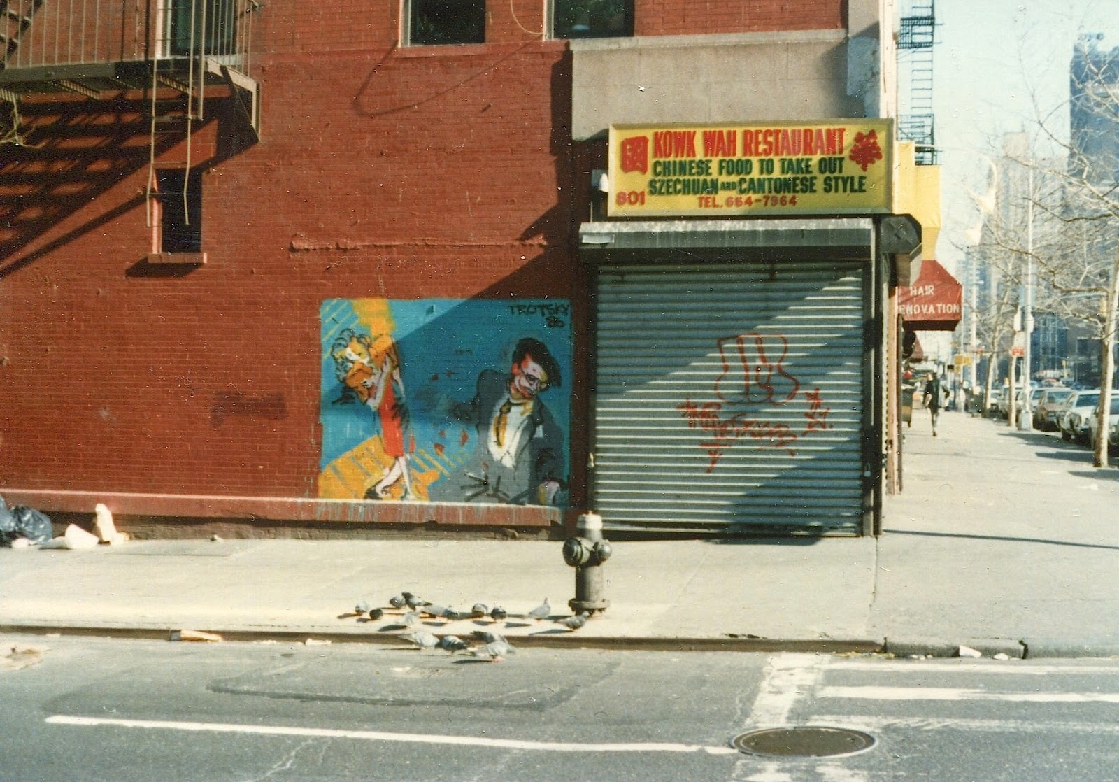
The story goes that Dylan's busy schedule prepping for his upcoming summer 1989 tour did not leave time for a photography shoot for the Oh Mercy cover. Around the corner from where rehearsals were taking place was an unassuming Chinese restaurant with a mural on the side painted by someone calling themselves "Trotsky '86." Dylan was intrigued and had it photographed by Jim Linderman, as a potential idea for the cover art. Columbia Records was then able to track down the artist, Remerro Trotsky Williams, and gained his approval to use the image for the cover. What's wild is that even though the cover art's origin was serendipitous, it still manages to capture the album's musical themes so succinctly, with its melancholic palette and dense illustrative style. I love how bloc-y and loud the Oh Mercy title font is too. The end result is a work of immense beauty through and through.
Bedouine
Bird Song of a Killjoy (2019)

On 2019's Bird Song of a Killjoy, LA-based artist Azniv Korkejian, aka Bedouine, stuns with her nomadic brand of contemporary folk, as her siren-like vocals float over 12 x elegant, plaintive tunes. I find myself reaching for Killjoy on rainy days, or any other lazy setting that calls for a soundtrack evoking that classic Laurel Canyon-type sound.
On the incredible art: the hypnotic cover was created by artist and musician Robert Beatty. I love it for its color choices, illustrative stylings, and its opaque, mysterious intent. One of those album covers that shows you everything and yet tells you absolutely nothing; in essence, infused with a sense of mystique and timelessness. This is a great example of album artwork, for which although you may not be familiar with the artist's music, on the strength alone of the cover you decide to take a leap of faith. In this case, what a leap of faith it was. Highly recommended.
Caribou
Our Love (2014)

A record that changed my life, simply put. I used to bike around London, where I lived for a spell, listening to this on endless repeat. In addition to being very moving, it's also strikingly danceable; this is a Caribou record after all. There's something very cool and unique about music that can make you dance and cry at the same time. This is one of those albums. The cover art is an explosion of kaleidoscopic color, mish-mashed into a chaotic, yet beautiful abstraction. Human beings are complex creatures, capable of feeling many things at different times, or all at once. The art achieves something inner-facing in that sense.
Soul Jazz Records Presents
Country Soul Sisters: Women in Country, 1952-74 (1975)

There is a bit of a complicated legacy within country music, to say the least, of giving female artists who co-pioneered the genre their proper shine. This compilation from Soul Jazz pulls together an outstanding collection of female country singer/songwriters and gives them the love they deserve. I picked it up on one of my first pilgrimages to the iconic Soho, London, record shop Sounds of the Universe. Soul Jazz comps have such a distinct aesthetic—usually bright, tasteful and attention-grabbing. The cover art is equal to the task as well. To me, the woman on this front is such a badass. She exudes confidence and authority, and also a bit of danger. I just love it. The way the image has been photographed from below further accentuates the heroic nature of its subject. It does what a great album cover should always do: show you that within the music waiting to be heard, there is more than meets the eye.
Art of the Album is a regular feature looking at the craft of album-cover design. If you'd like to write for the series, or learn more about our Clio Music program, please get in touch.

Related Stories


Editor's Picks


Advertise With Us
